
阿花晚熟皂
AHUA cold process handmade soap
brand strategy, branding, rebranding, package design, graphic design
2015
Art Director
余岱官 Kuan
Designer
余岱官 Kuan
白偉奇(DM)
汪平(產品說明卡)
Photography
白偉奇
AHUA cold process handmade soap
brand strategy, branding, rebranding, package design, graphic design
2015
Art Director
余岱官 Kuan
Designer
余岱官 Kuan
白偉奇(DM)
汪平(產品說明卡)
Photography
白偉奇
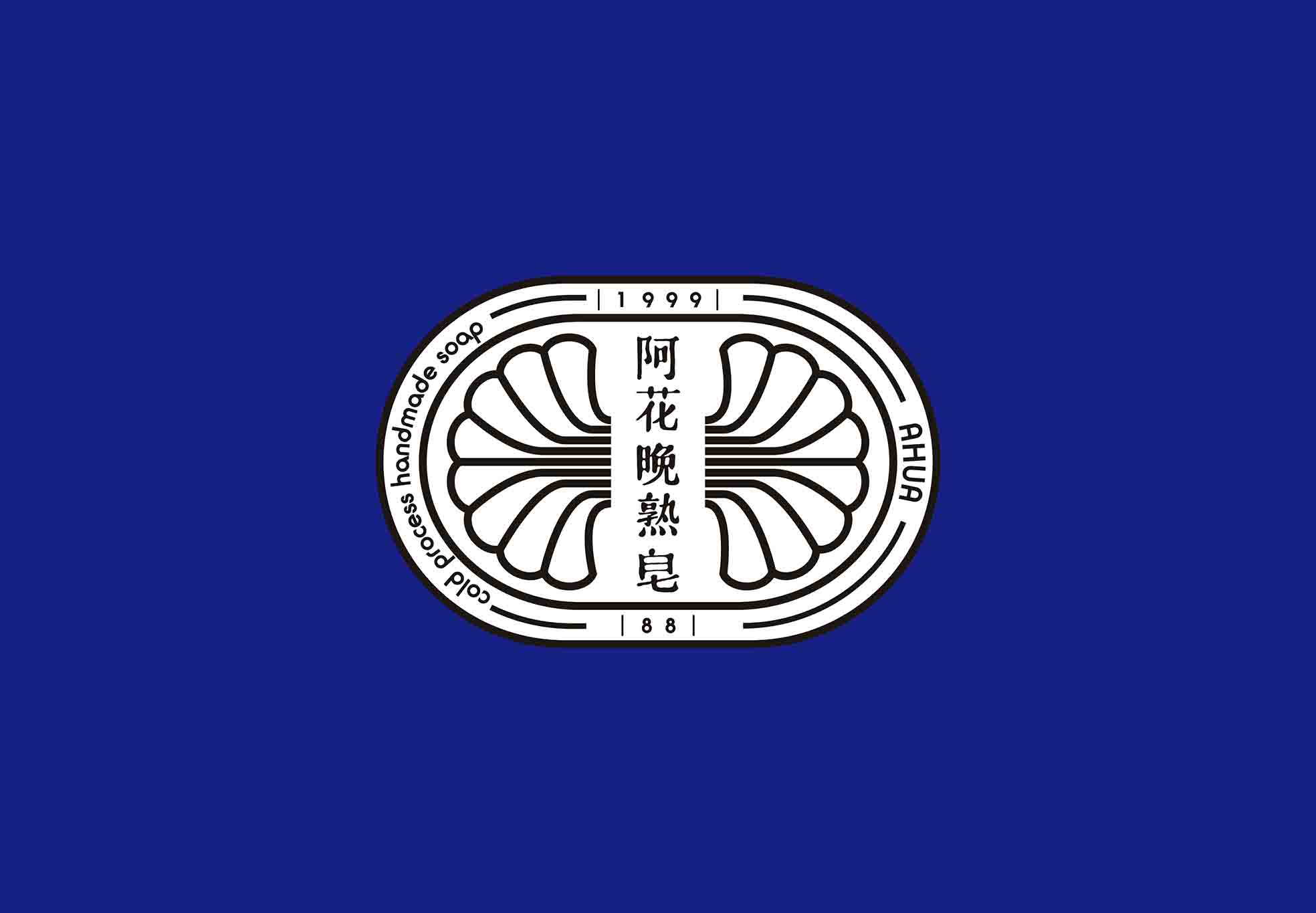
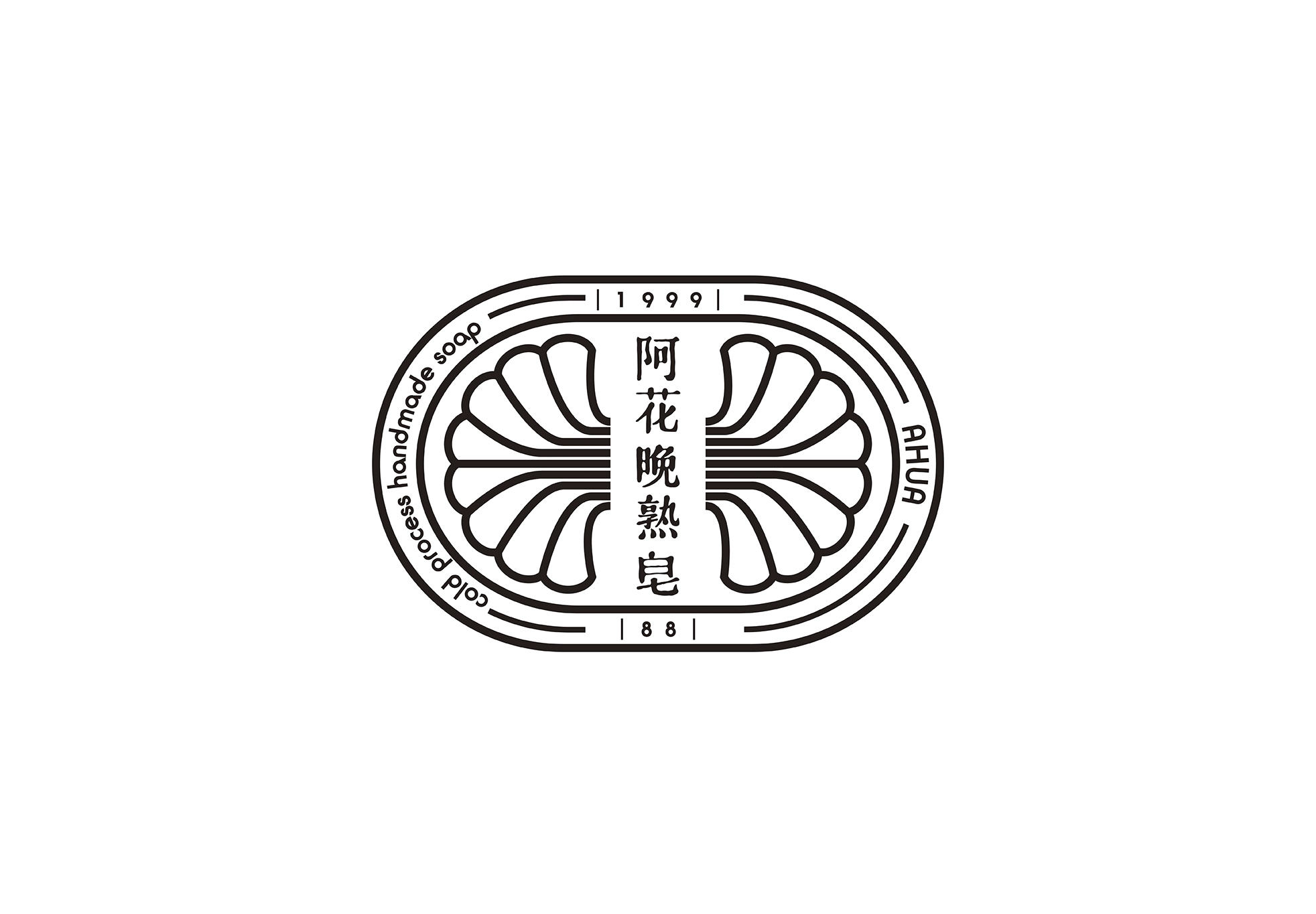
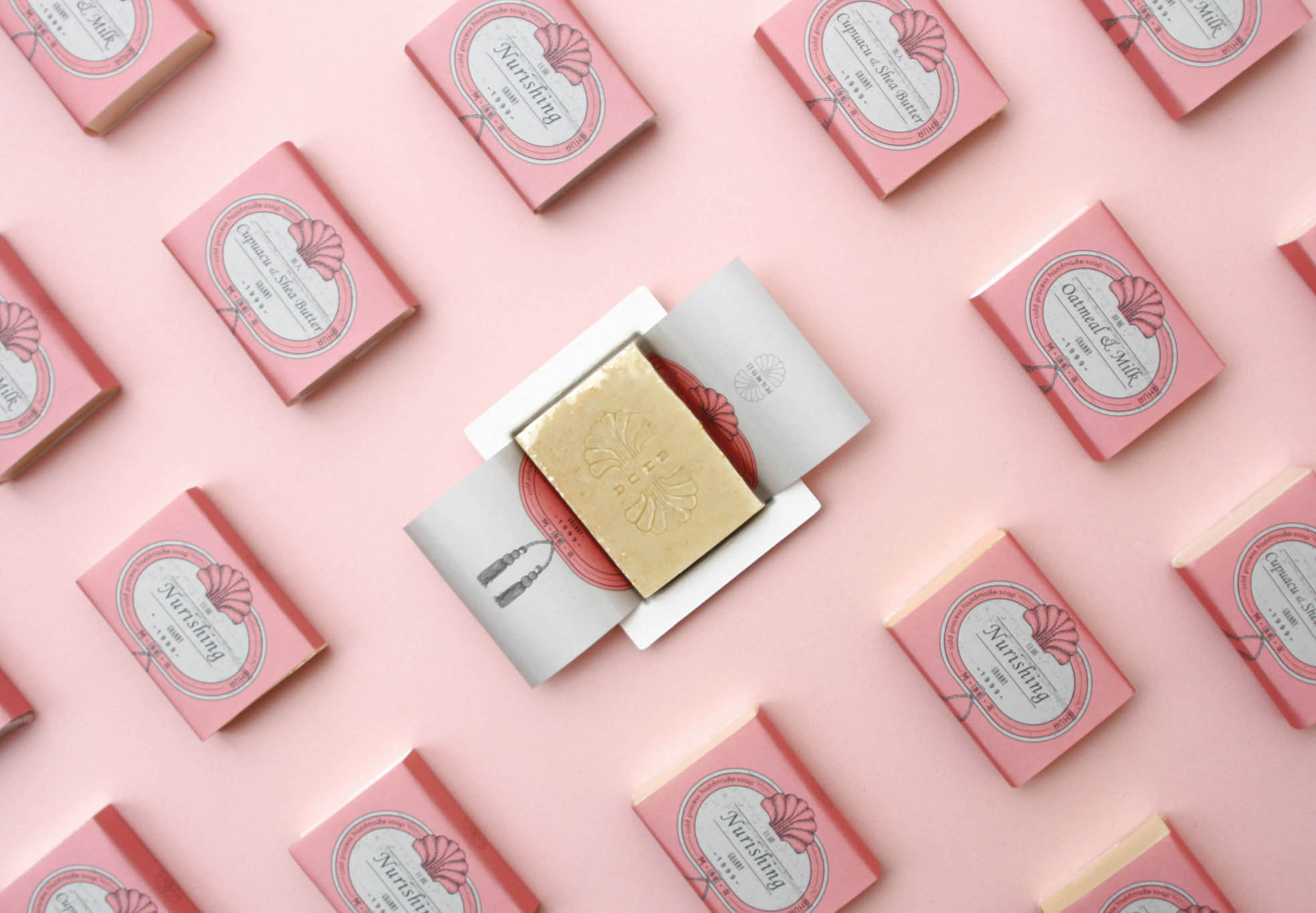
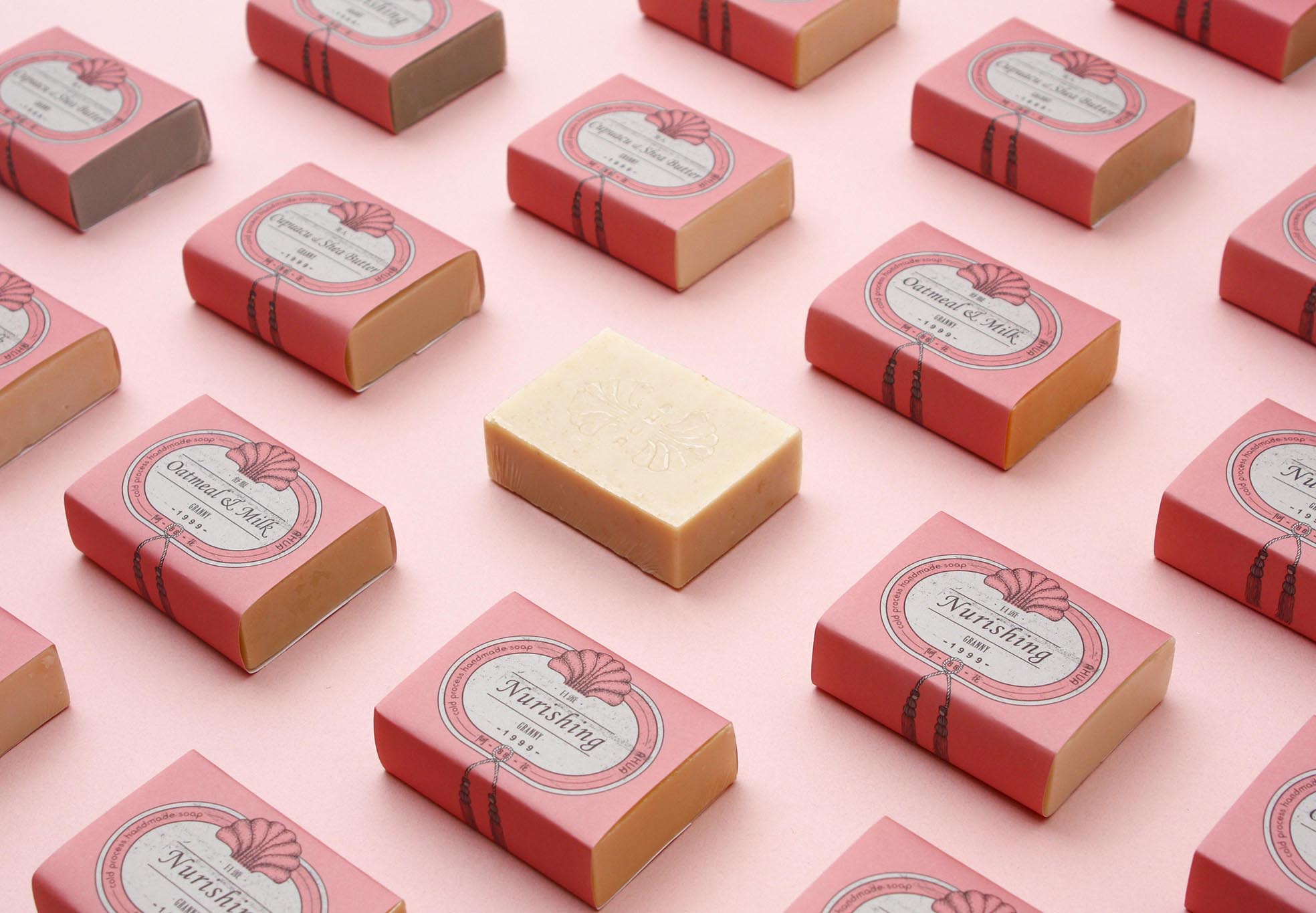
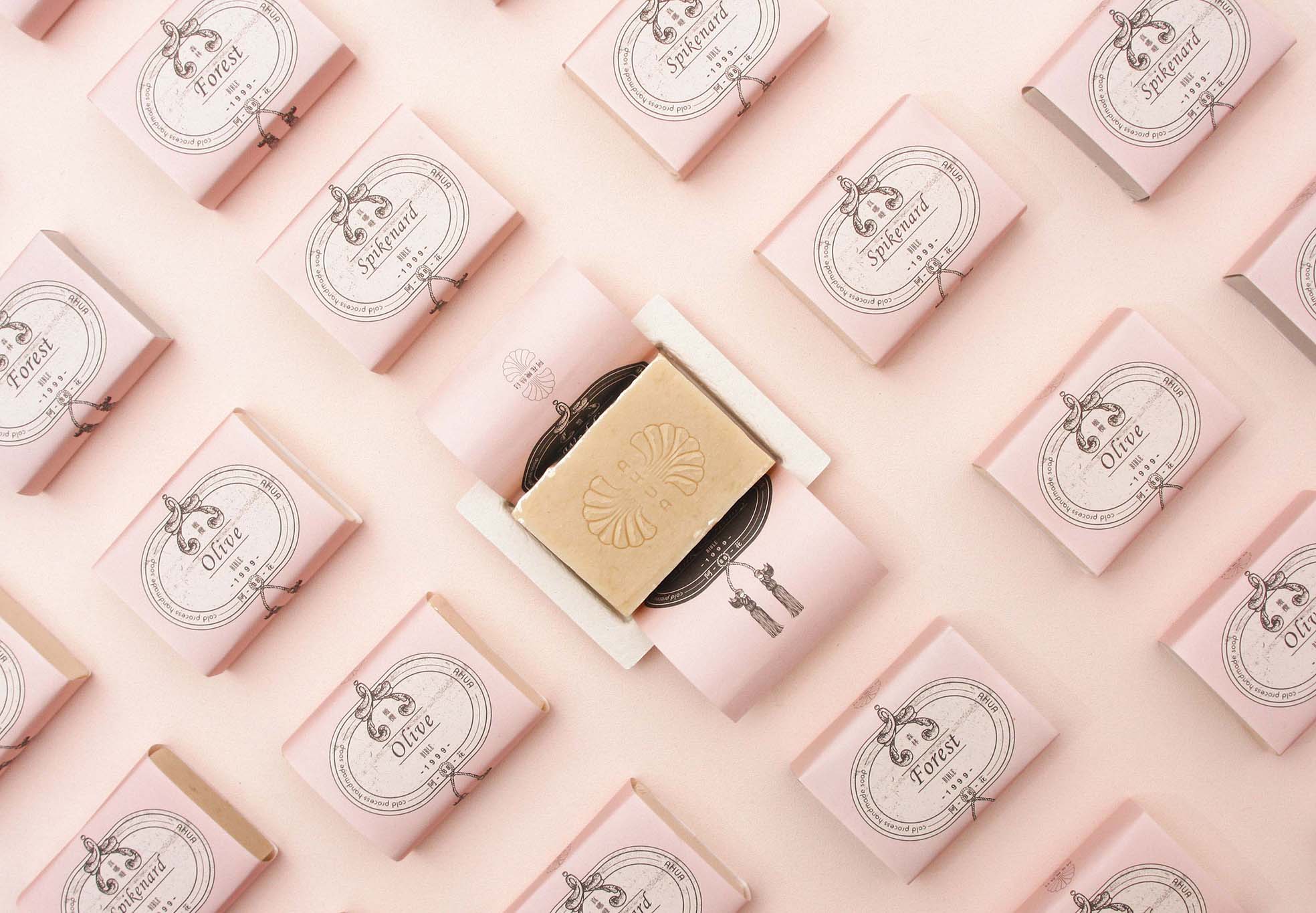
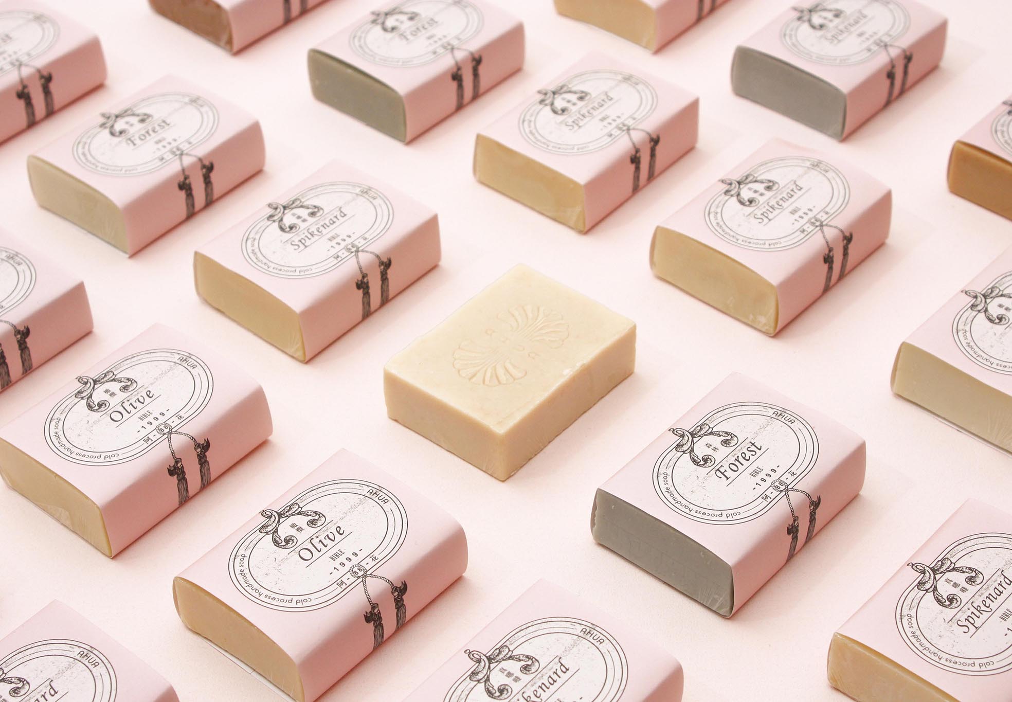
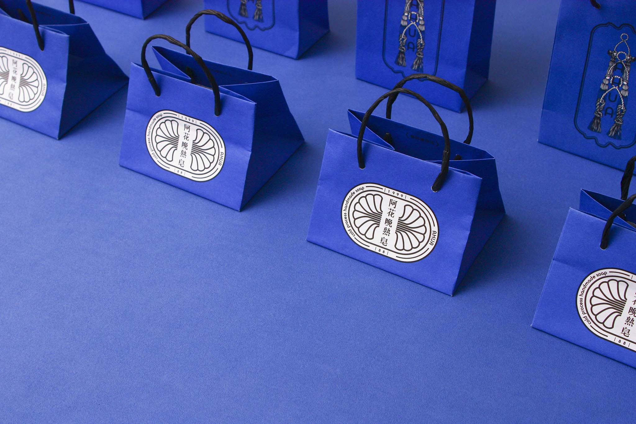
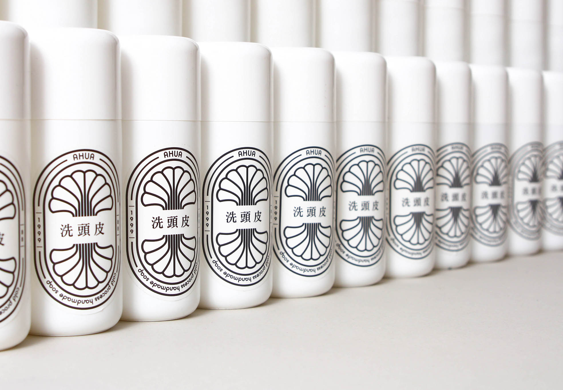
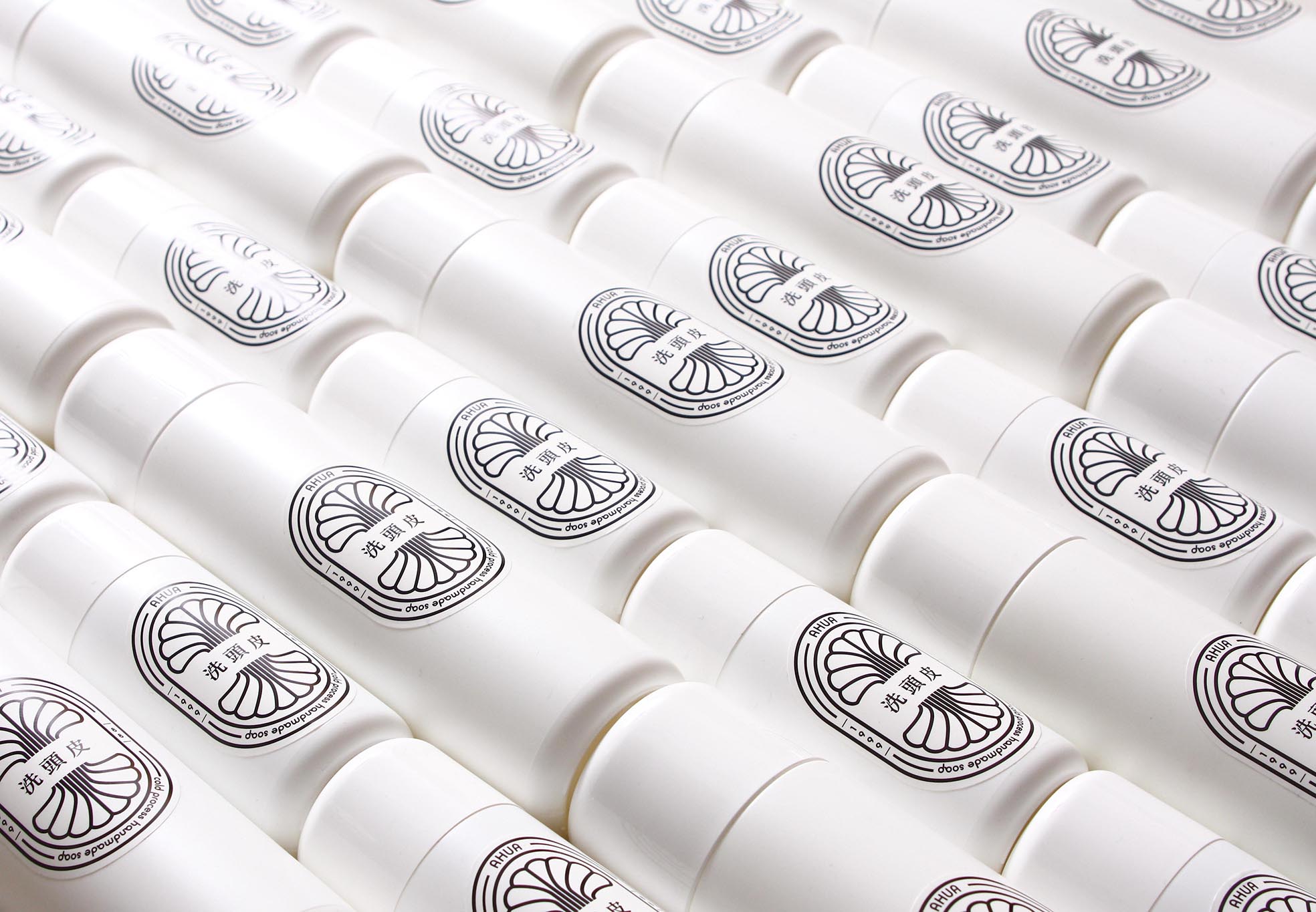
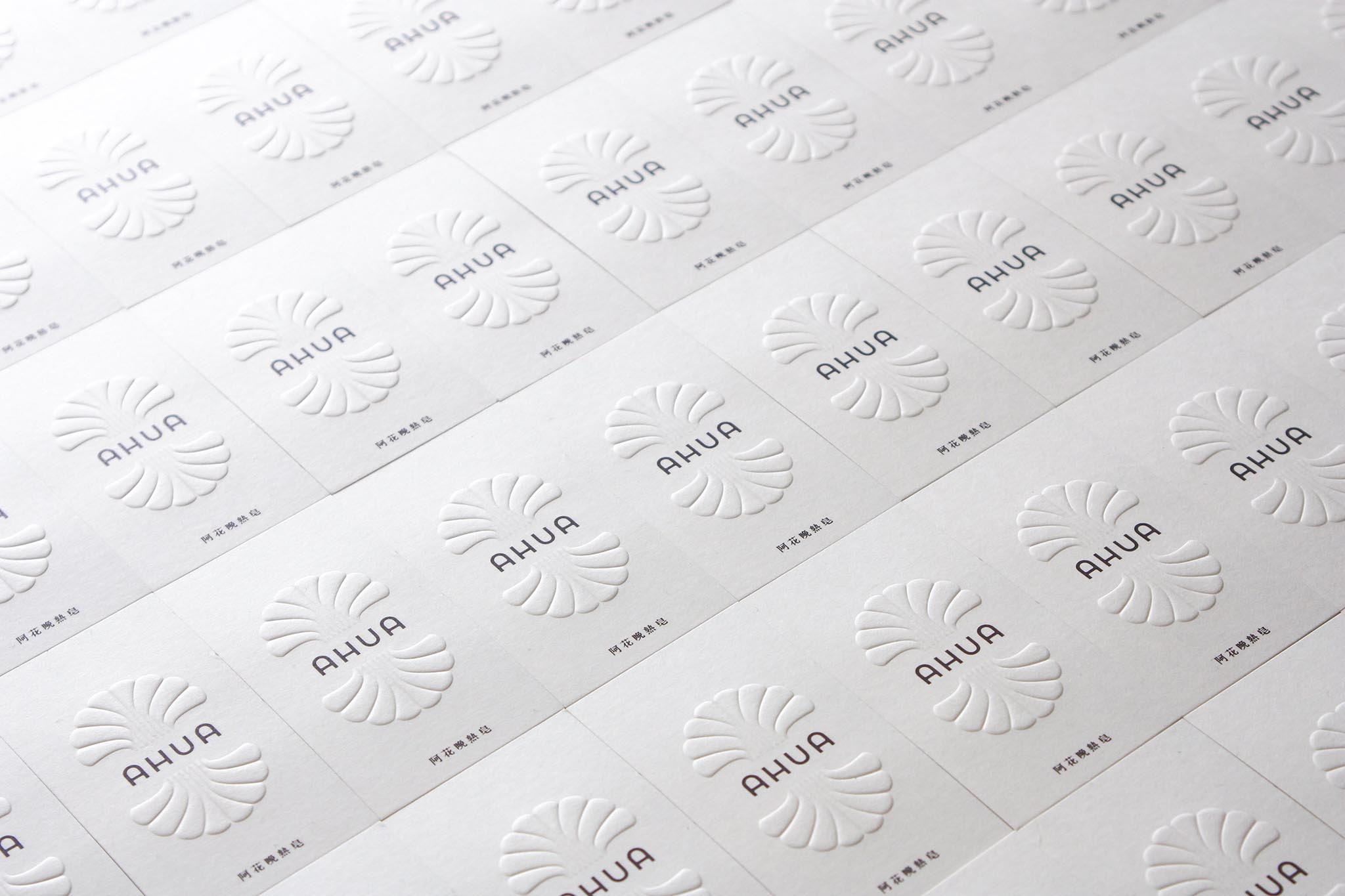
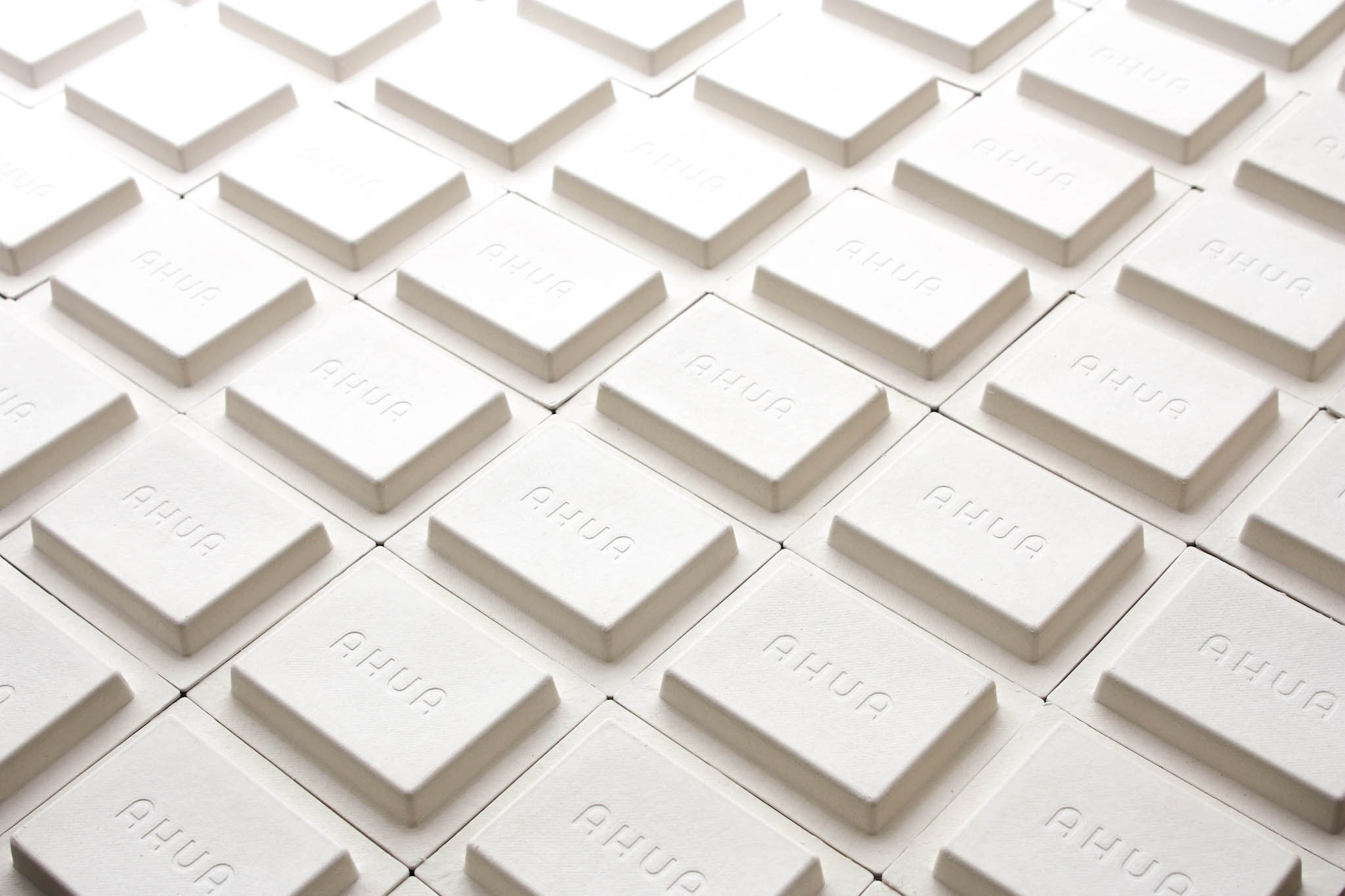
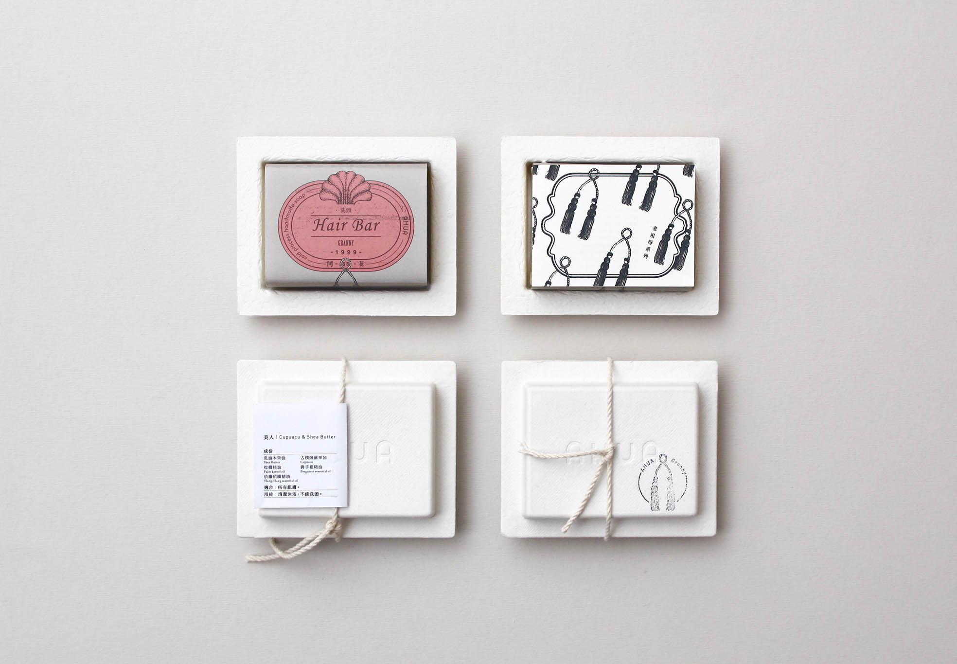
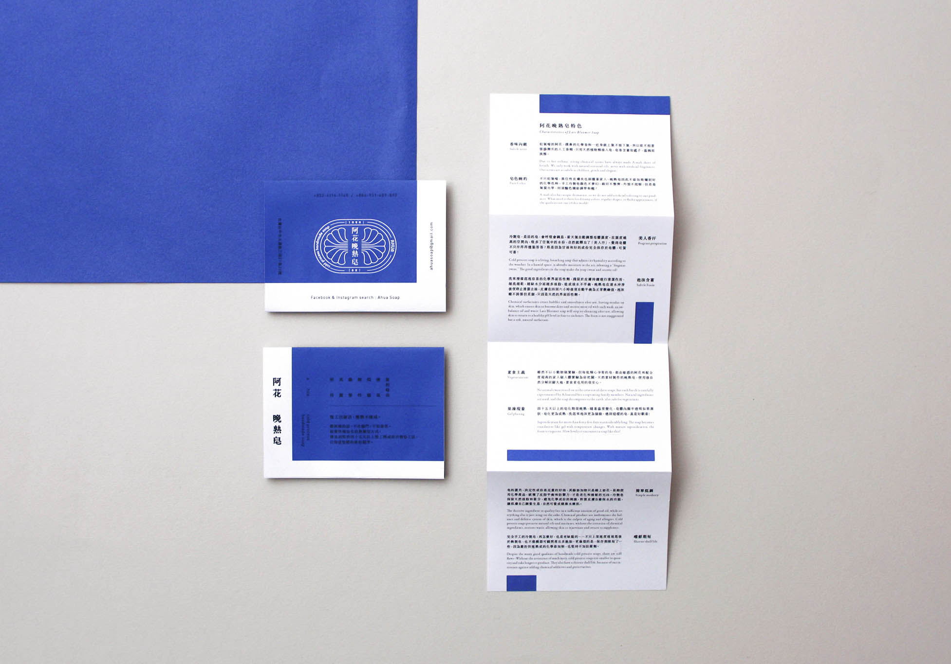
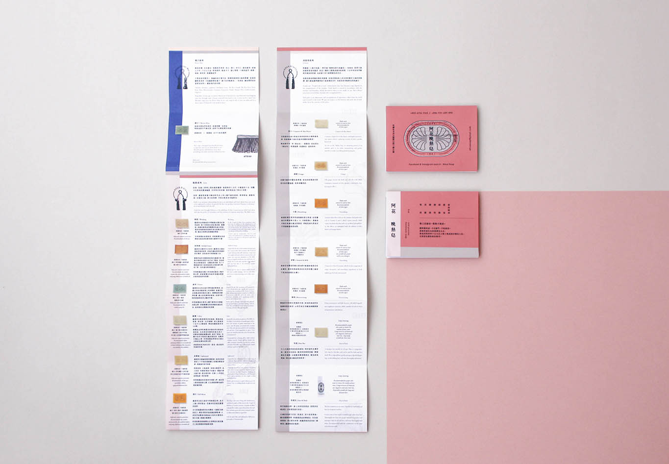
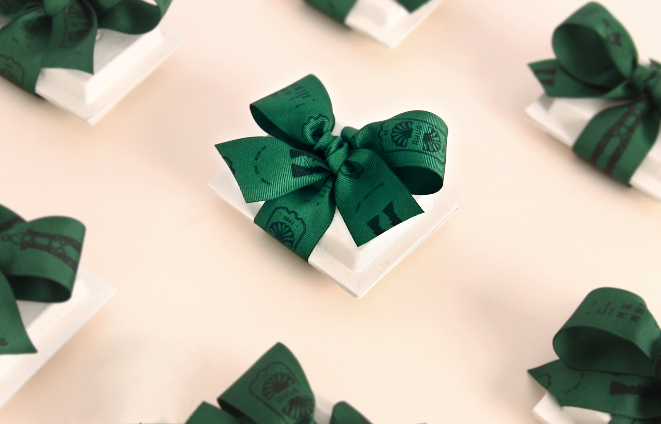
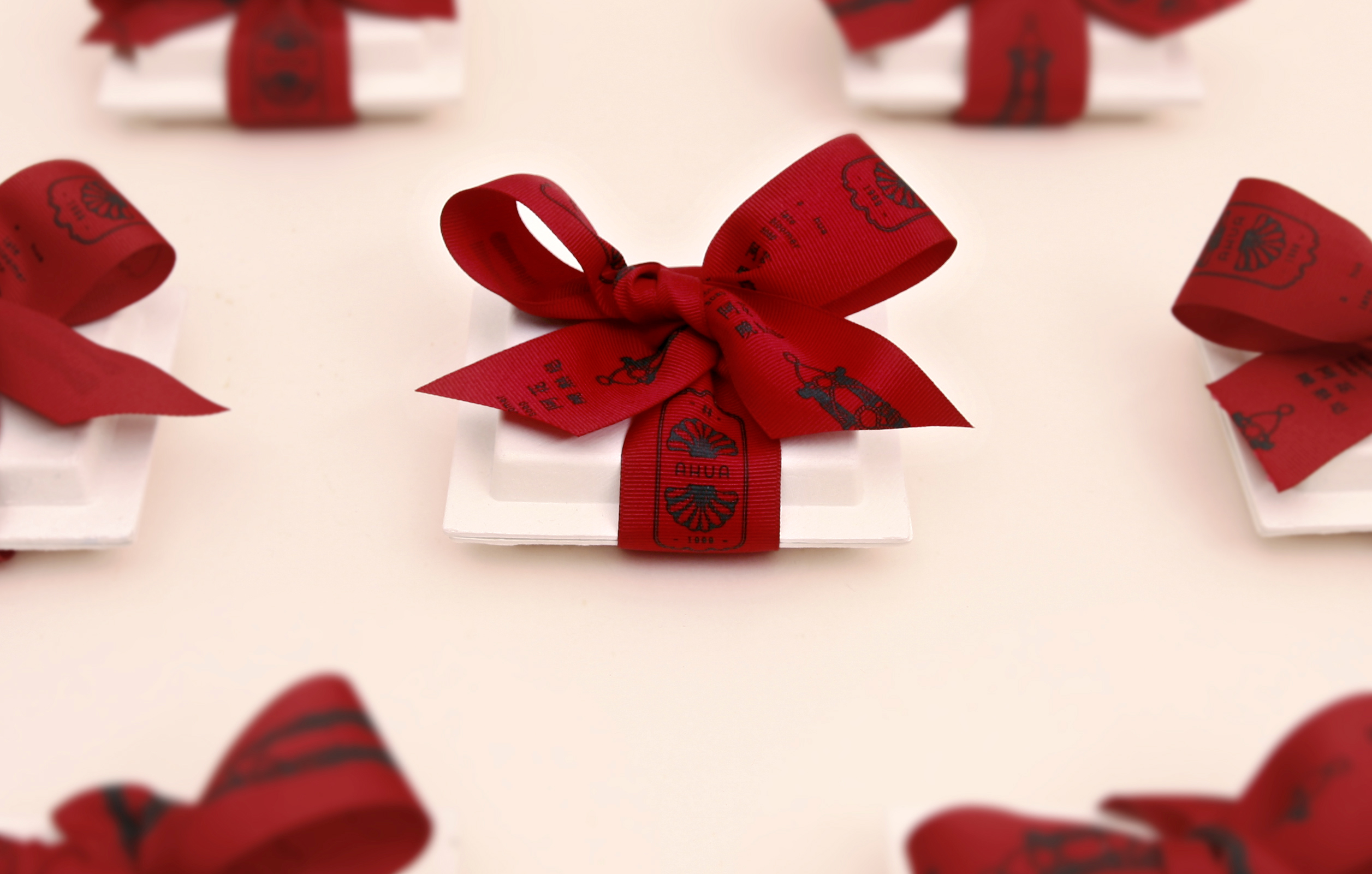
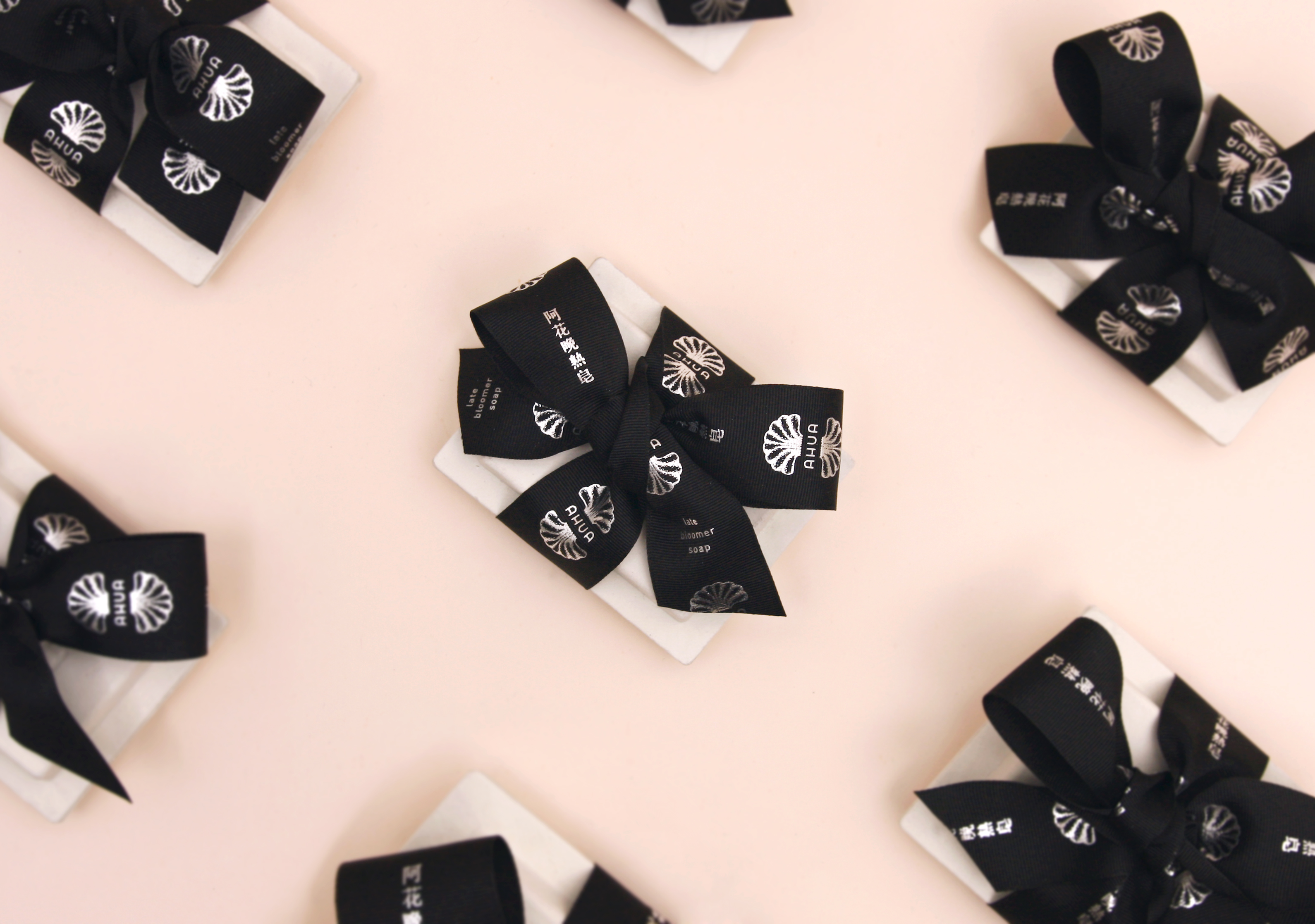
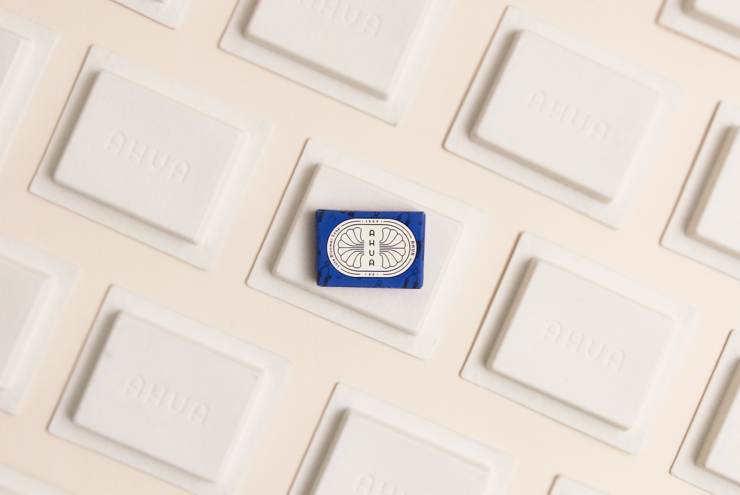
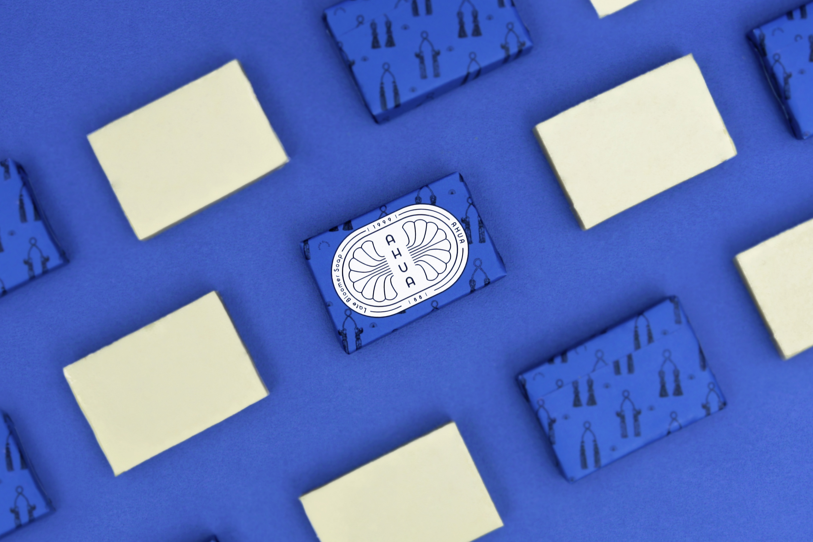
手工皂來自於西方,阿花來自台灣. 阿花是一種態度與個性,一種純樸實在且熱心的精神. 創辦人想念著阿嬤,也傳承著阿嬤精神,取之於自然尊重天地智慧;更向所有堅韌的台灣婦女致敬. 整體視覺以歐式感為主軸,裡面藏著台灣本土的細節; 以台灣早期大家所使用的香皂外型為logo外框,與代表台灣早期的雞冠花所組成.主色系以強烈的靛藍來表現阿嬤無畏且堅毅的性格.包裝盒使用觸感溫潤的紙漿膜,呼應手工皂之天然與其溫潤.
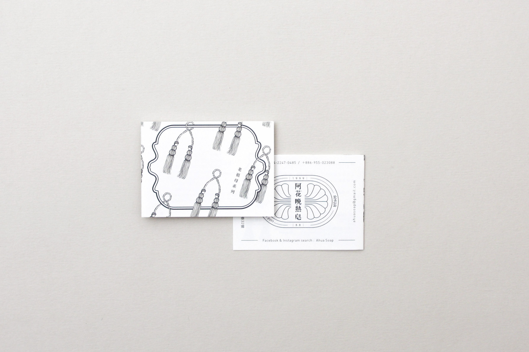
老祖母系列 granny |磚橘紅+老祖母流蘇
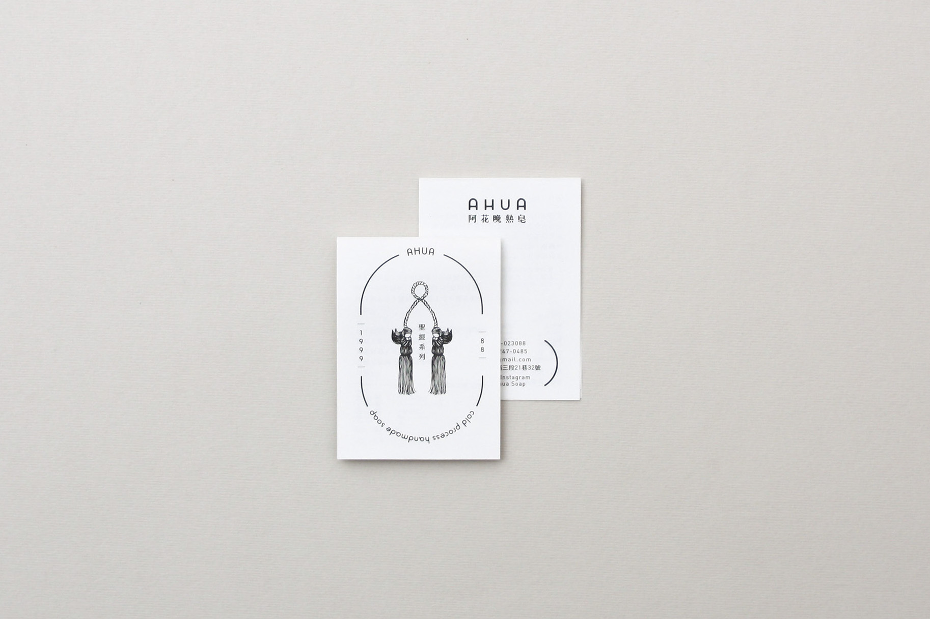
聖經系列 bible |粉紅+天使流蘇
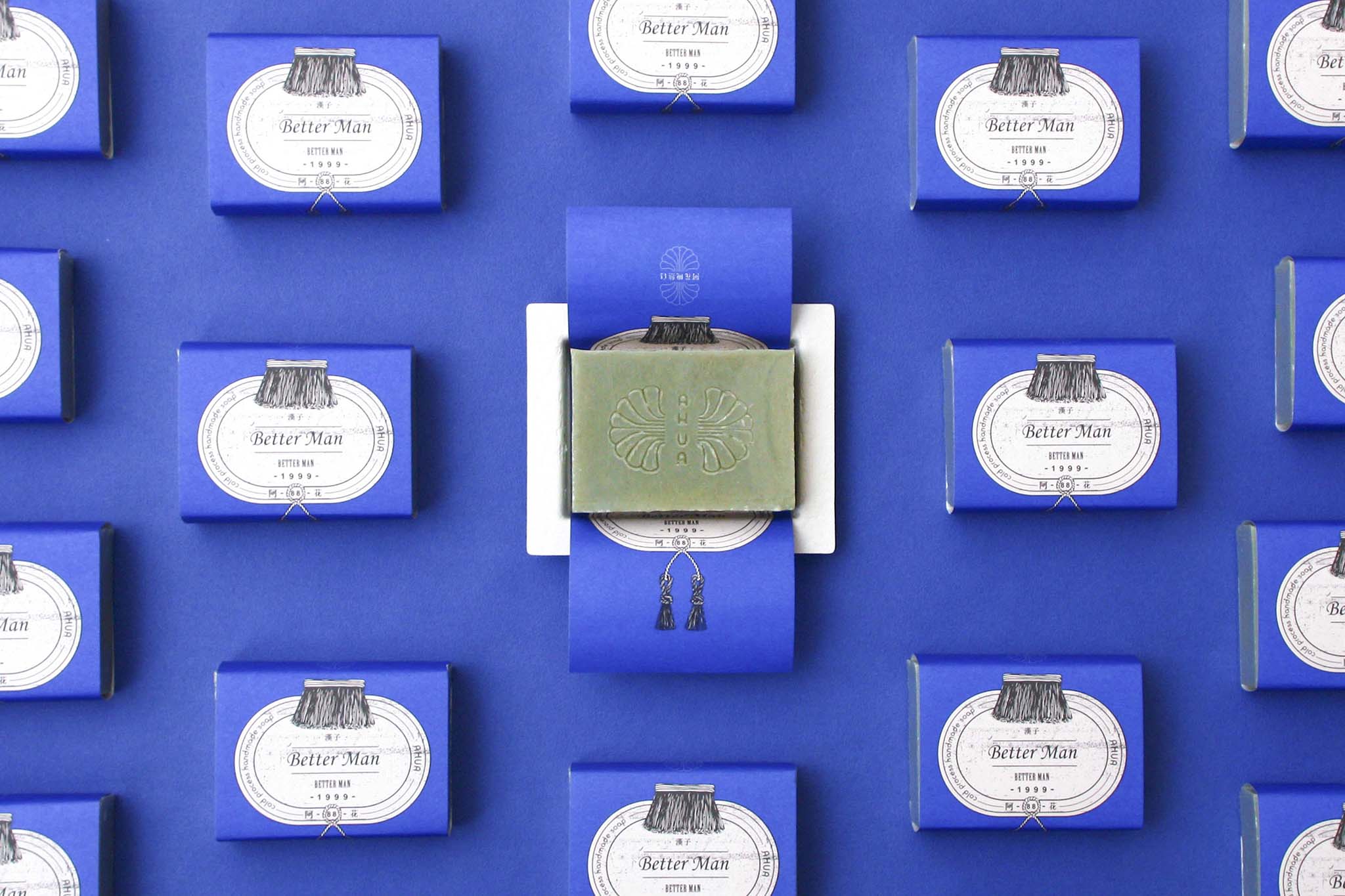
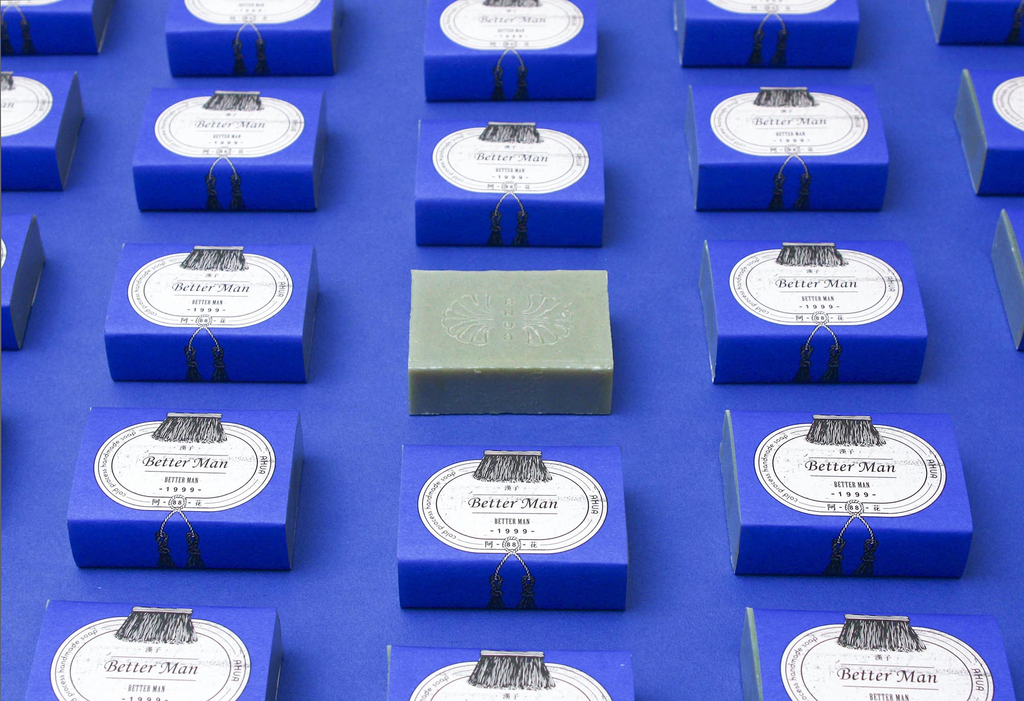
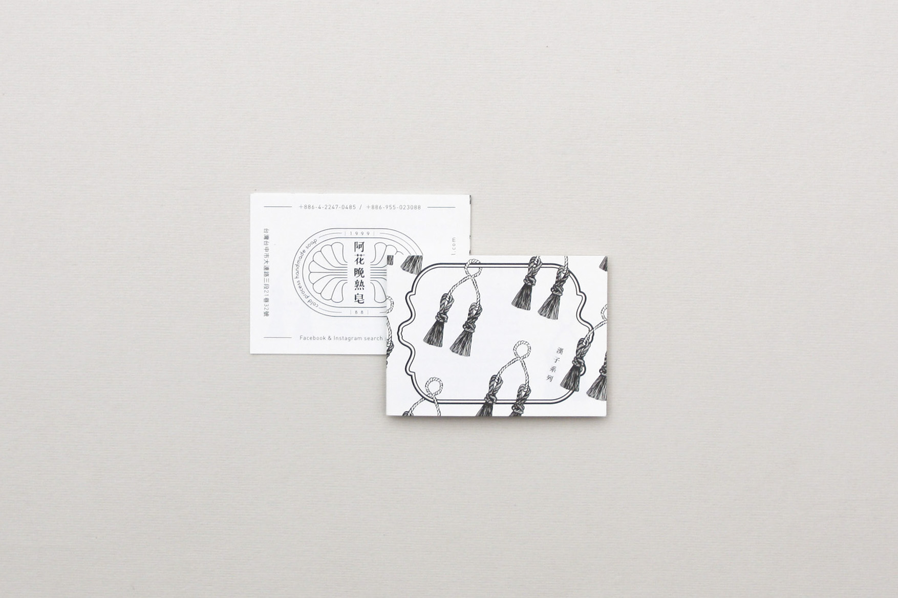
漢子系列 better man|藍+刷子
Cold process handmade soap is from the west, while AHUA is from Taiwan. AHUA is an attitude, a character, it represents the spirit of purity yet full of passion. Inspired by the founder's grandmother (Ama), the brand was founded to pass on her wisdom of respect to the nature. In addition, to tribute to all the strong female figures in Taiwan. The packaging adapted the European style as the main focus of the design, with details of the local touch, that is, the shape of the soap from the early days as the frame of the logo, paired with the cockscomb flowers which previously represented Taiwan. In the series, the sharp blue color is specially used to reflect the fearless and strong personality of Ama. Paper pulp was chosen as the packaging material to match with this handmade soap with natural materials.
Series:
Granny - brick red with grandma tassels
Bible - pink with angel tassels
Better man - blue with brush
老祖母系列 granny |磚橘紅+老祖母流蘇
聖經系列 bible |粉紅+天使流蘇
漢子系列 better man|藍+刷子
Cold process handmade soap is from the west, while AHUA is from Taiwan. AHUA is an attitude, a character, it represents the spirit of purity yet full of passion. Inspired by the founder's grandmother (Ama), the brand was founded to pass on her wisdom of respect to the nature. In addition, to tribute to all the strong female figures in Taiwan. The packaging adapted the European style as the main focus of the design, with details of the local touch, that is, the shape of the soap from the early days as the frame of the logo, paired with the cockscomb flowers which previously represented Taiwan. In the series, the sharp blue color is specially used to reflect the fearless and strong personality of Ama. Paper pulp was chosen as the packaging material to match with this handmade soap with natural materials.
Series:
Granny - brick red with grandma tassels
Bible - pink with angel tassels
Better man - blue with brush