
中僑參茸
Chong Kio Farmacia Chinesa co.
branding, rebranding, package design, graphic design, culture
2014 - 2015
Art Director
余岱官 Kuan
Designer
余岱官 Kuan(品牌視覺、核心規劃)
汪平
Photography
白偉奇
Chong Kio Farmacia Chinesa co.
branding, rebranding, package design, graphic design, culture
2014 - 2015
Art Director
余岱官 Kuan
Designer
余岱官 Kuan(品牌視覺、核心規劃)
汪平
Photography
白偉奇
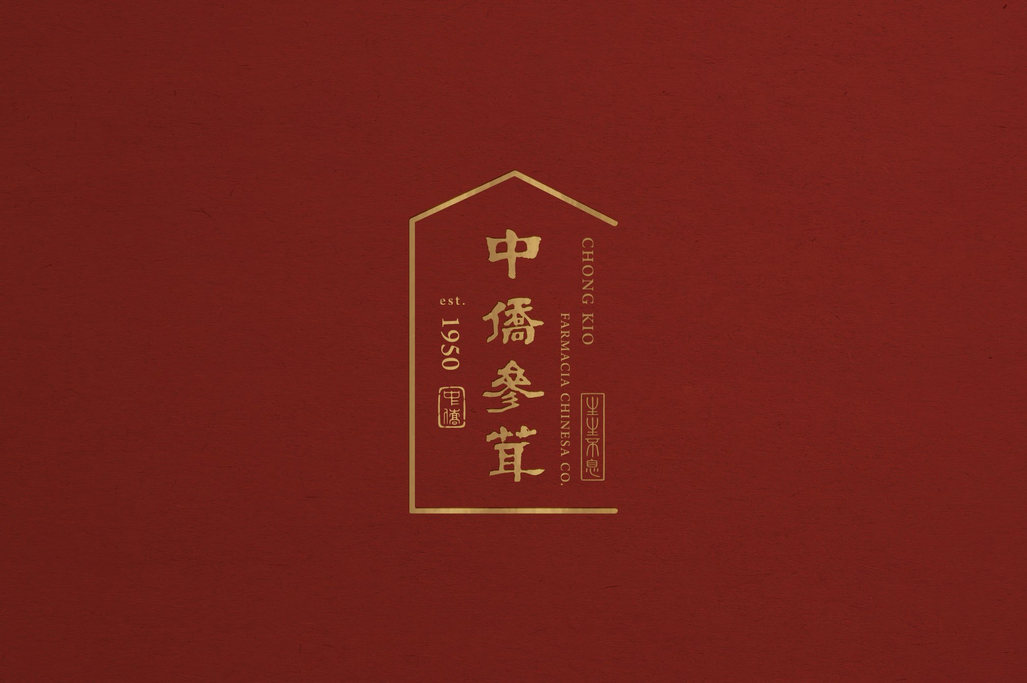
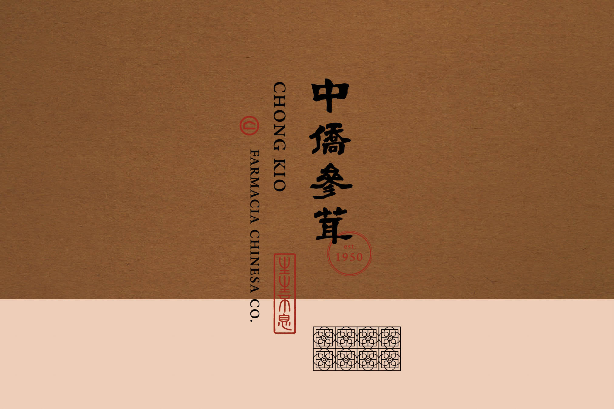
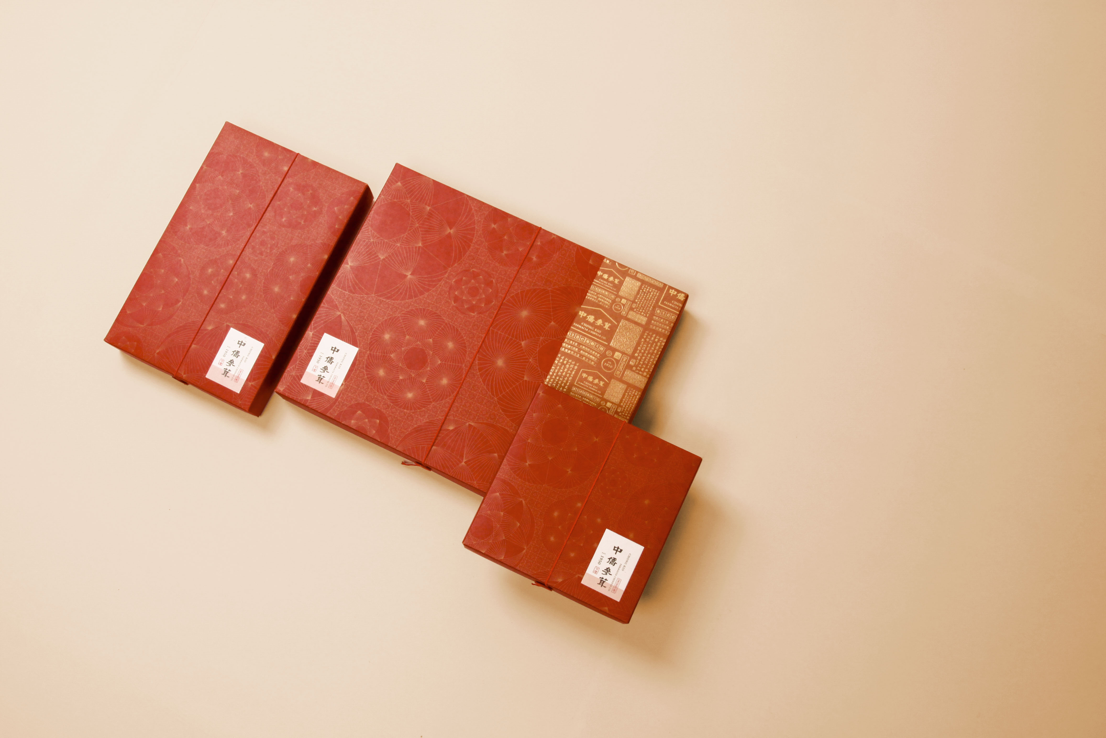
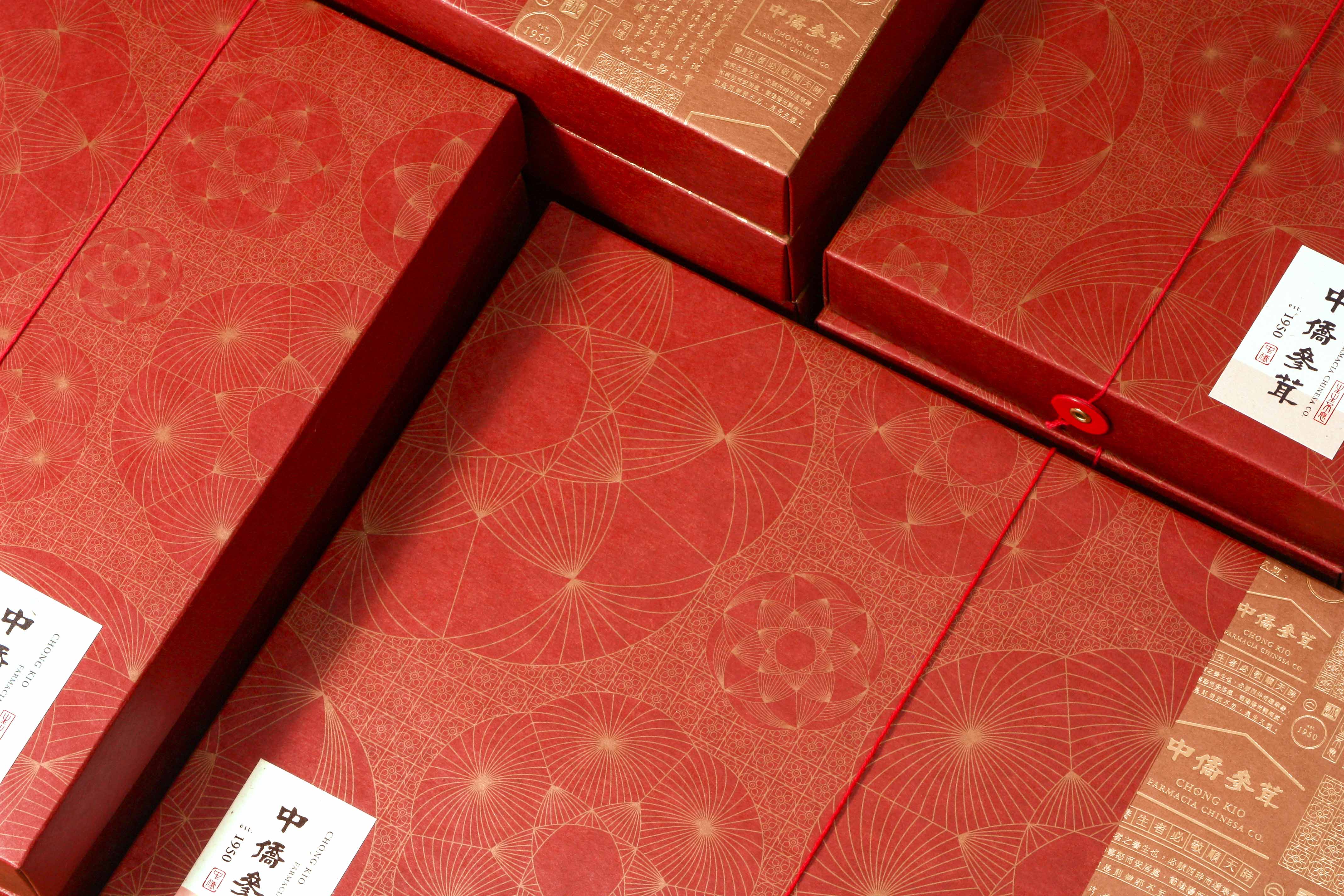
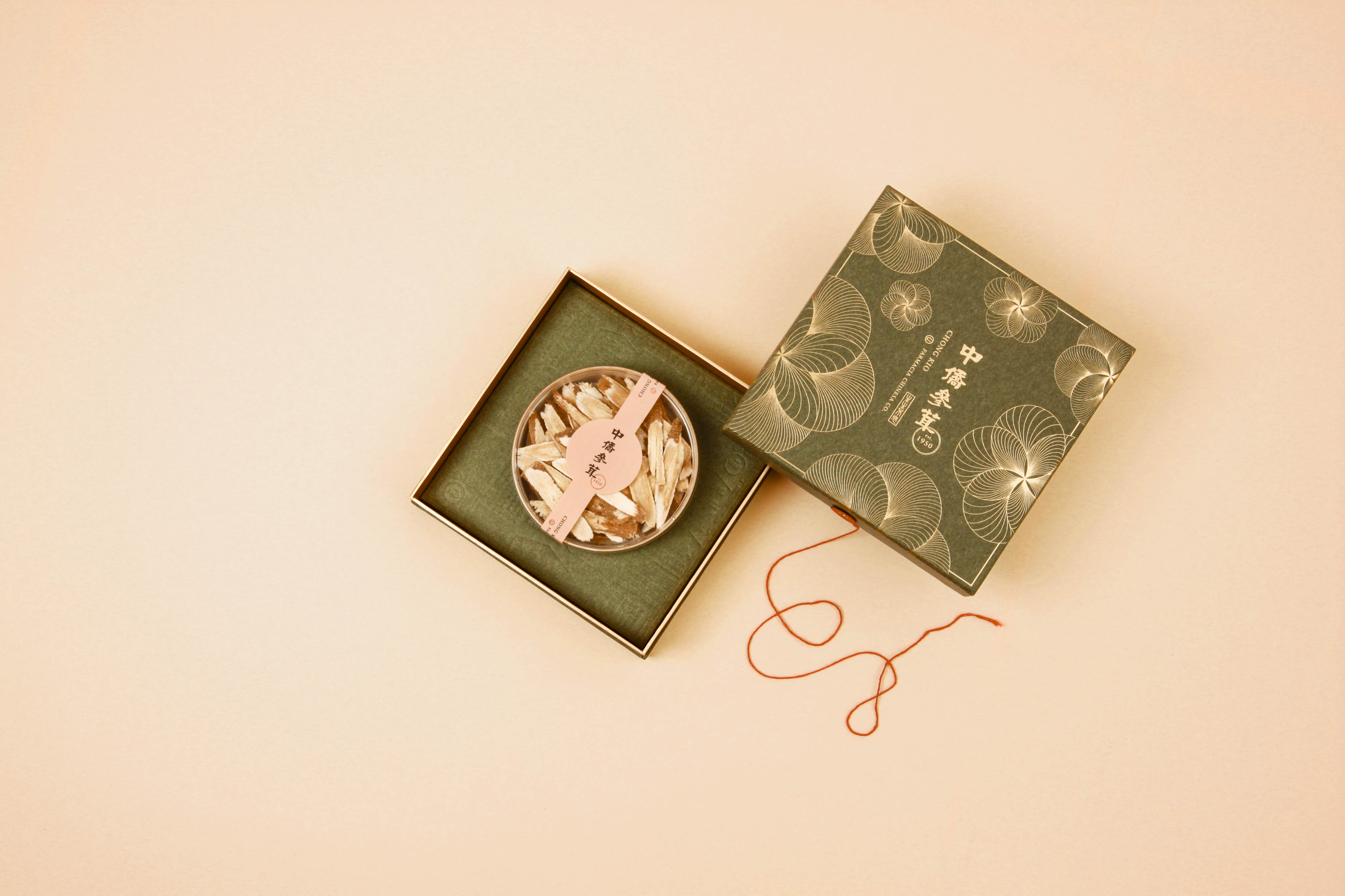
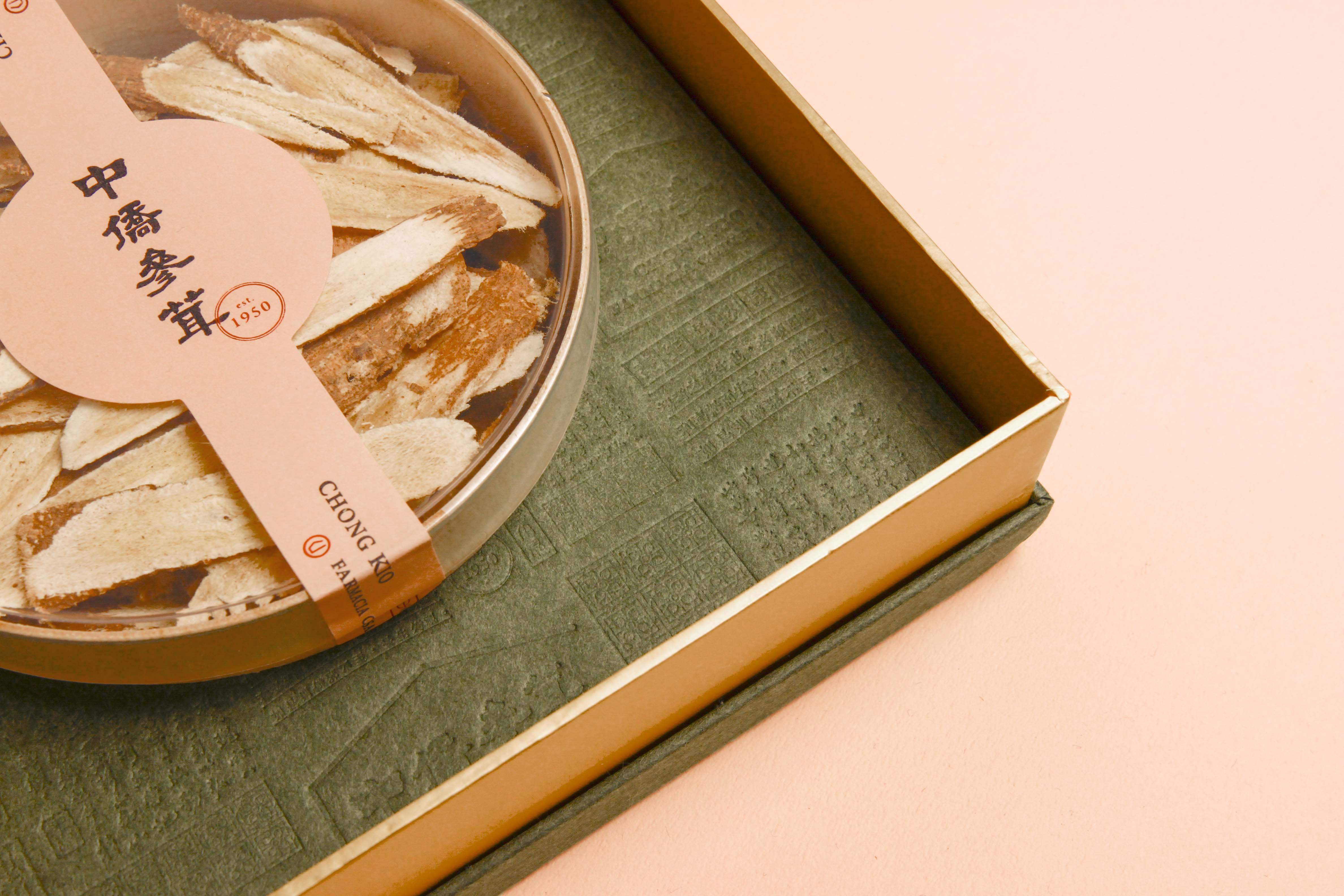
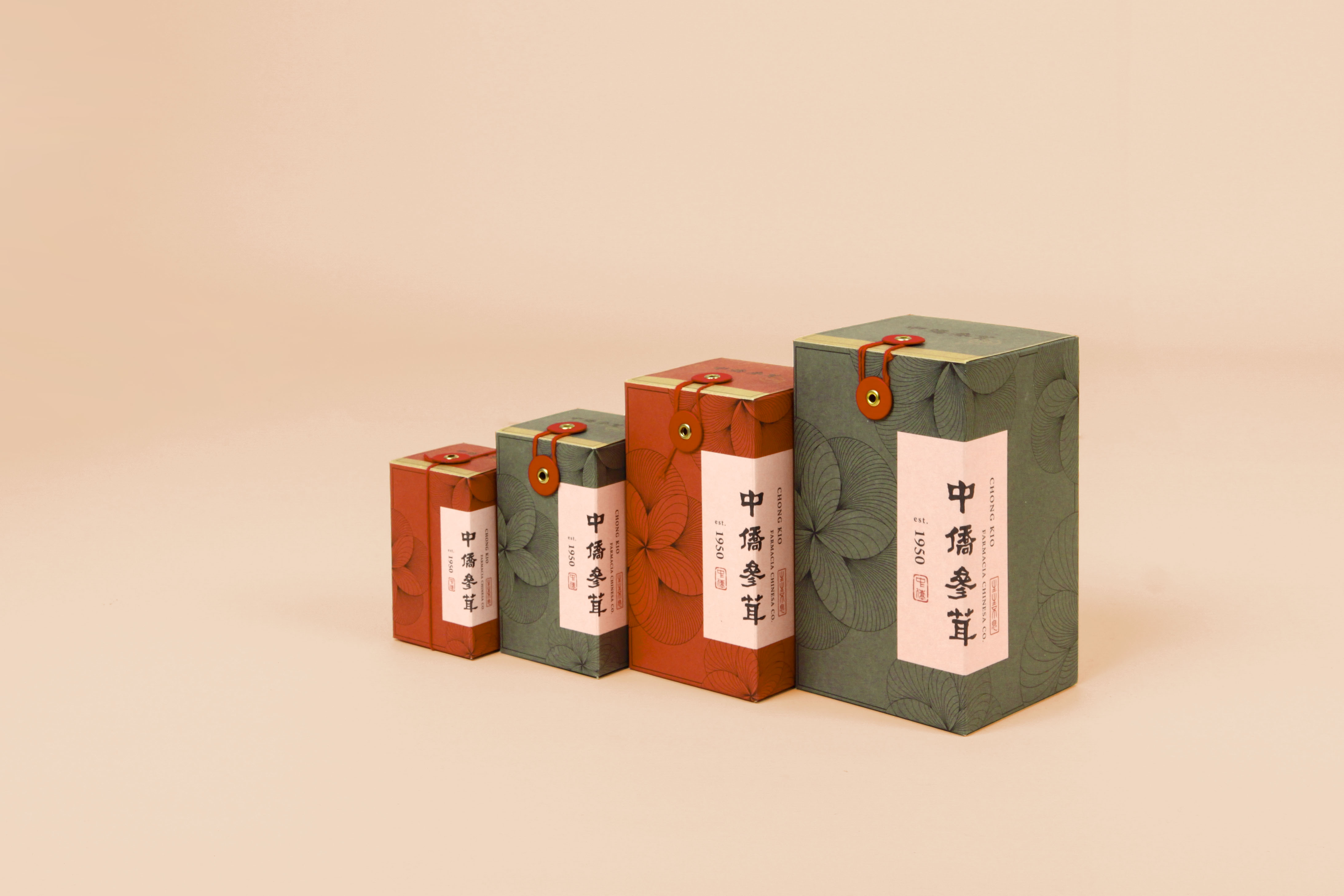
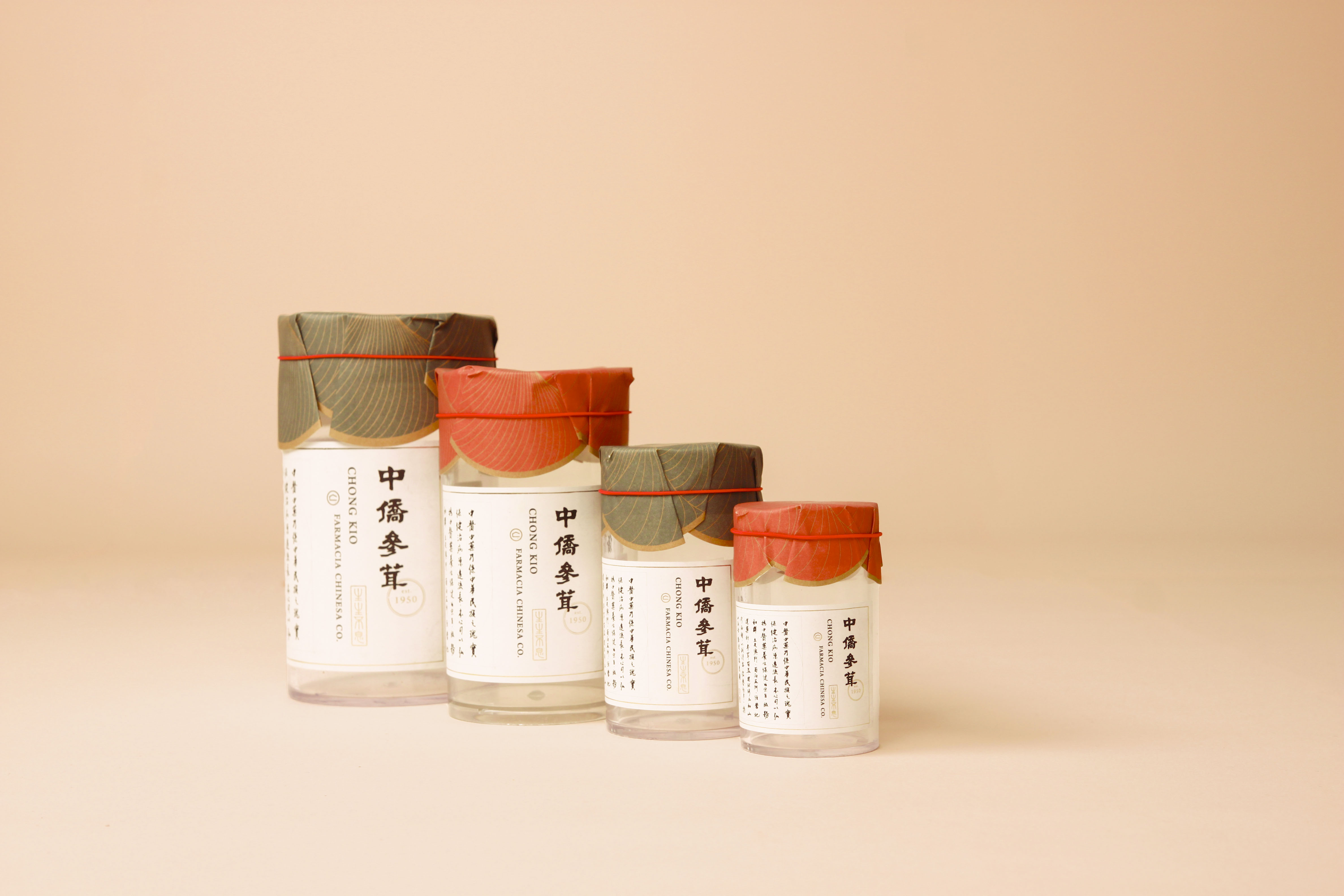
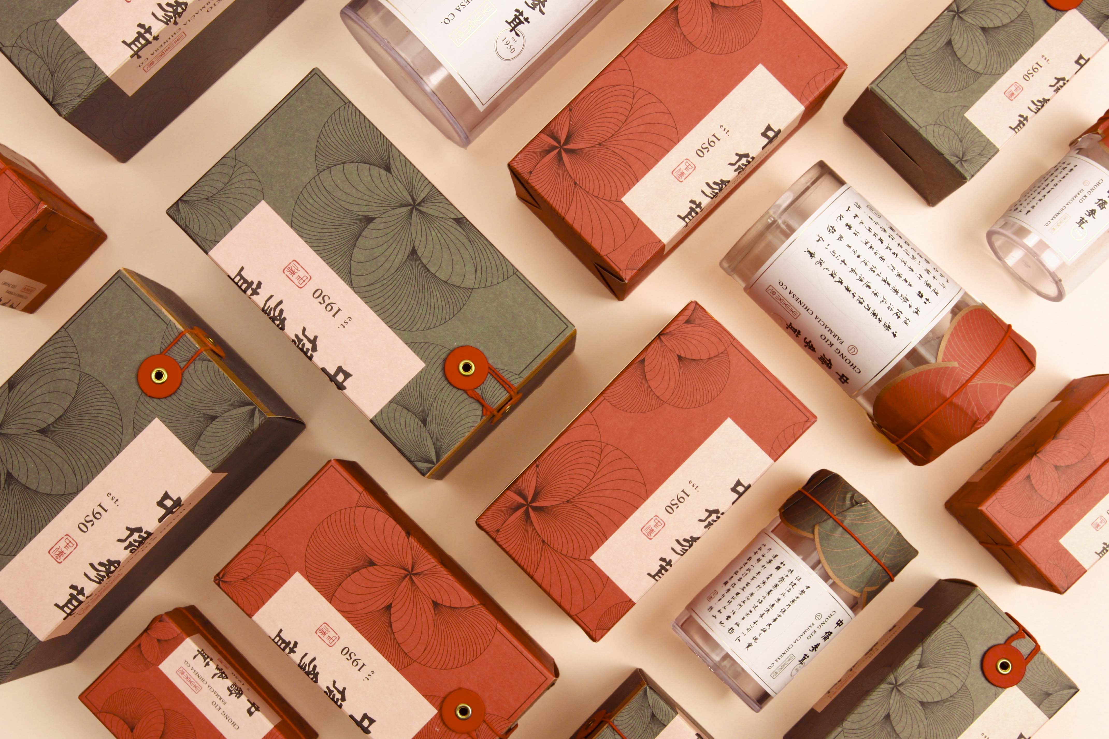
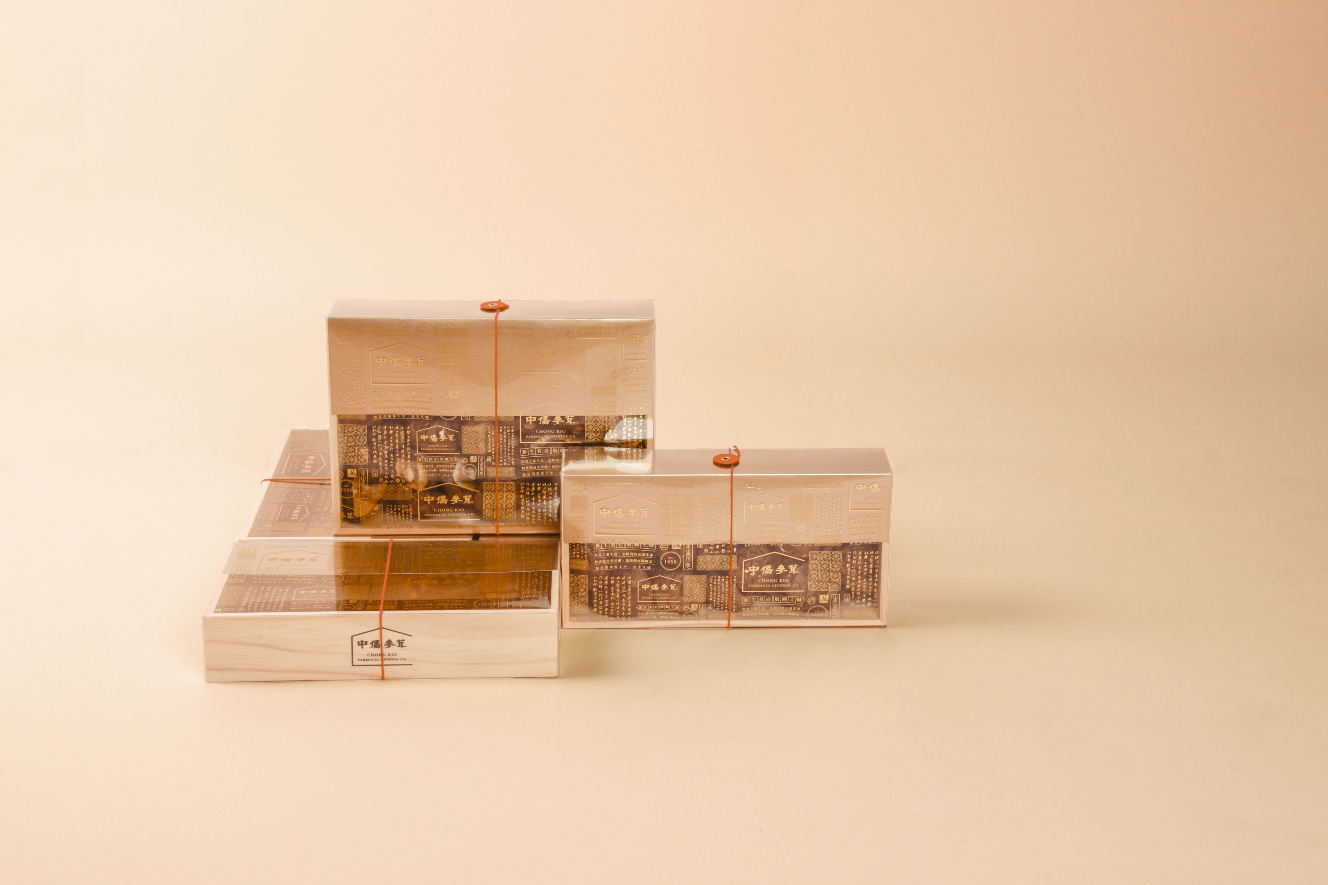
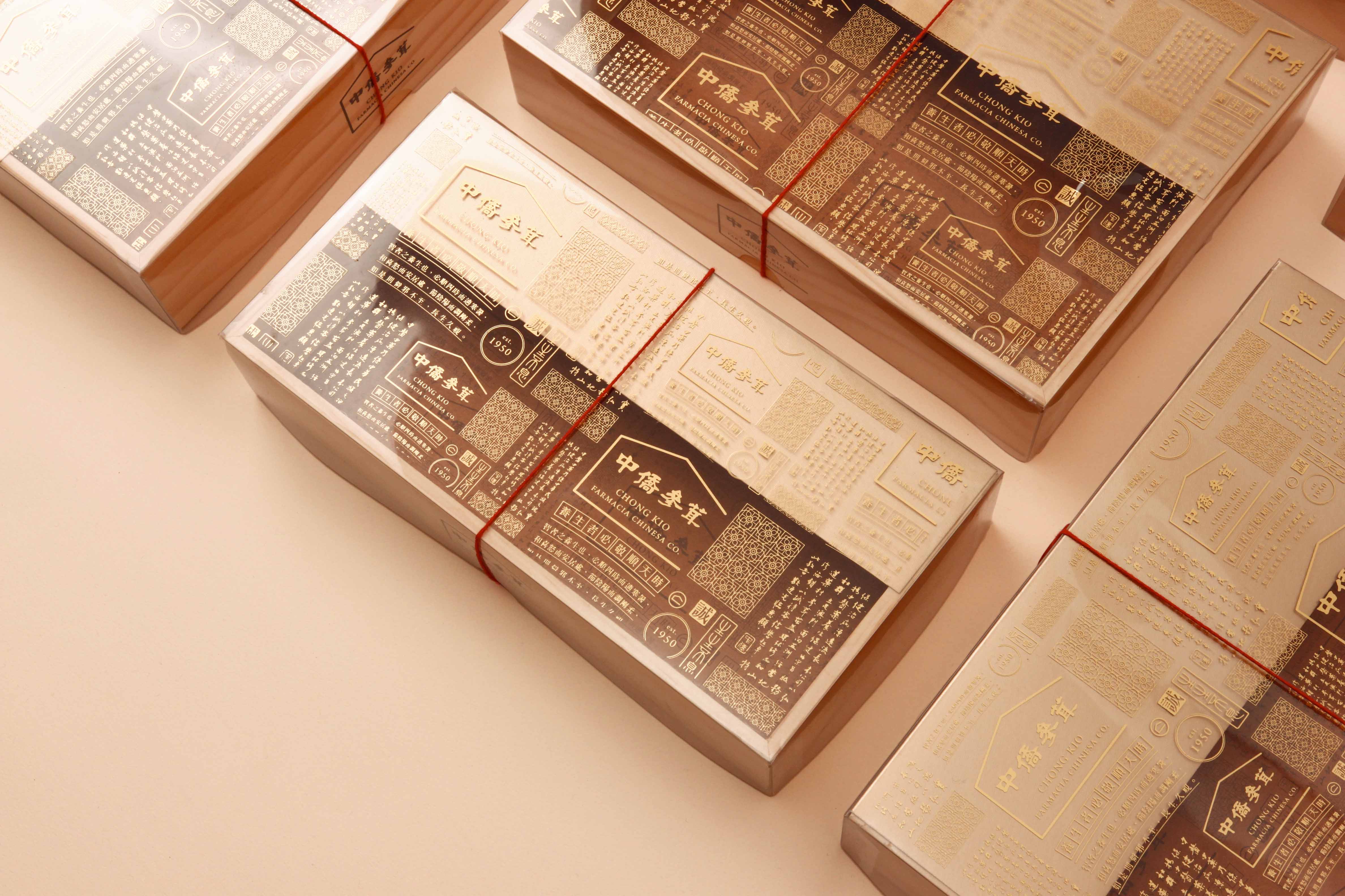
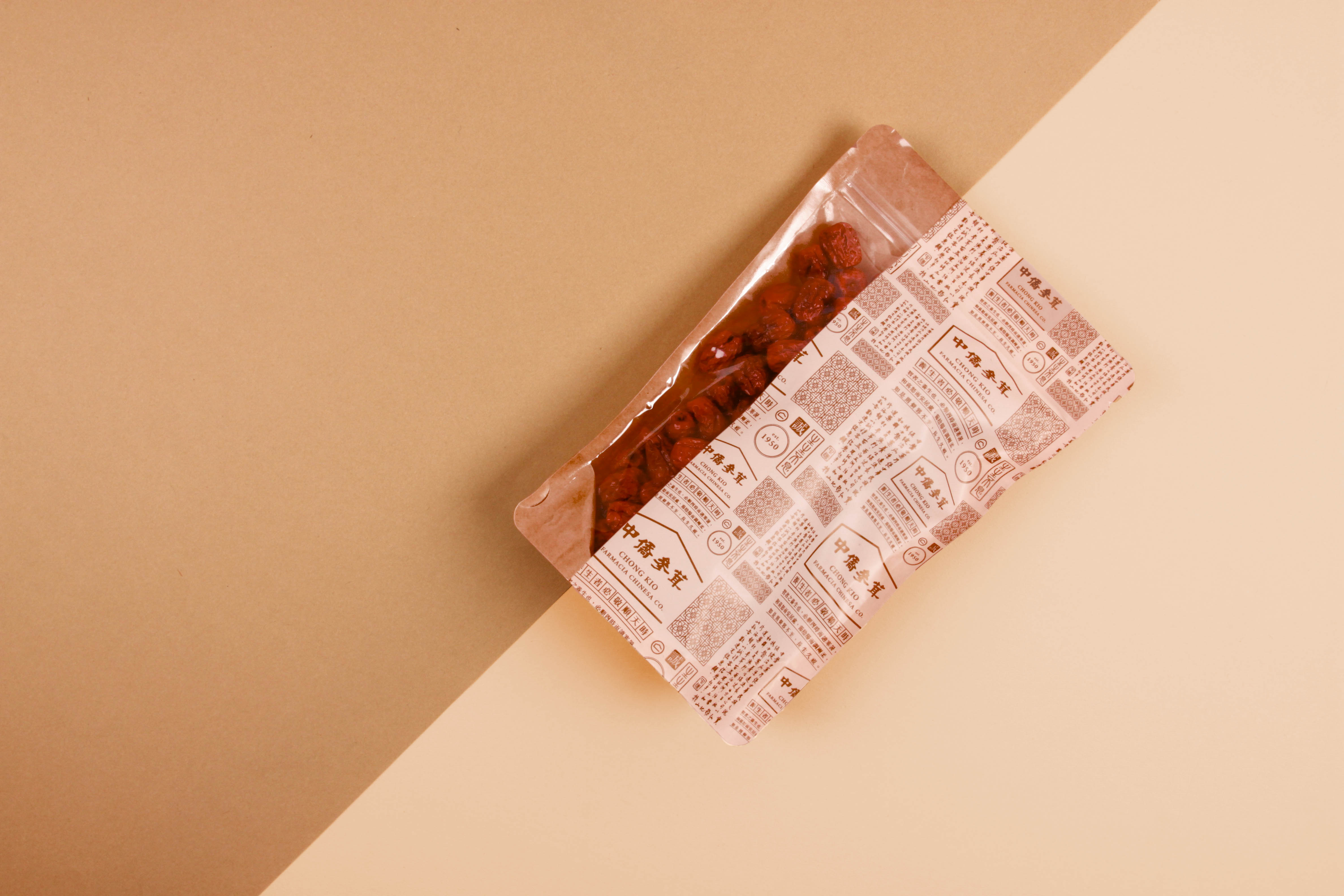
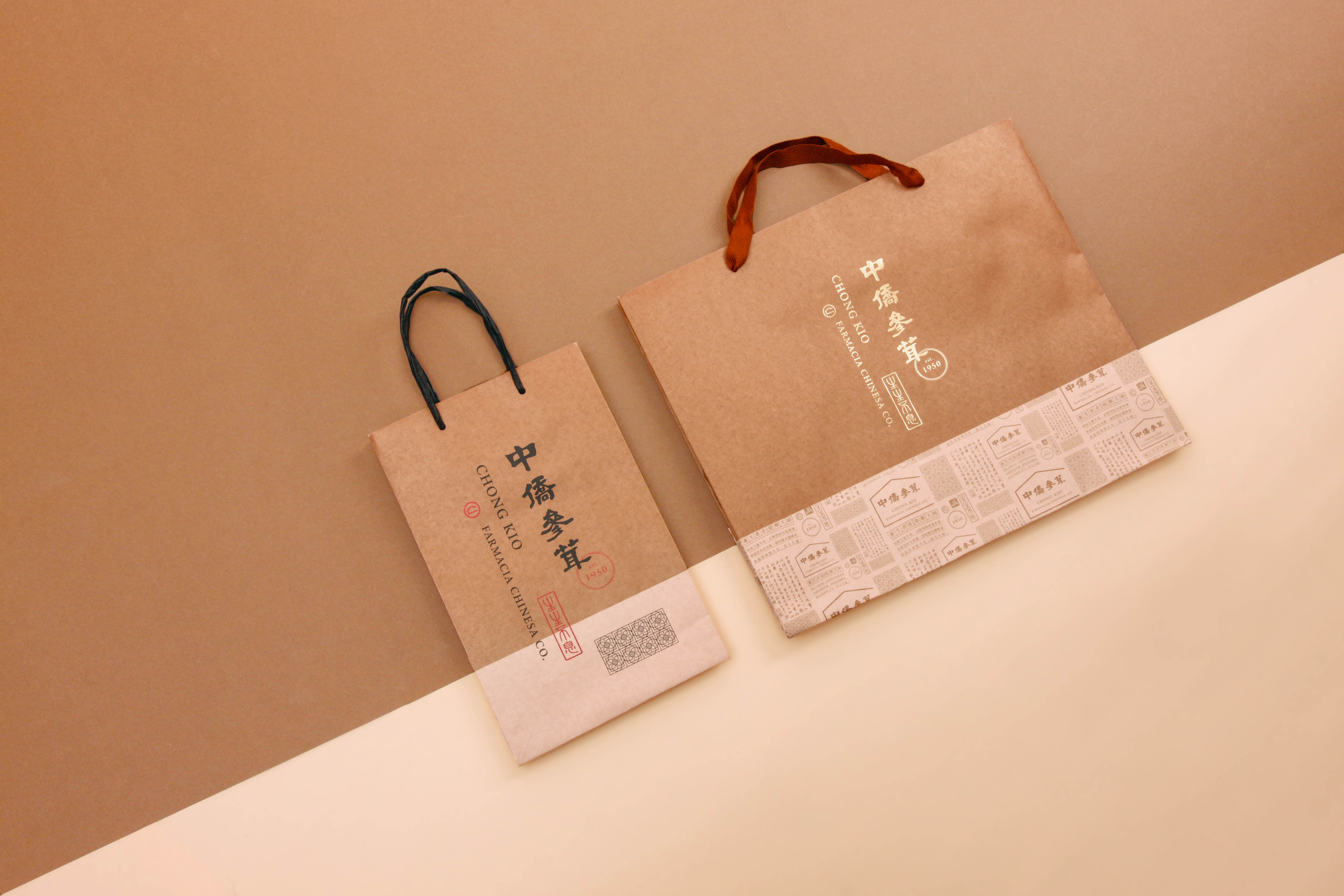
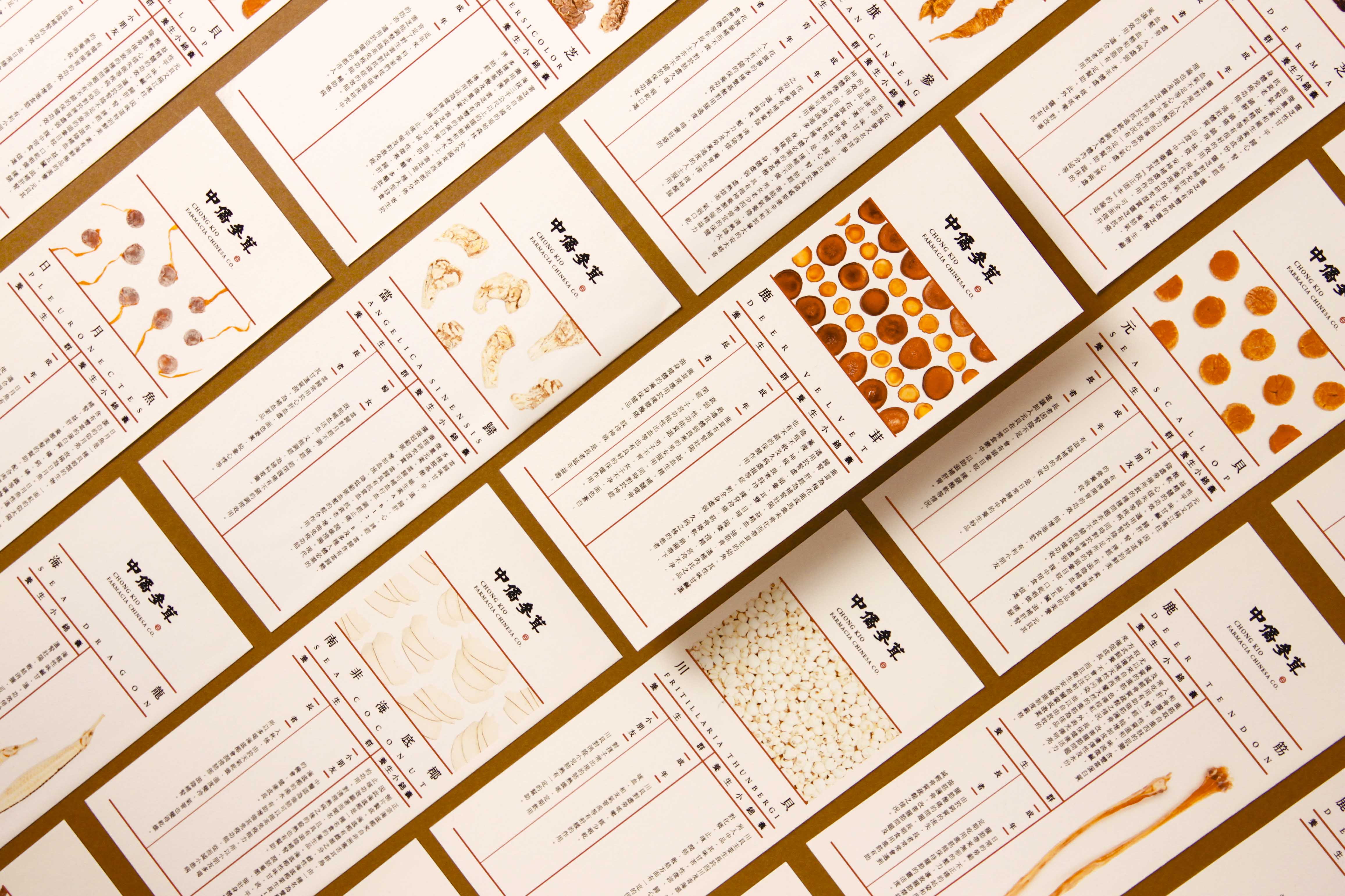
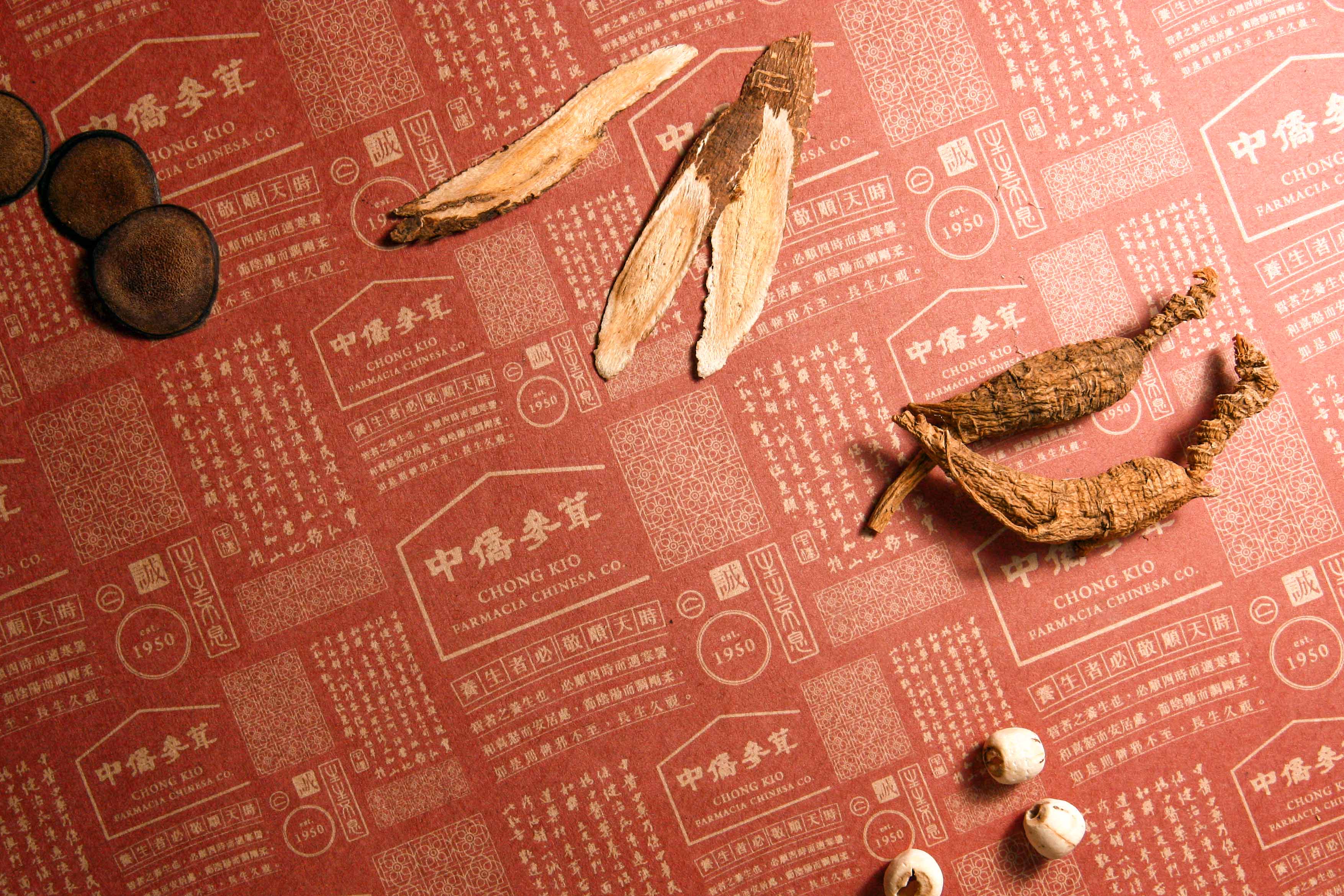
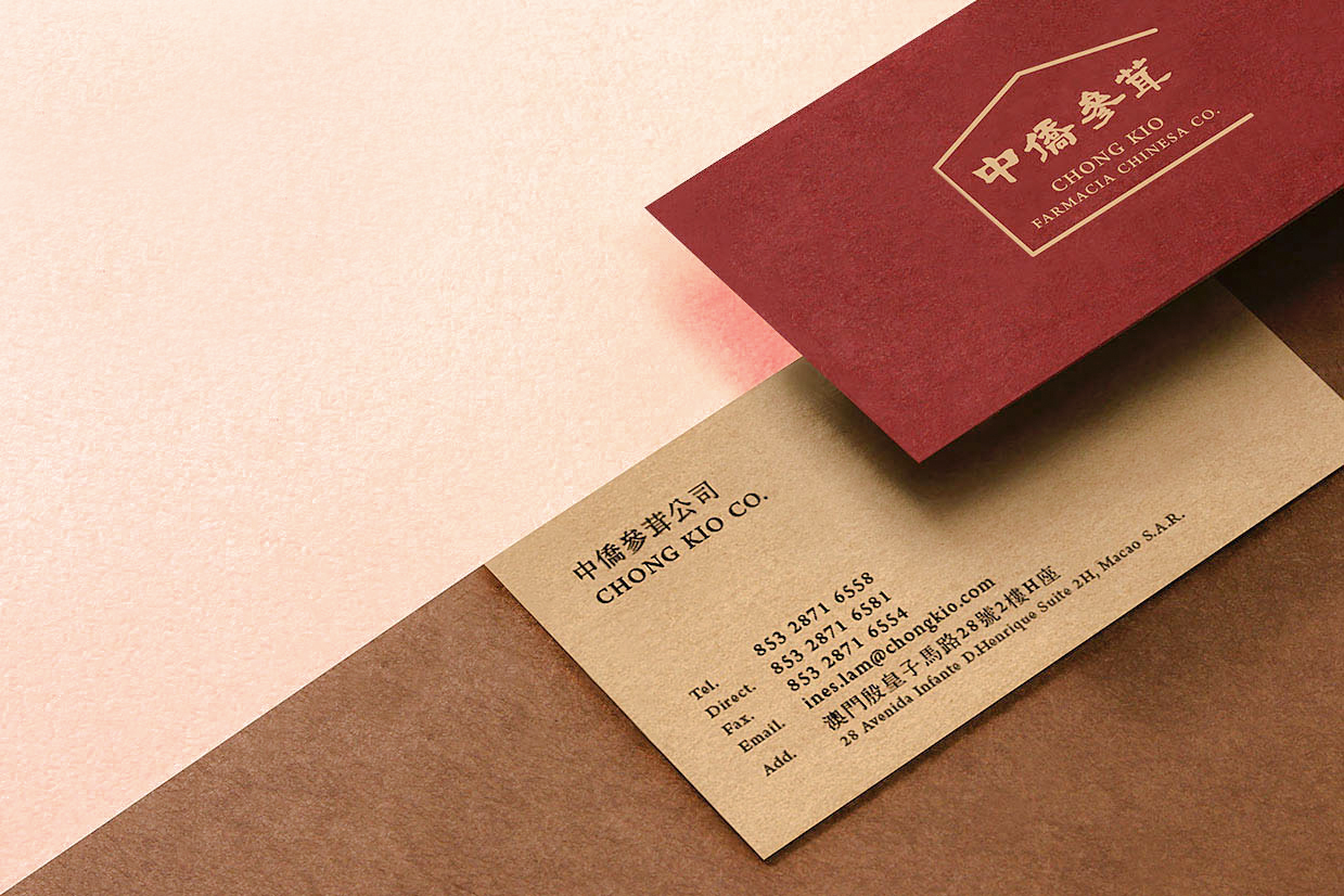
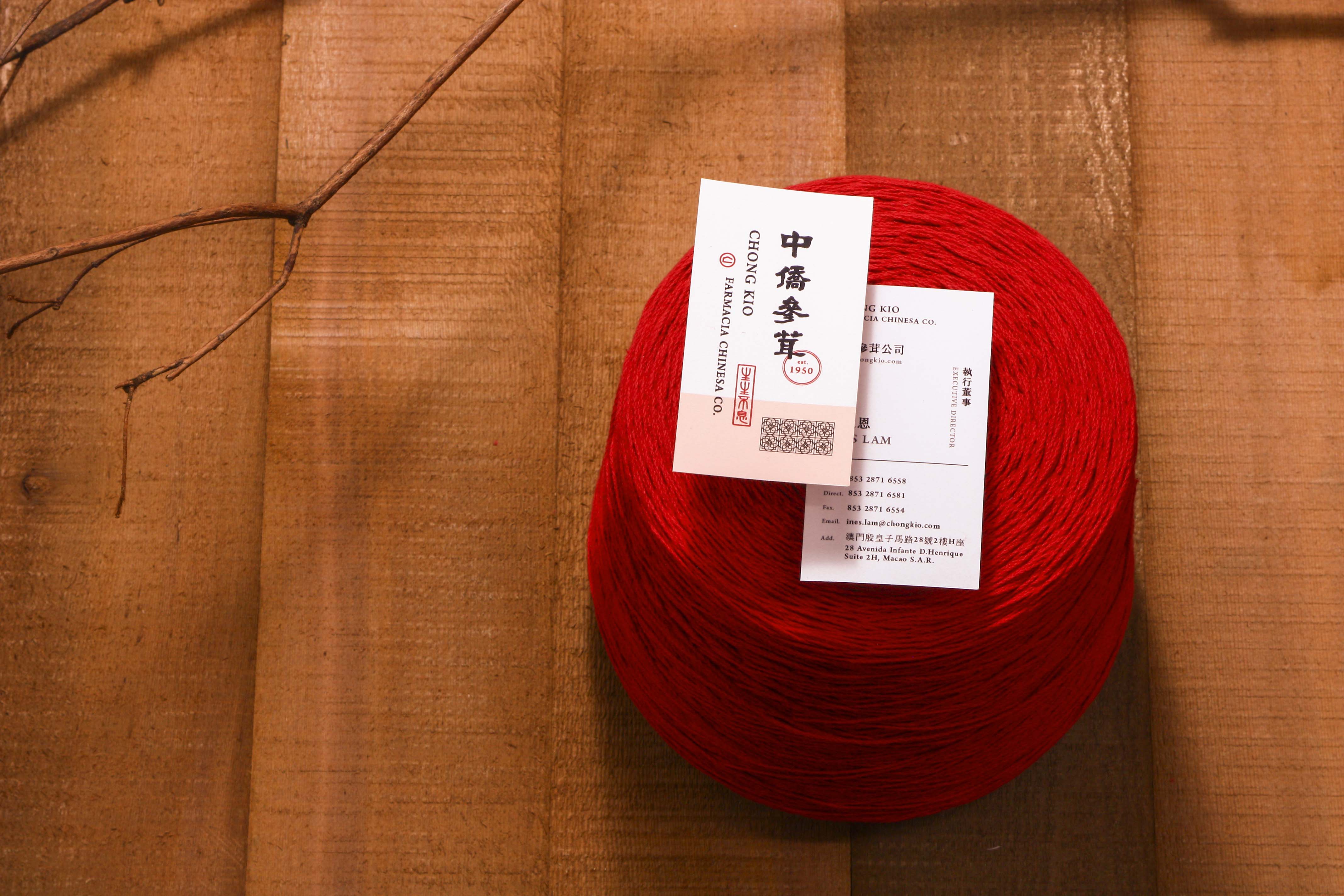
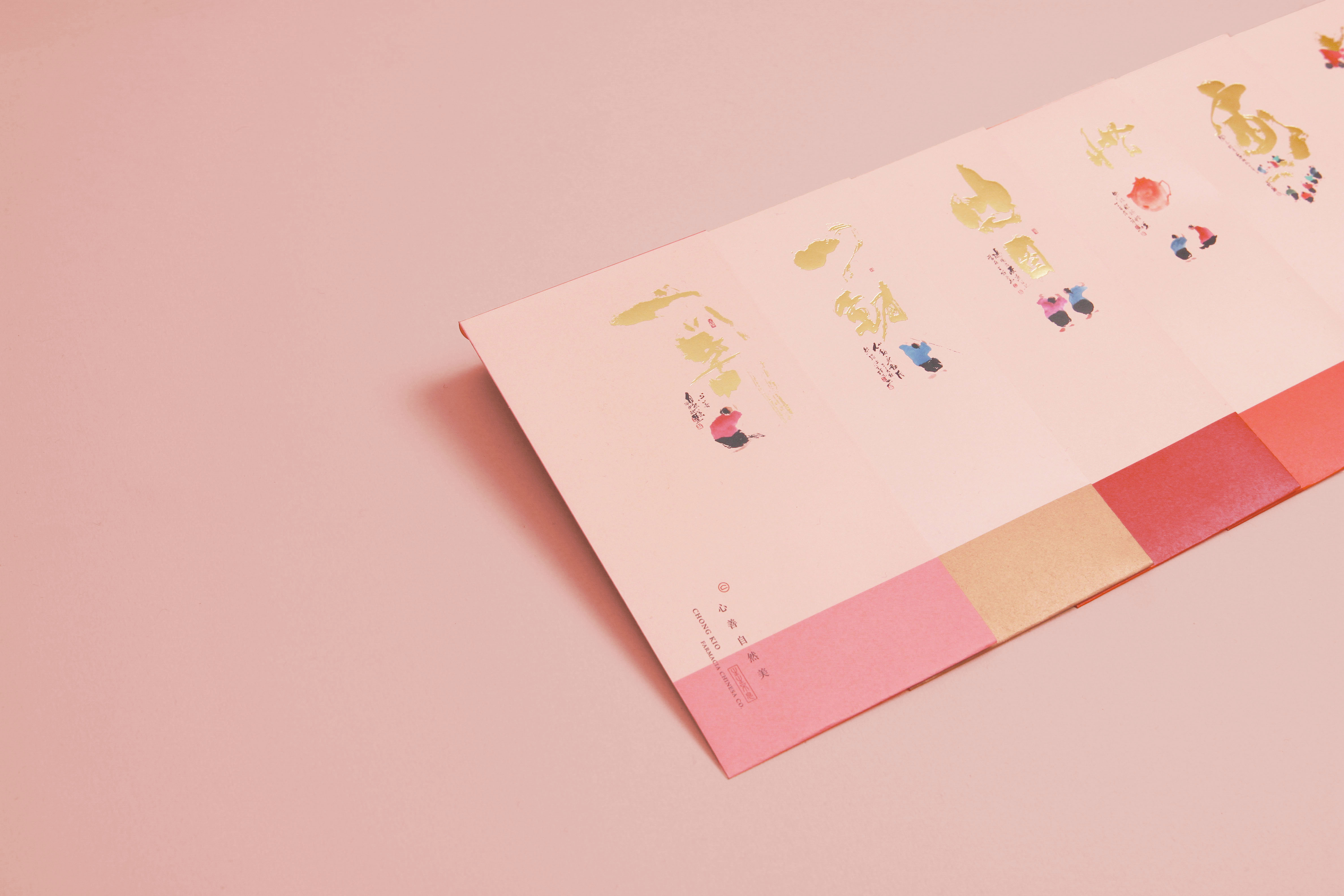
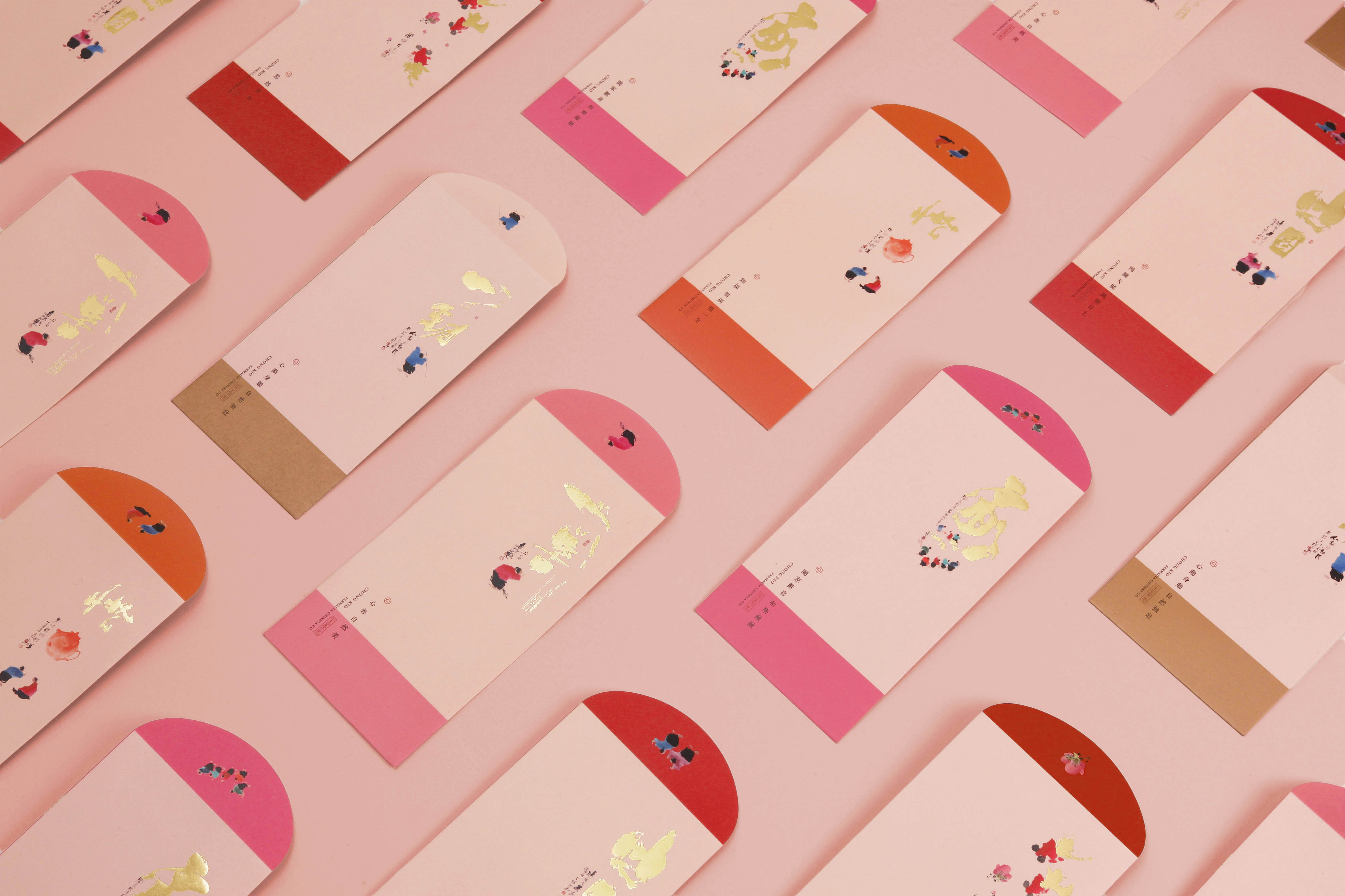
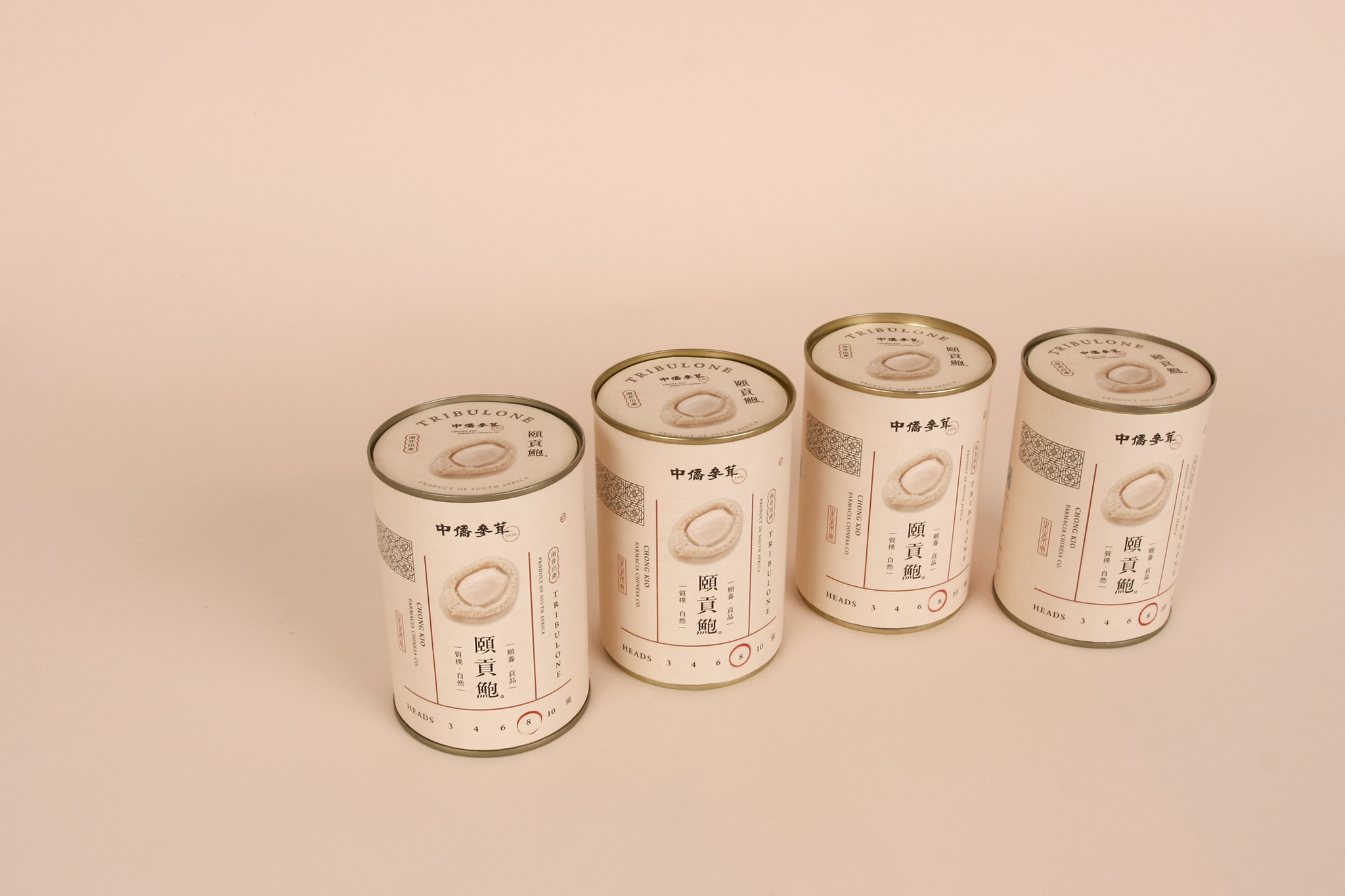
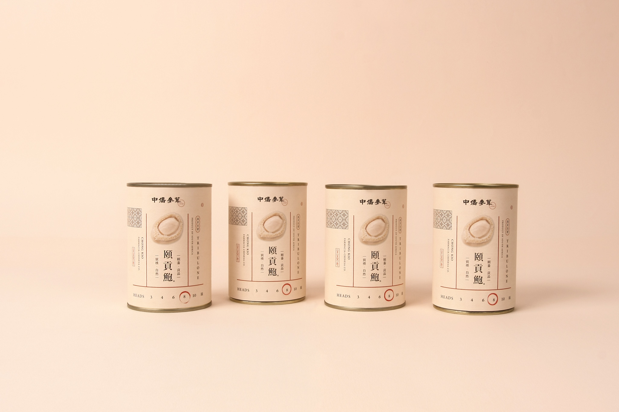
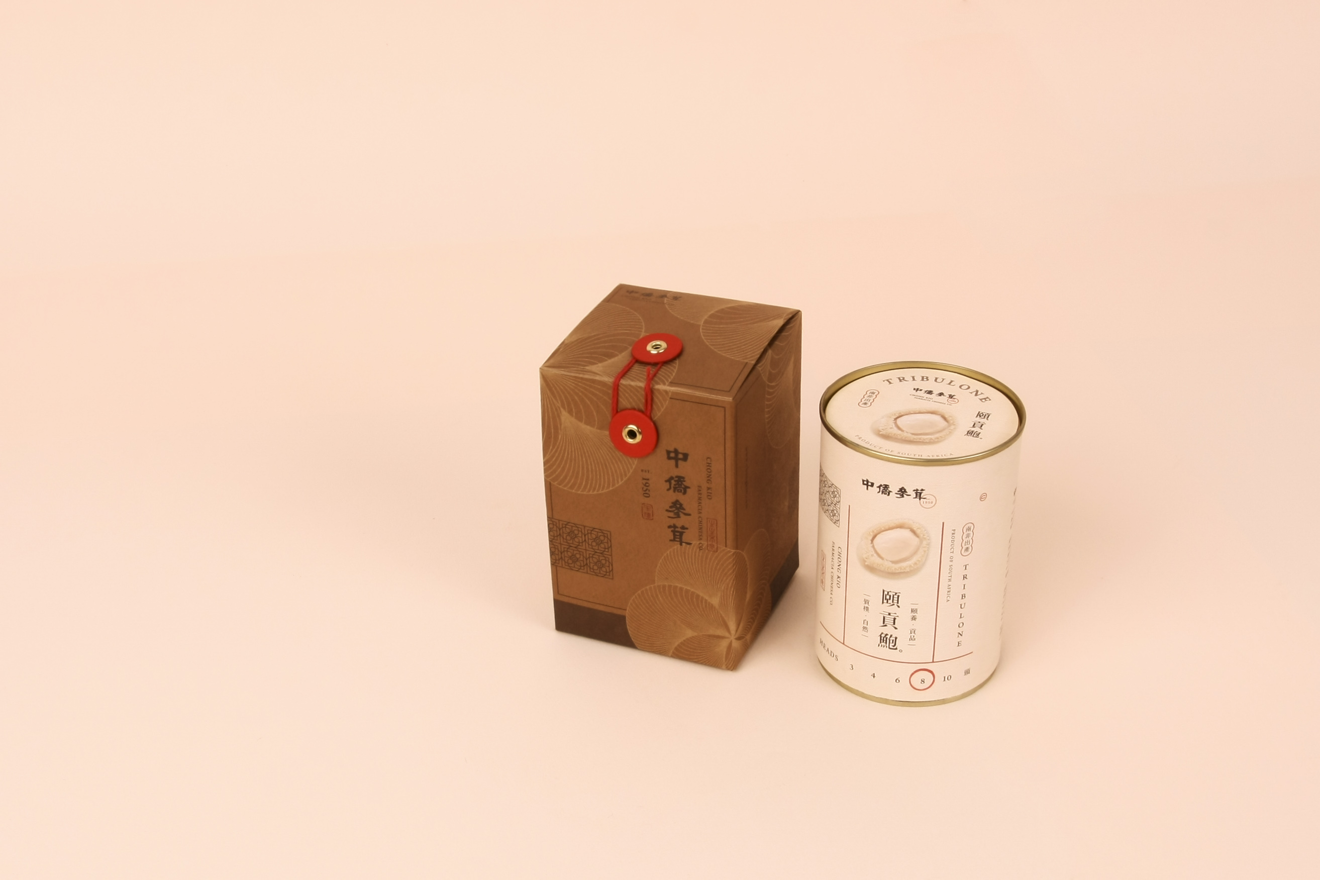
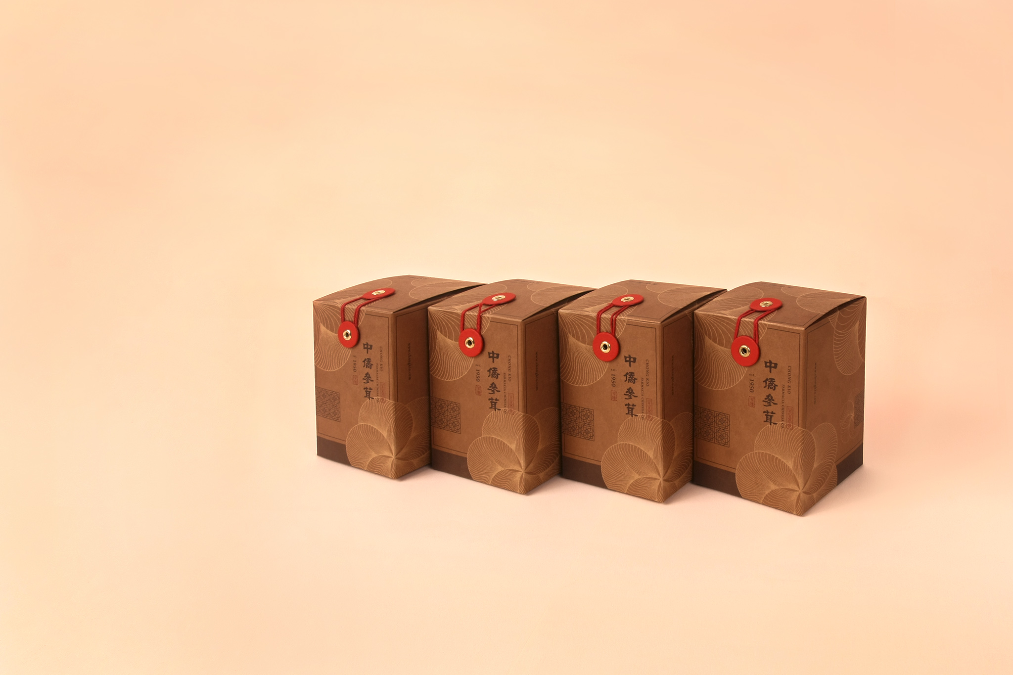
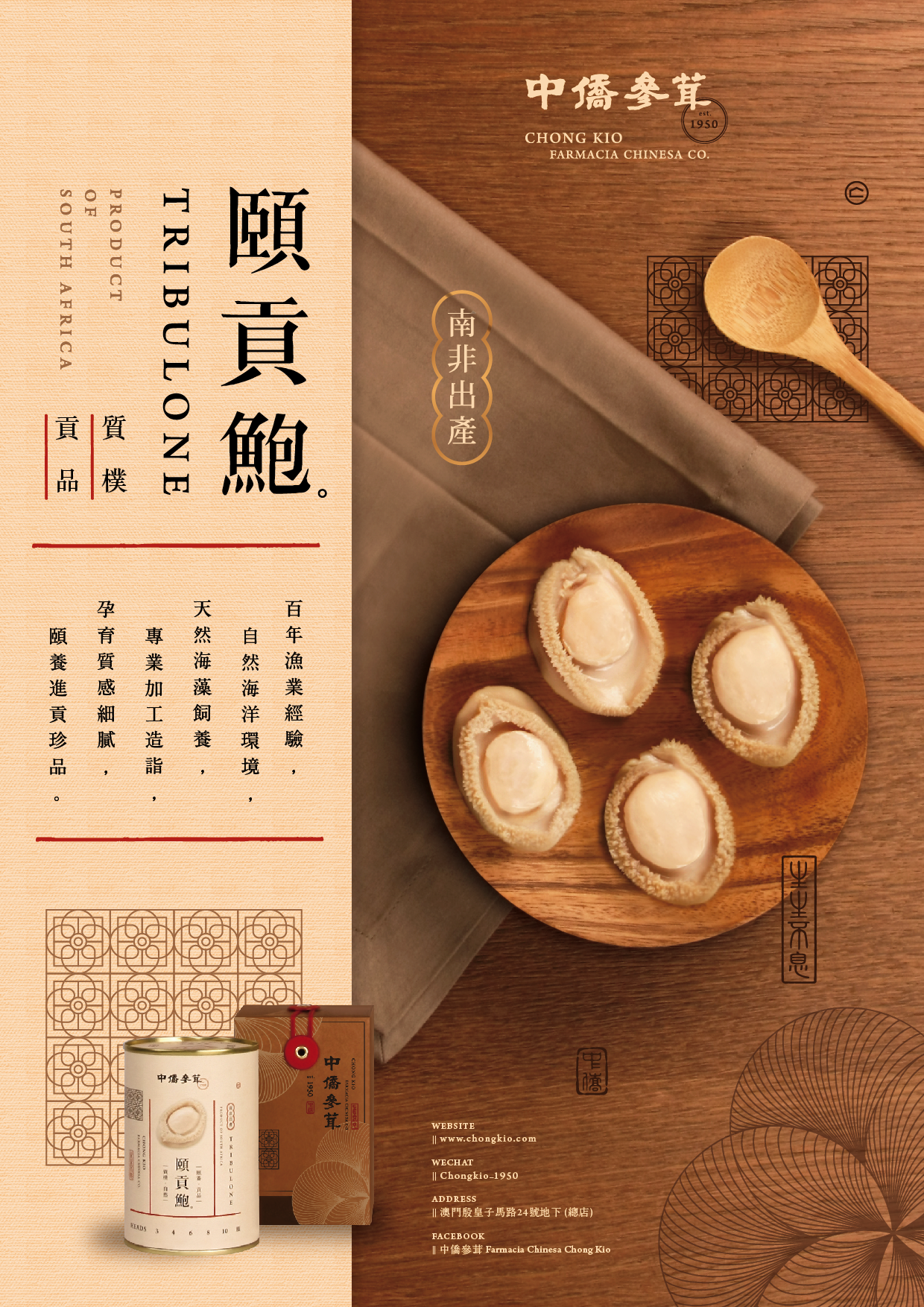
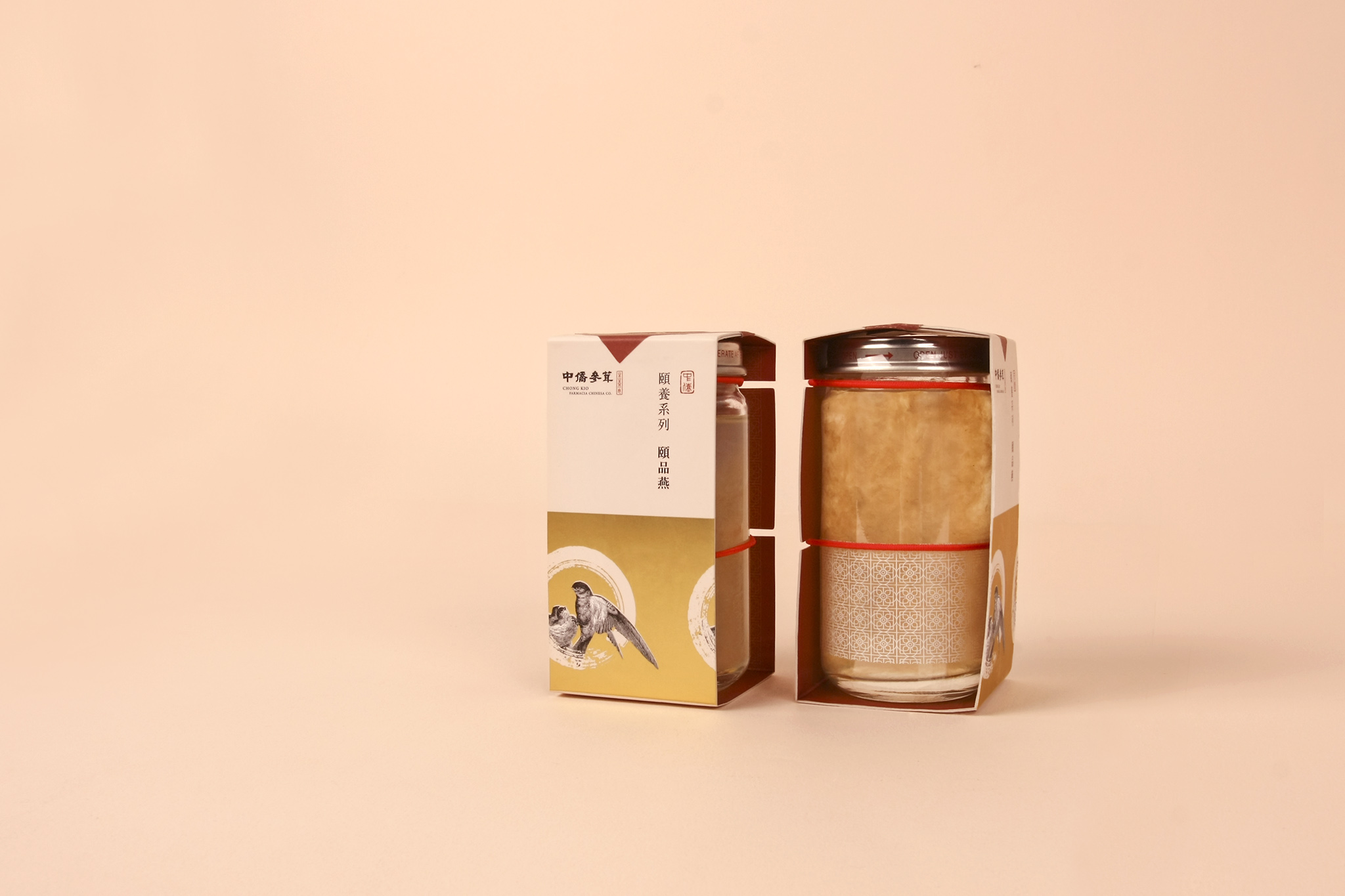
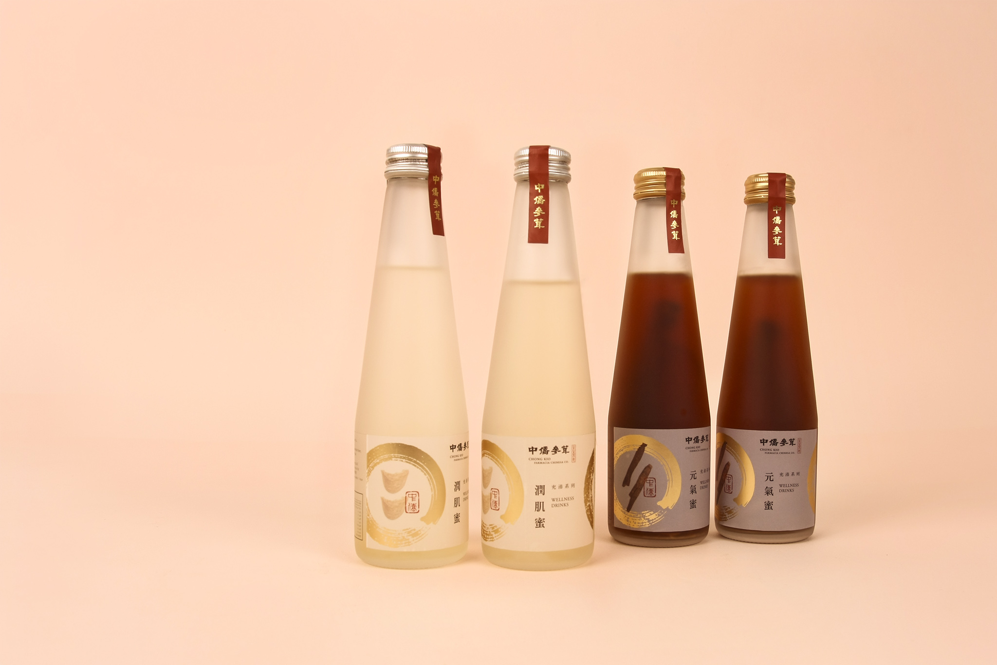
「 中庸之道 僑胞之義」 創立於澳門1950年,基於歷史背景,來自各地的僑胞當時返鄉困難, 而期盼能帶給熟識溫暖-家的感受,在品牌標誌上取首字母C作為“家”的意象。
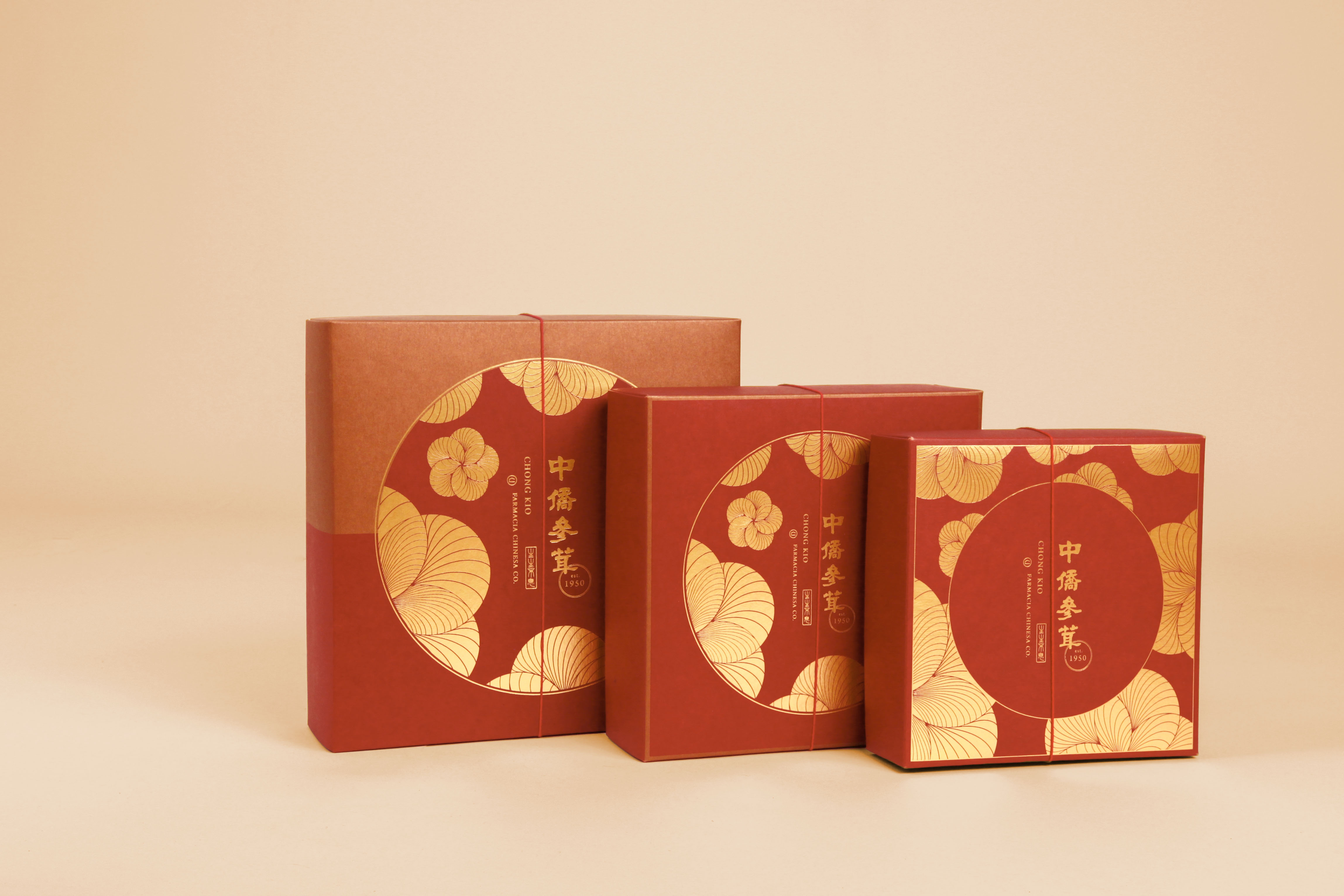
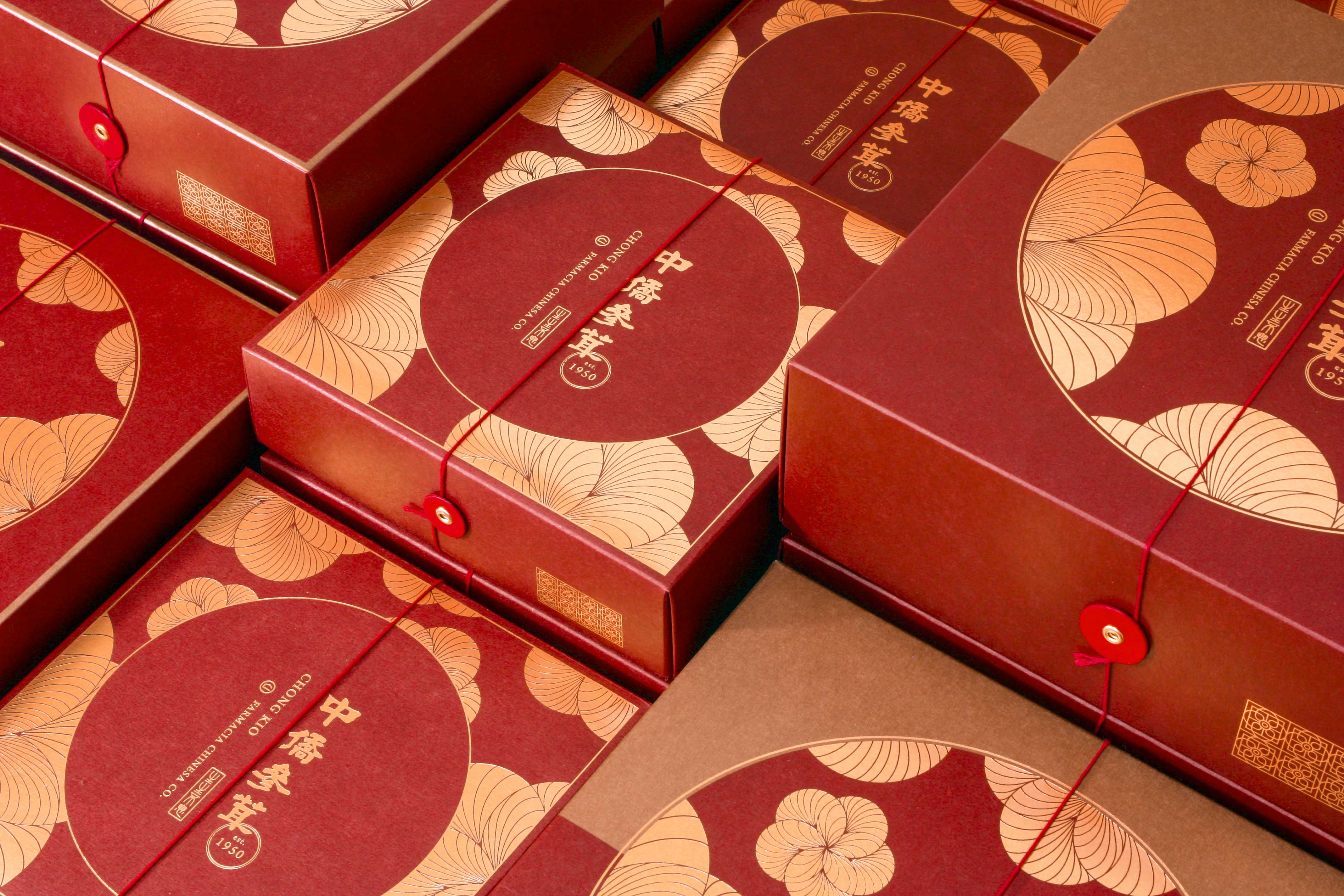
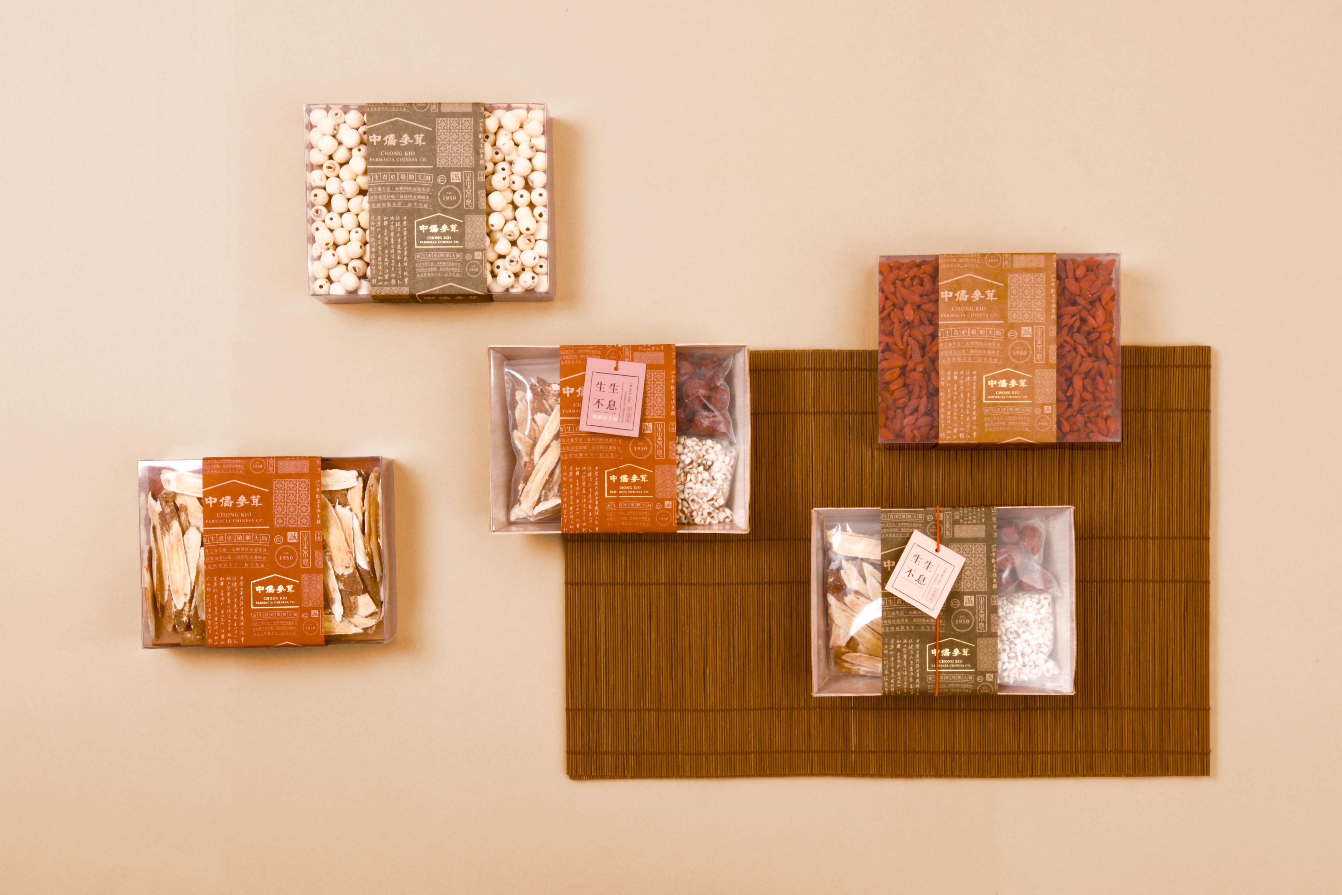
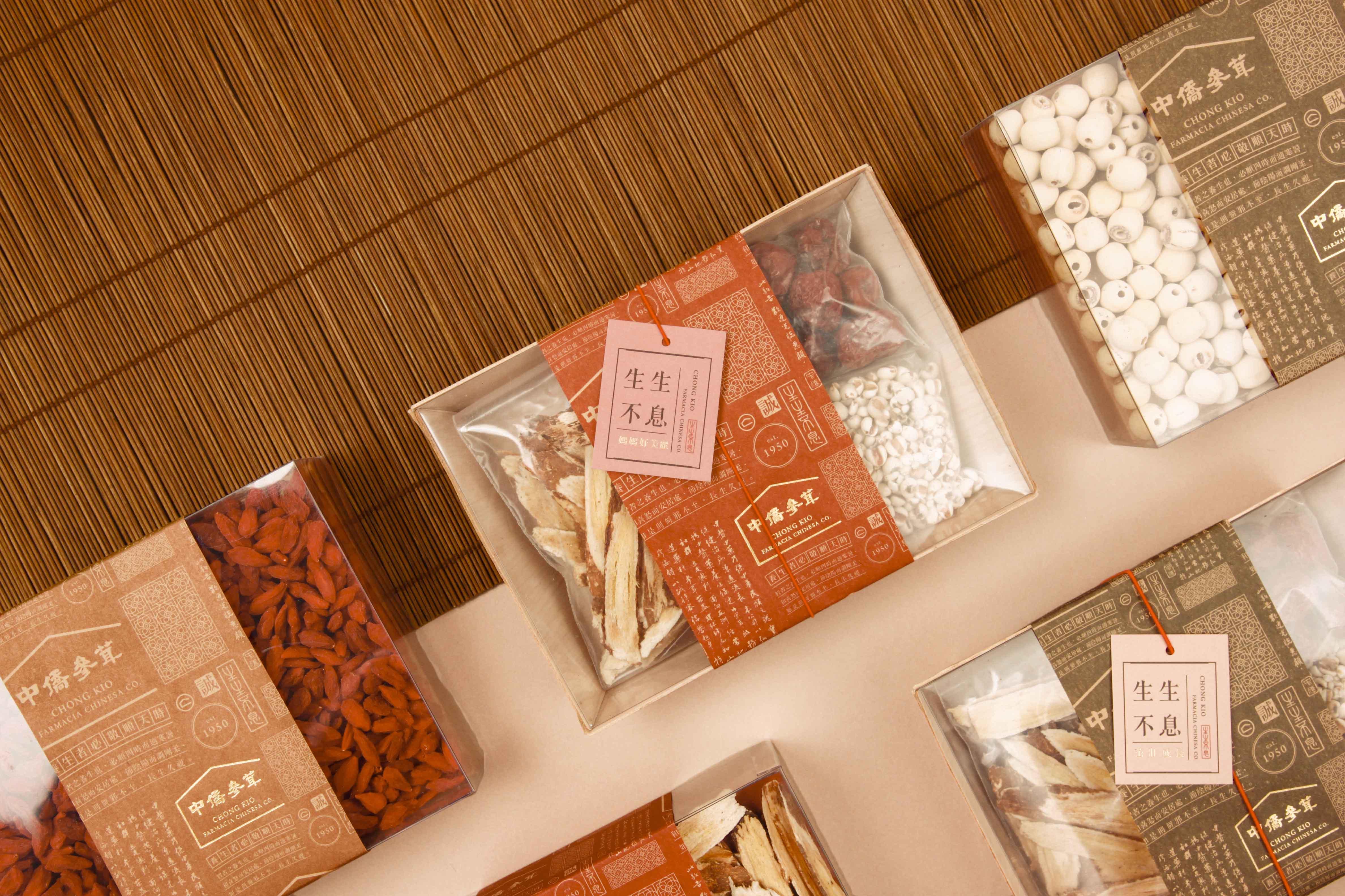
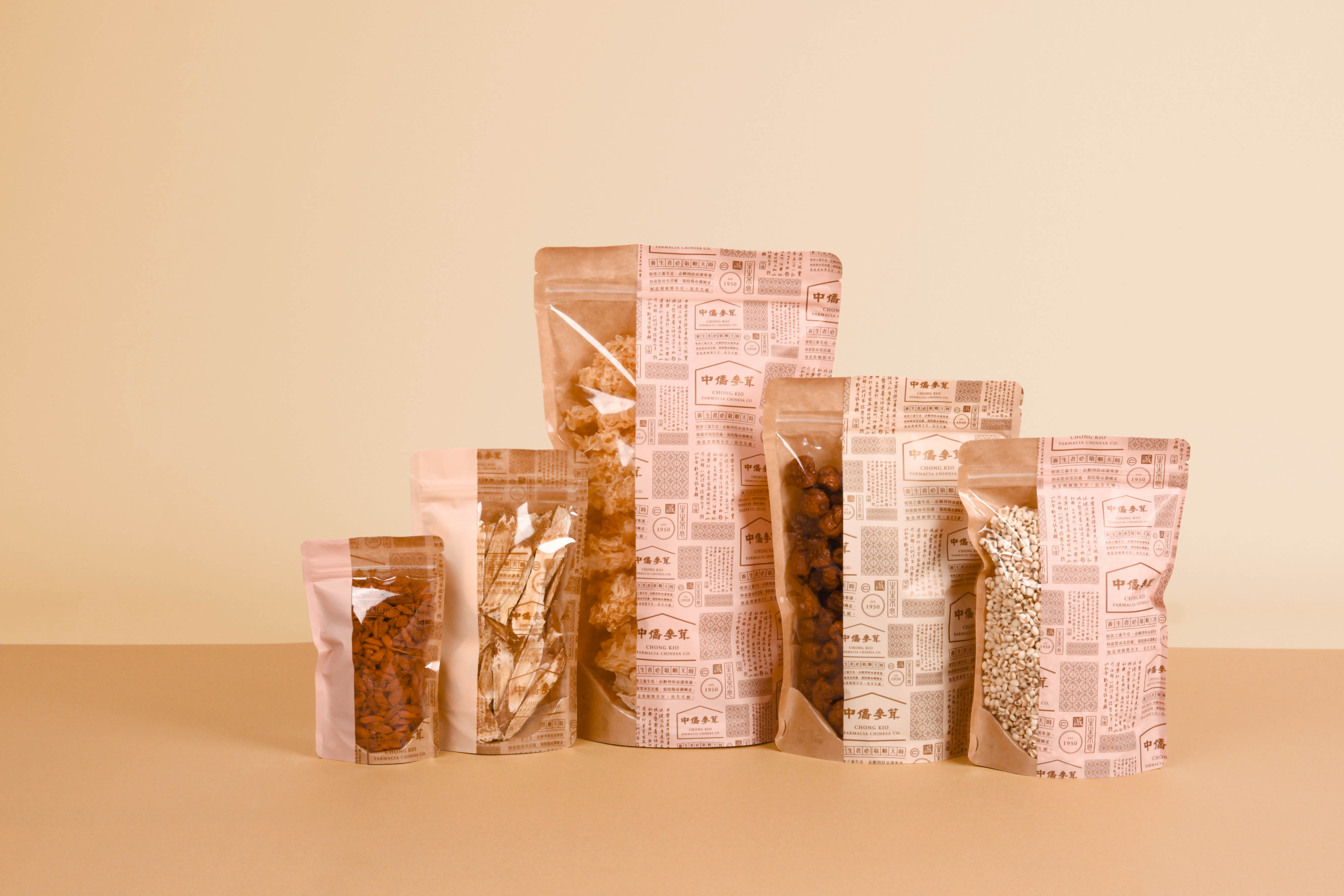
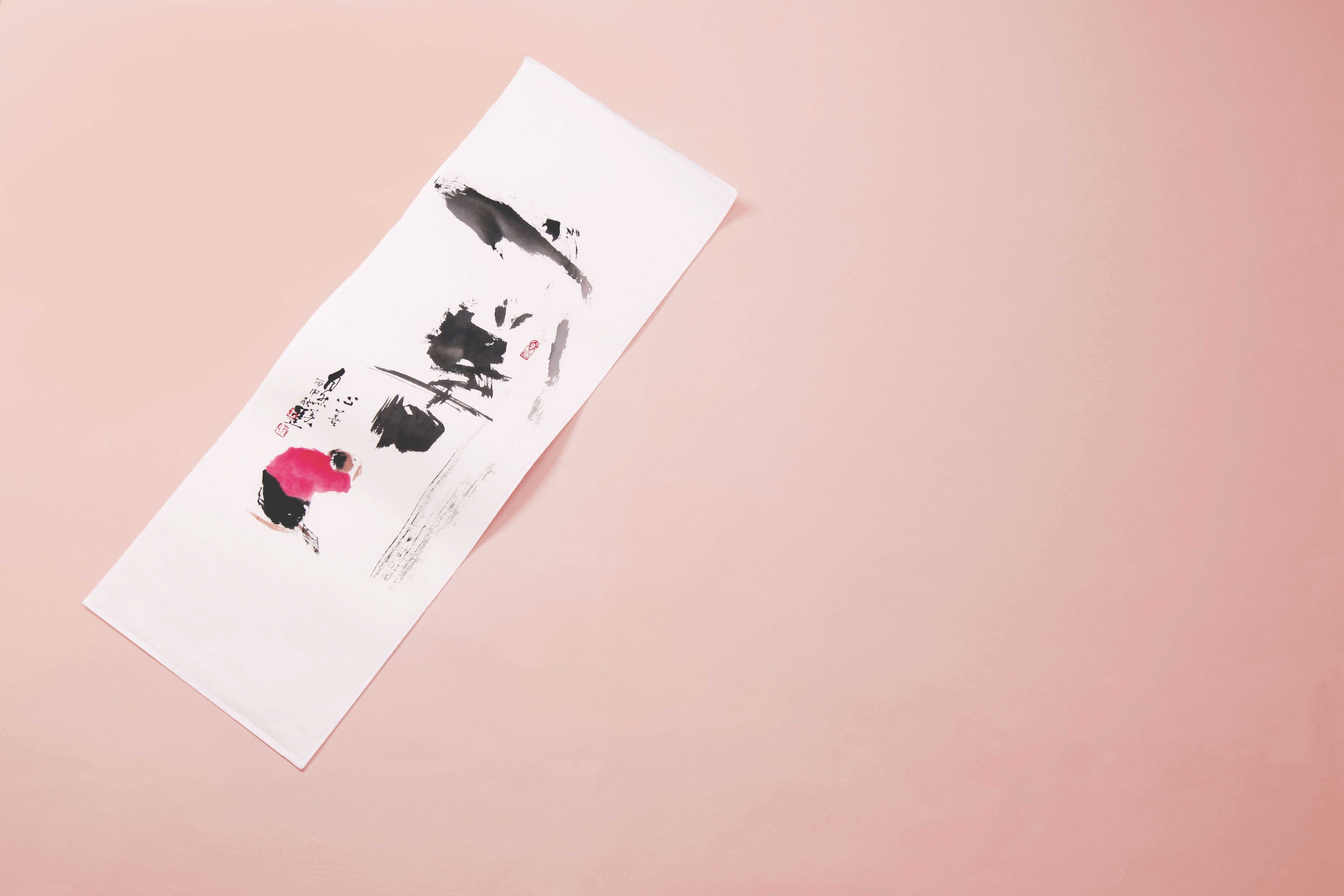
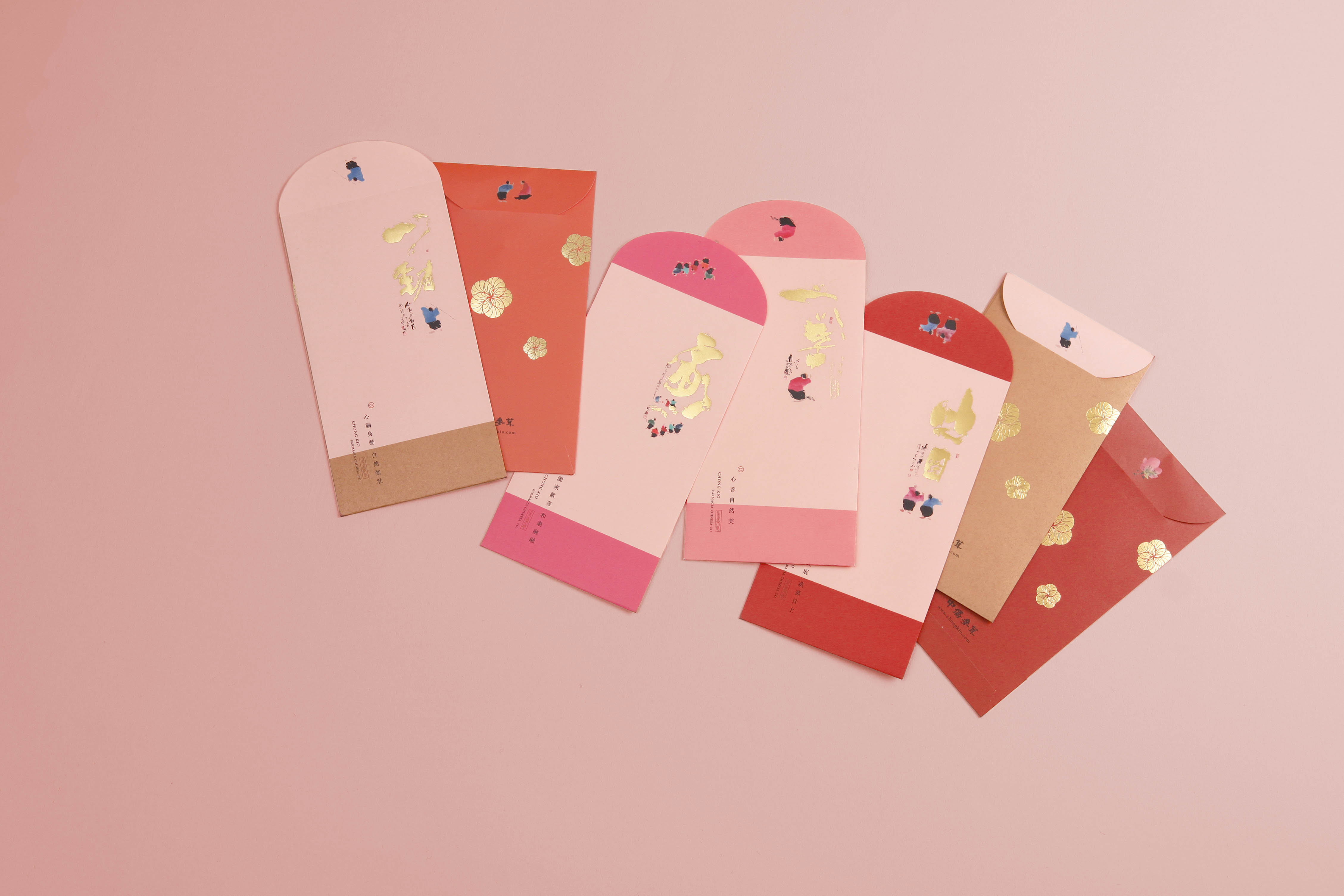
弘揚中醫藥養生保健為宗、訴求養生保健需從年輕開始, 中僑策略於“老品牌年輕化”,同時也保留祖訓的美德。 新氣象的粉紅與傳統的中國紅,自然不謀而合。 以“圓融、中庸”為主,發展出“方中有圓、一分為二”的主視覺, 並用誠心誠意、生生不息的理念持續傳承, 新舊交織的中僑品牌就此誕生。
Founded in Macau in 1950, due the historical background at the time, Chinese expatriates from all over the world faced daunting challenges to return to their hometown,in order to evoke the familiar feeling and warmth of home, the letter C is used on the brand logo as a symbol of "home".
With the aspiration of promoting traditional Chinese medicine and healthcare, the brand pursues the appeal of health preservation starting from a young age,Chong Kio's "Old Brand Rejuvenation" strategy also retains the virtues and wisdom of our ancestors.Perfect fusion of novel, pink color with traditional Chinese red color. Inspired by the philosophy of "roundness and mean", the main visual of "circle within square and bisection" is developed; furthermore, the concept of sincerity, earnestness and everlasting vivacity is combined with traditional heritage to give birth to the brand of Chong Kio.