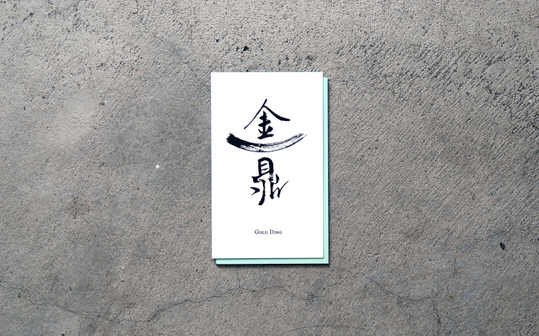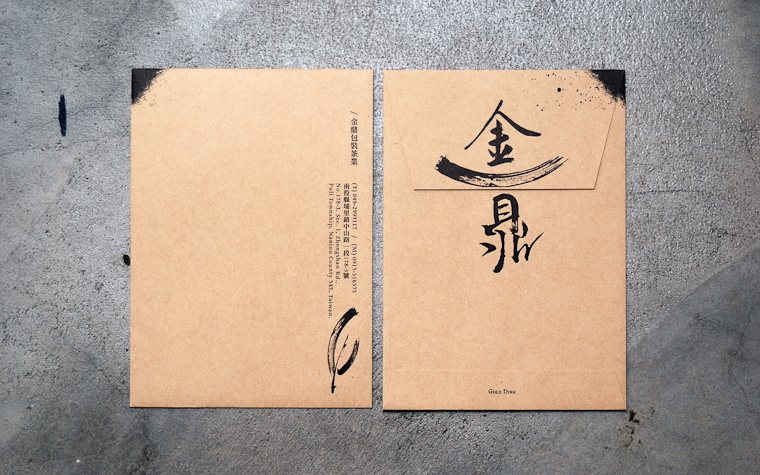

茶業包裝 / 袋茶包裝 / 茶業批發 / 綠盾驗毒 / 代客烘培 - logo以書法字表現茶道,中間一撇象徵「鼎」,撐起「金」,象徵聚財、興旺。再用中間這一撇的元素組成茶葉的抽象圖,表現品牌產業。
The logo embodies the way of tea through calligraphy, with a stroke in the center symbolizing "Ding (three legged ancient Chinese cooking vessel)", which in turn supports word "Jin (gold)", representing wealth and prosperity. furthermore, the symbolic elements of "Ding" are used to form an abstract motif of tea to demonstrate the brand's industry characteristics.
The logo embodies the way of tea through calligraphy, with a stroke in the center symbolizing "Ding (three legged ancient Chinese cooking vessel)", which in turn supports word "Jin (gold)", representing wealth and prosperity. furthermore, the symbolic elements of "Ding" are used to form an abstract motif of tea to demonstrate the brand's industry characteristics.