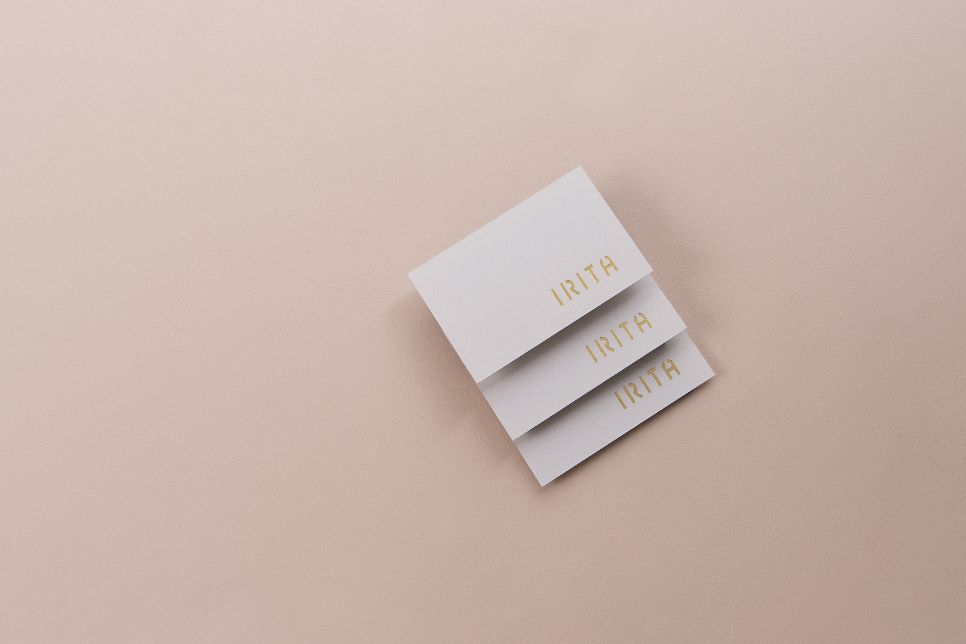

IRITA專一純粹保養
brand strategy, branding, rebranding,
package design,
2020 - 2021
Art Director
余岱官 Kuan
Designer
余岱官 Kuan、
汪平(產品DM)、
林宛渝(包裝文字排版)
Photography
Arko Studio 光和影像、汪平
brand strategy, branding, rebranding,
package design,
2020 - 2021
Art Director
余岱官 Kuan
Designer
余岱官 Kuan、
汪平(產品DM)、
林宛渝(包裝文字排版)
Photography
Arko Studio 光和影像、汪平
成立於2015年
歷經人生的轉折重新思考,帶給別人舒服與善待自己是負責人的核心理念,IRITA於2020年重生。
『 IRITA 』在希臘語象徵著一道美麗的彩虹,充滿希望與祝福,如同透過保養品,IRITA也希望能夠為認真照顧肌膚的你,帶來支持的力量。無論多忙、多累,都懷抱著被祝福的心情,繼續抬頭挺胸的向前邁進。
-
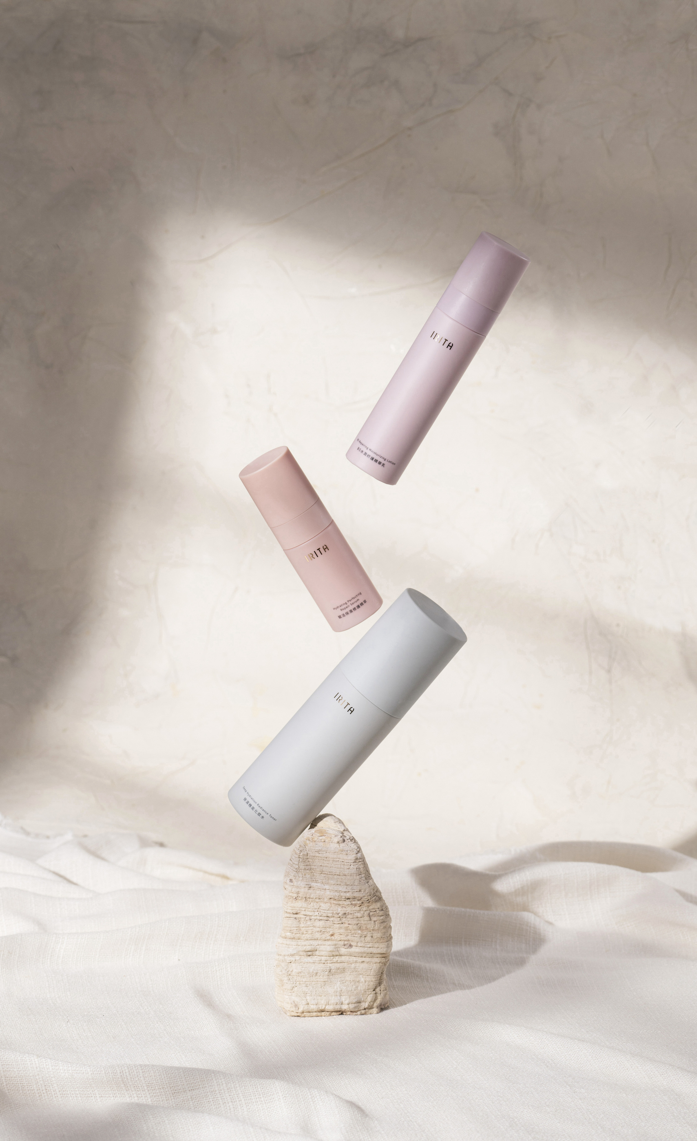
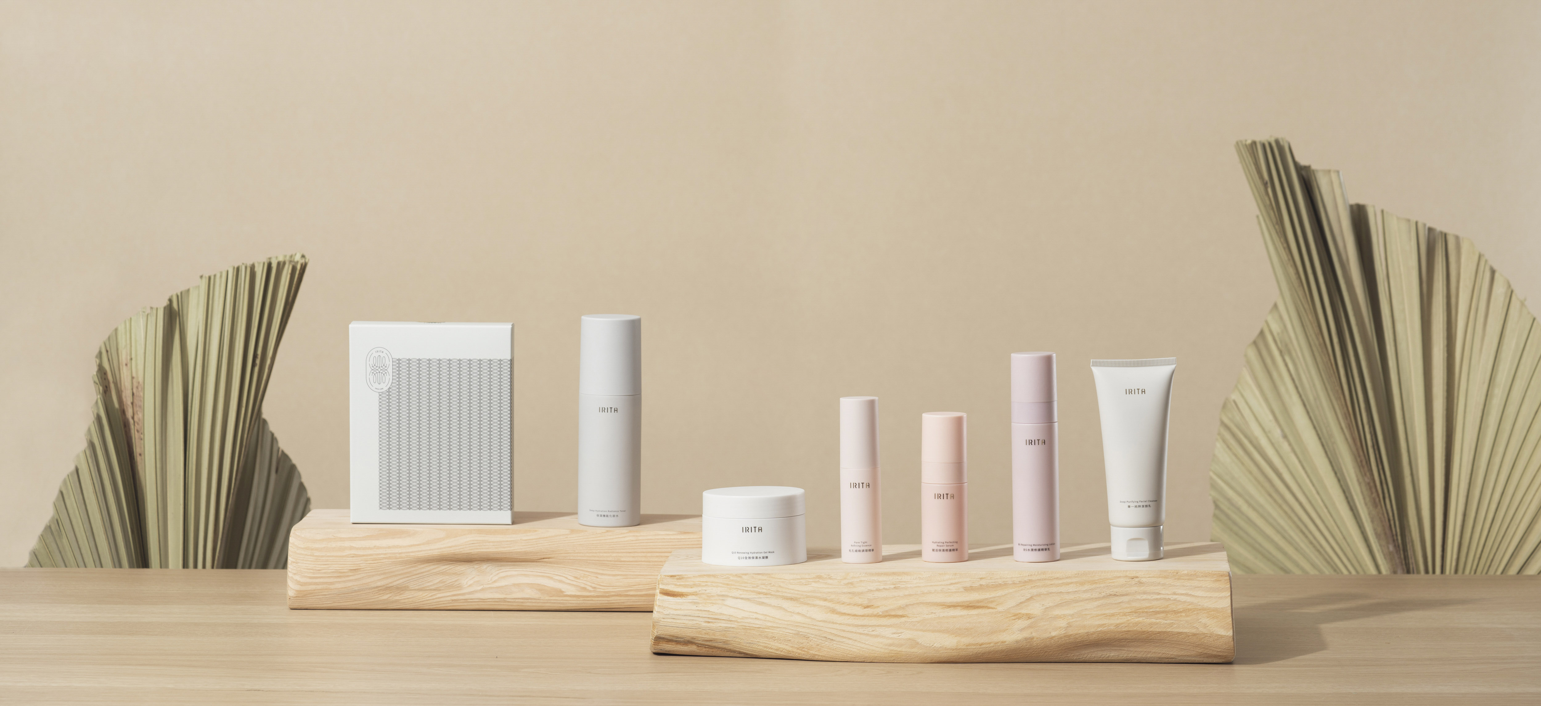
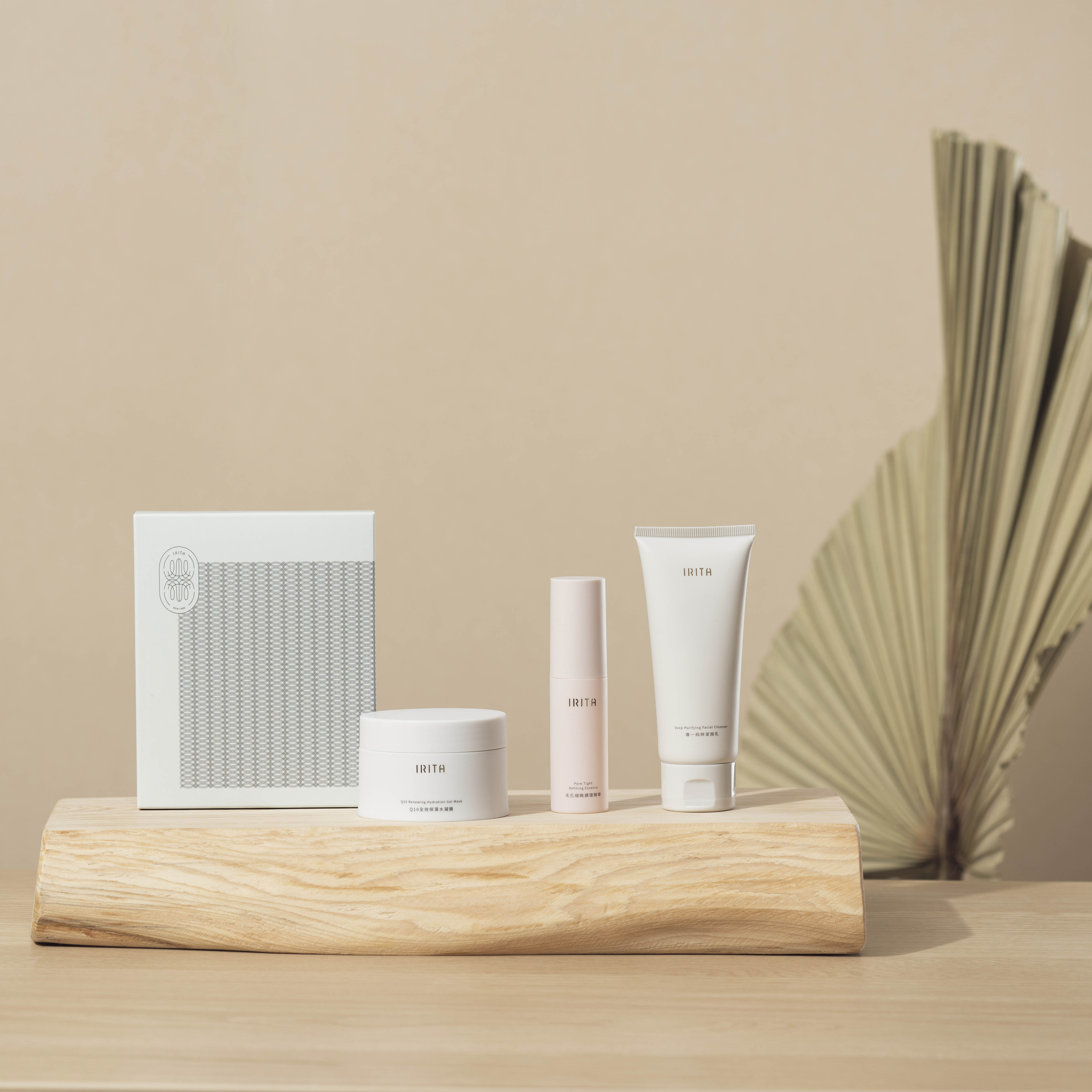
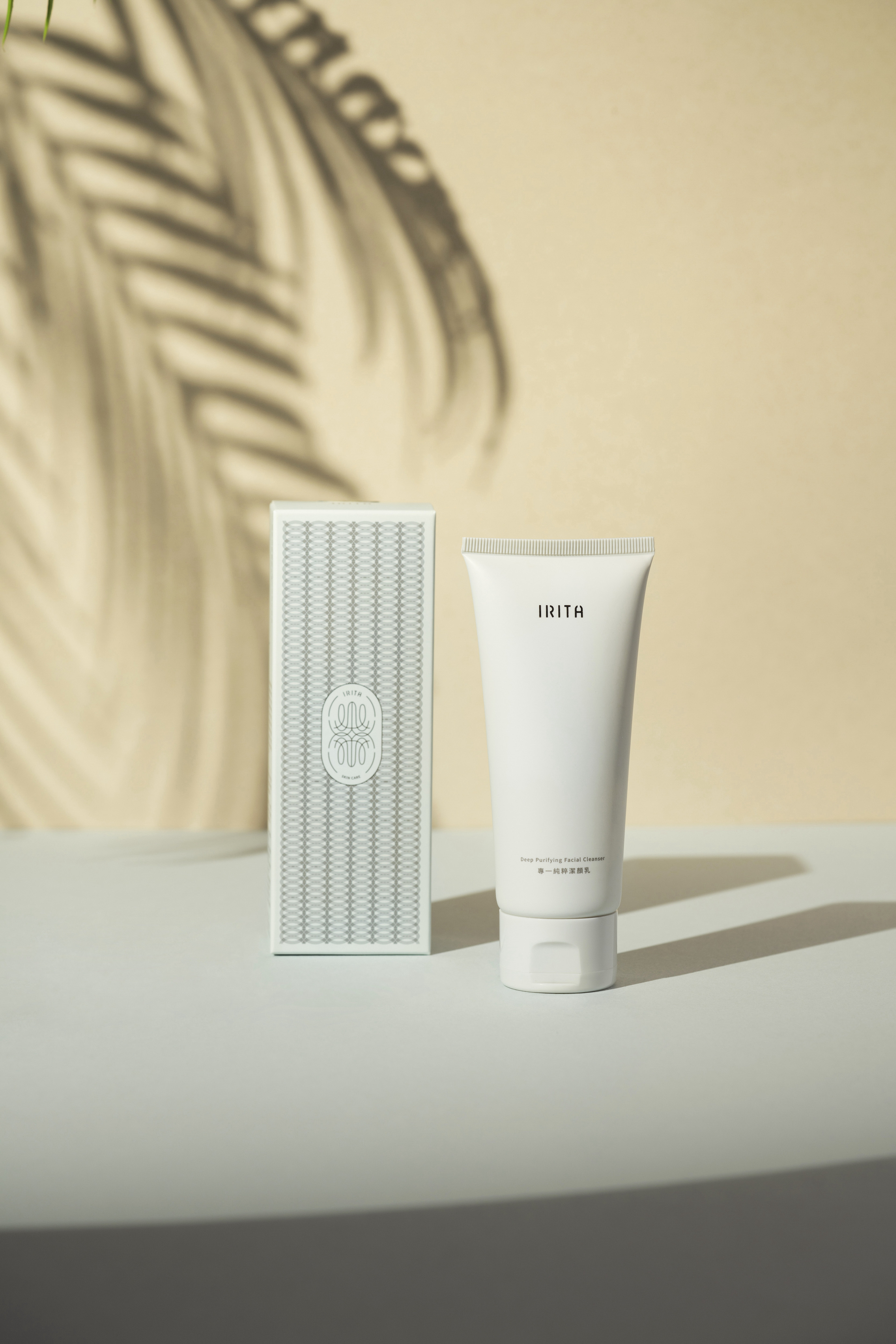
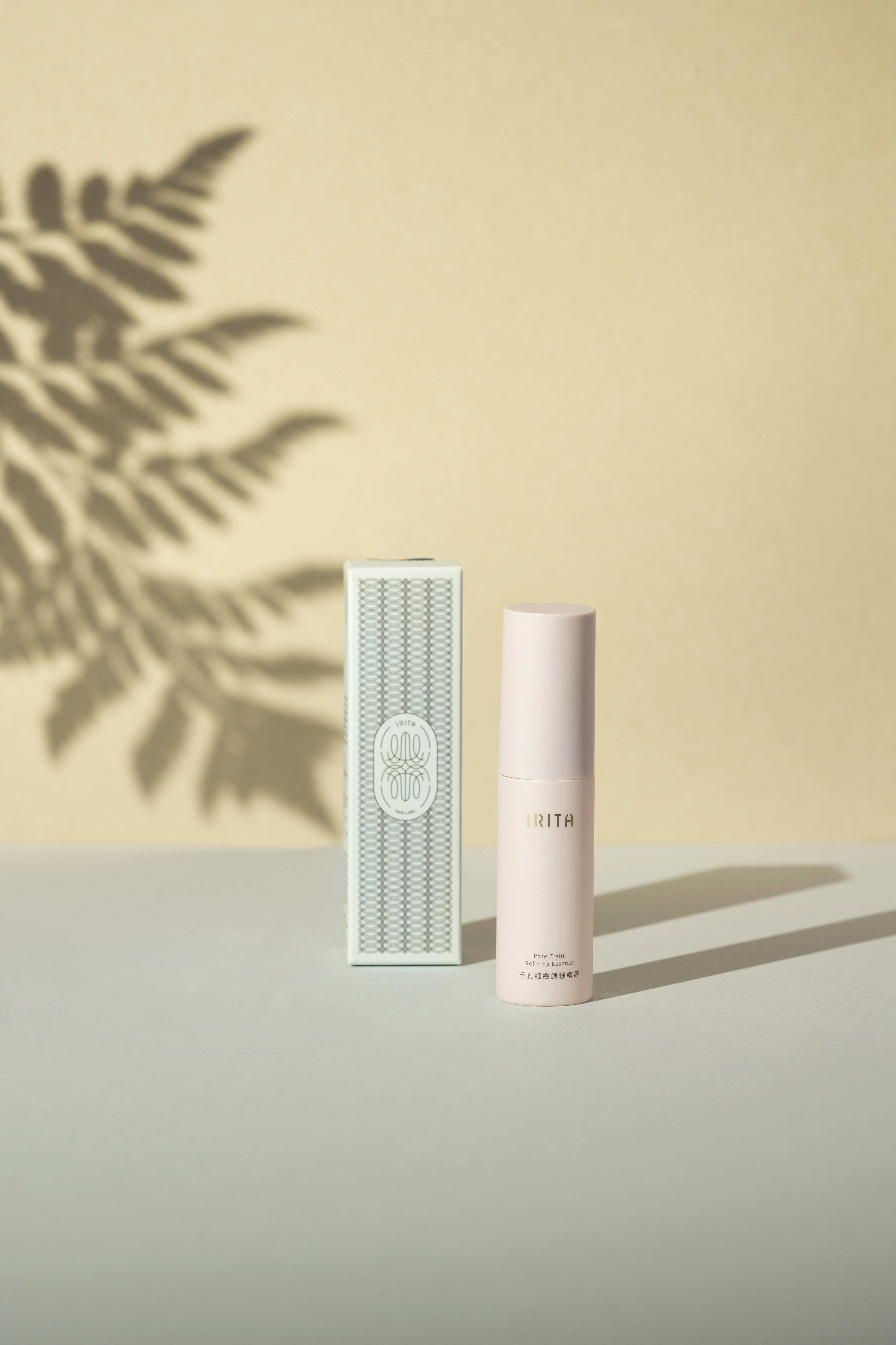
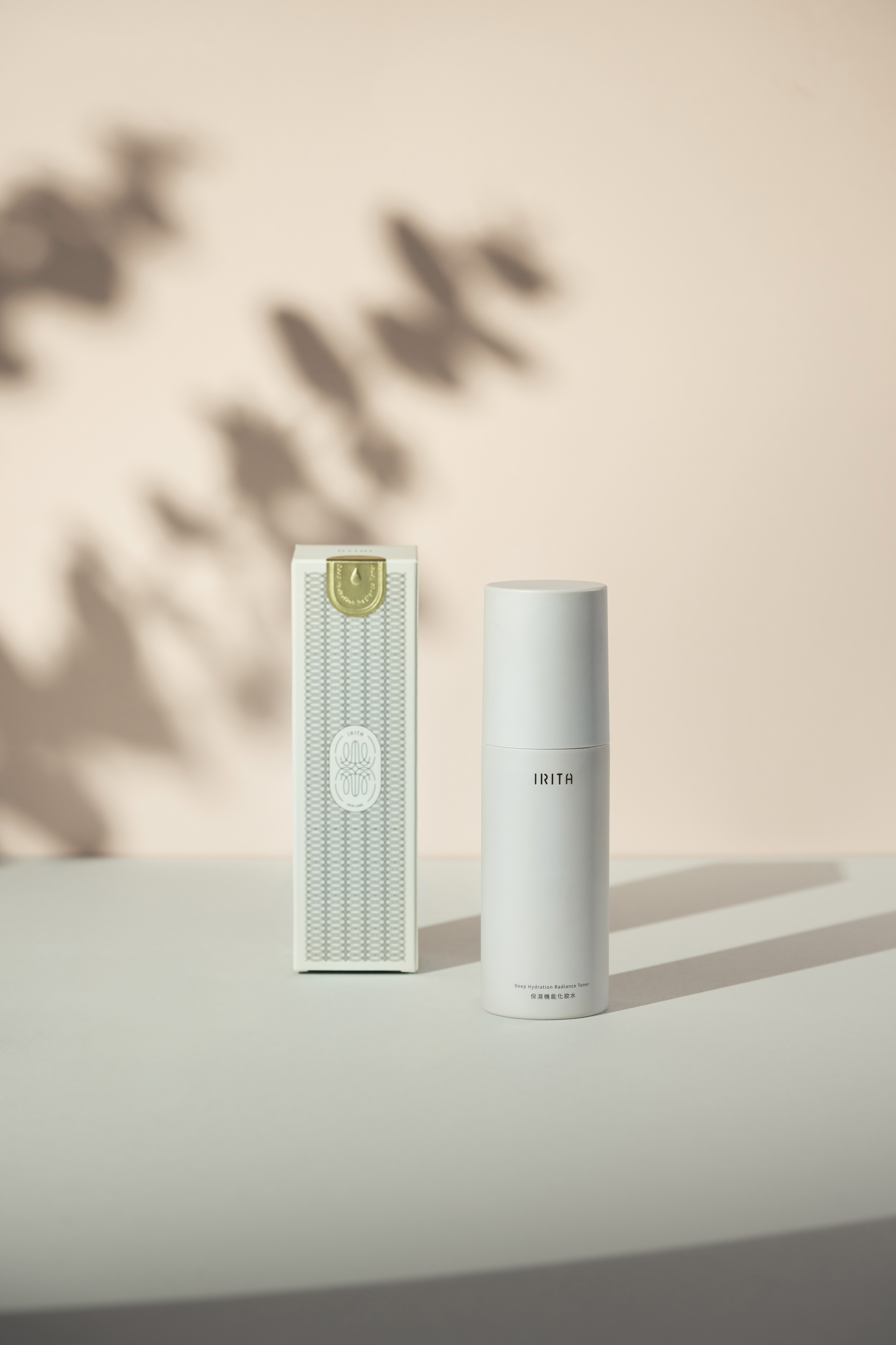
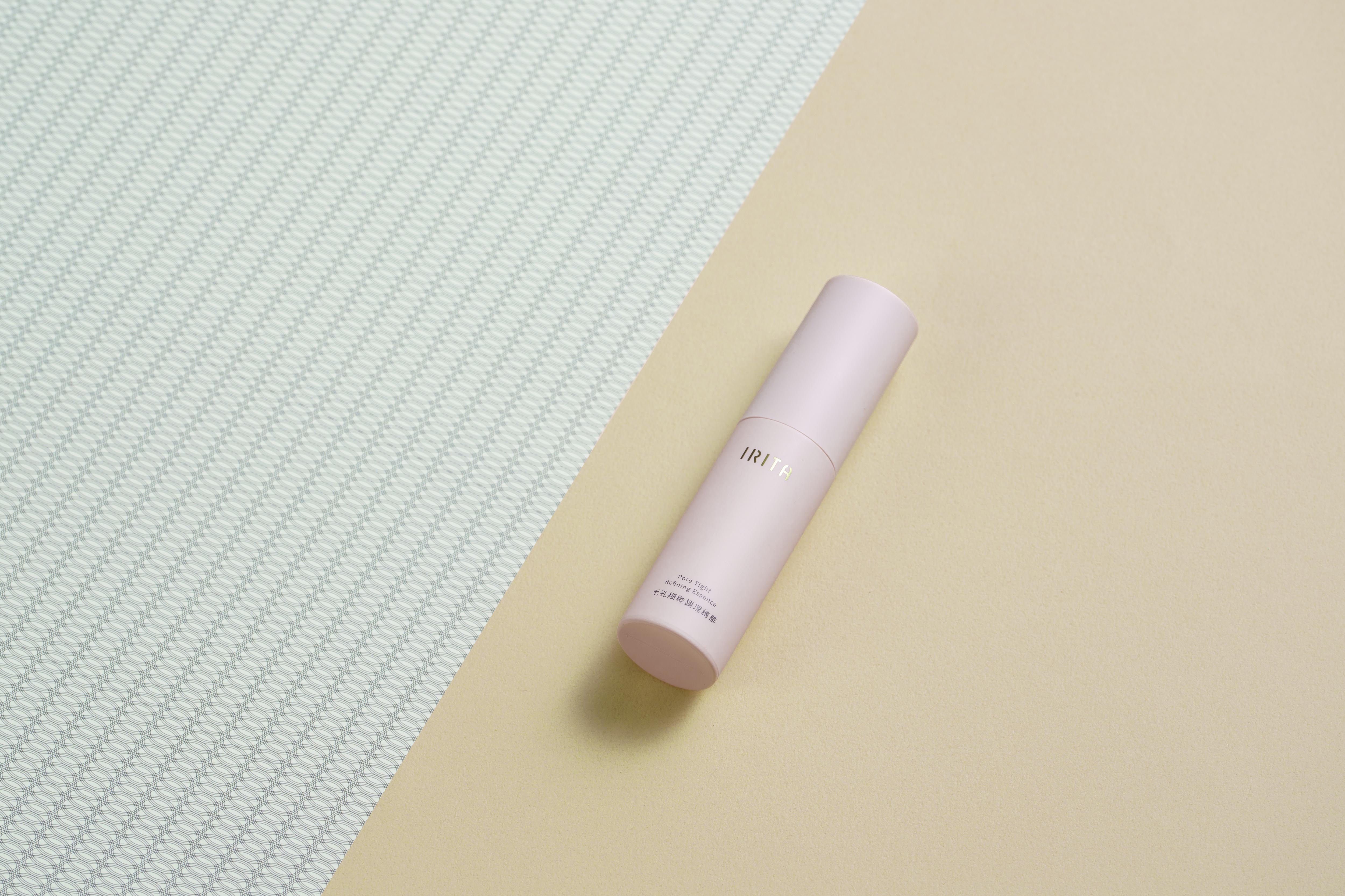
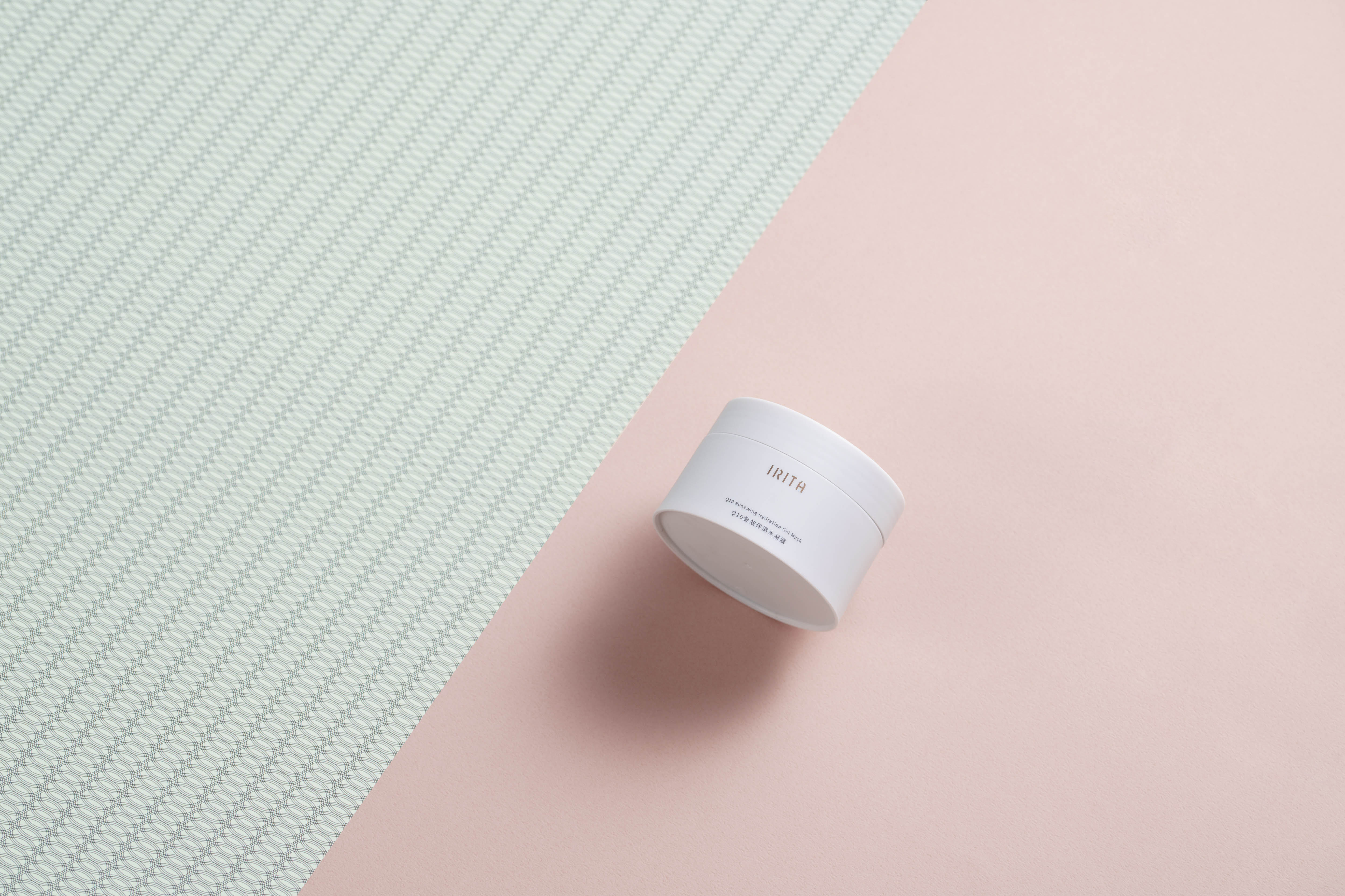
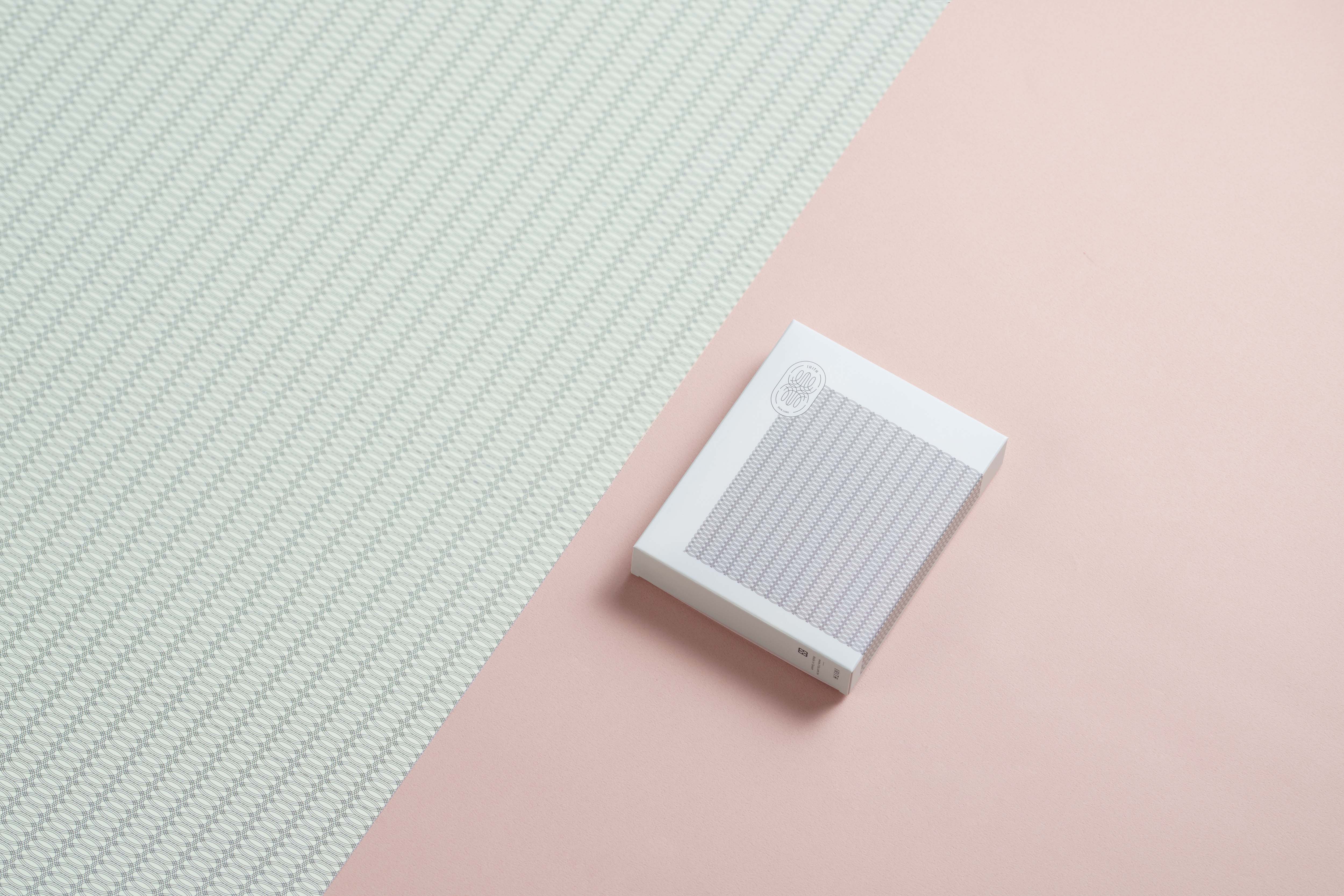
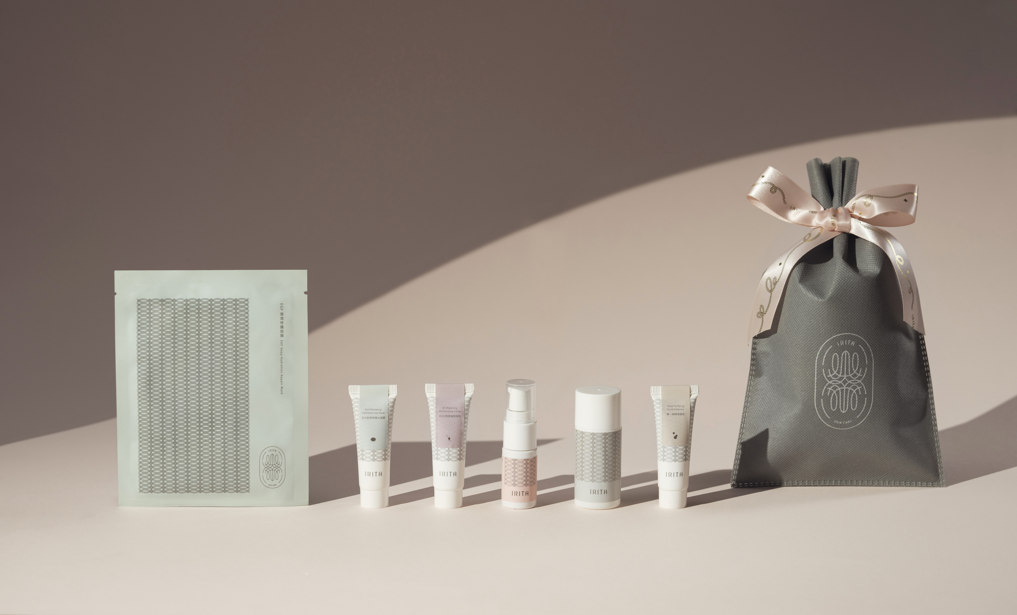
以優雅溫柔的色系來呈現品牌想帶給女性幸福與呵護感 ;
多層次粉色的瓶身,這樣柔軟的節奏感,讓女孩置身於幸福的滿足裡。
薄荷綠的清爽清澈感,彷彿置身大自然的平靜與自在。
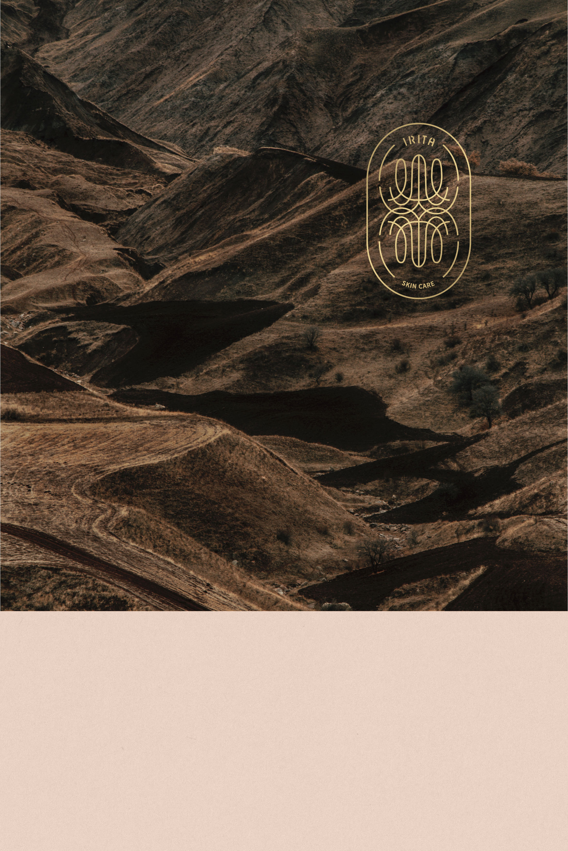
Logo像朵盛開的花又像合掌的雙手,象徵懂的善待自己就如花朵一樣美麗盛開。
-
Established in 2015, but after a turn of events in the founder’s life, Irita was reborn in 2020, still maintaining its core mission to bring people comfort and to treat the self with kindness.
‘Irita’ means a beautiful rainbow in Greek. The word connotes hope and greeting. In the same way, Irita also hopes to support you, who is keen to take good care of your skin. No matter how tired or busy, Irita supports you to make the stride forward with ample support and good faith.
With an elegant palette, the Irita brand wants to achieve a feeling of wholesomeness and tender care for women. The different shades of pastel on the packaging create a soft rhythm, allowing the woman who uses Irita to dwell in comfort and fulfilment. The use of mint green brings an air of clarity and refreshing feeling, as if you’re in nature.
The logo took inspiration from not only a flower, but also closed palms, symbolizing the idea that people who take care of themselves will eventually bloom like beautiful flowers.
歷經人生的轉折重新思考,帶給別人舒服與善待自己是負責人的核心理念,IRITA於2020年重生。
『 IRITA 』在希臘語象徵著一道美麗的彩虹,充滿希望與祝福,如同透過保養品,IRITA也希望能夠為認真照顧肌膚的你,帶來支持的力量。無論多忙、多累,都懷抱著被祝福的心情,繼續抬頭挺胸的向前邁進。
-
以優雅溫柔的色系來呈現品牌想帶給女性幸福與呵護感 ;
多層次粉色的瓶身,這樣柔軟的節奏感,讓女孩置身於幸福的滿足裡。
薄荷綠的清爽清澈感,彷彿置身大自然的平靜與自在。
Logo像朵盛開的花又像合掌的雙手,象徵懂的善待自己就如花朵一樣美麗盛開。
-
Established in 2015, but after a turn of events in the founder’s life, Irita was reborn in 2020, still maintaining its core mission to bring people comfort and to treat the self with kindness.
‘Irita’ means a beautiful rainbow in Greek. The word connotes hope and greeting. In the same way, Irita also hopes to support you, who is keen to take good care of your skin. No matter how tired or busy, Irita supports you to make the stride forward with ample support and good faith.
With an elegant palette, the Irita brand wants to achieve a feeling of wholesomeness and tender care for women. The different shades of pastel on the packaging create a soft rhythm, allowing the woman who uses Irita to dwell in comfort and fulfilment. The use of mint green brings an air of clarity and refreshing feeling, as if you’re in nature.
The logo took inspiration from not only a flower, but also closed palms, symbolizing the idea that people who take care of themselves will eventually bloom like beautiful flowers.