
SOMA特調飲品
SOMA Tea & Mocktail
brand strategy, branding, package design, environment
2013
Art Director
余岱官 Kuan
Designer
賴怡伶
Photography
賴怡伶
SOMA Tea & Mocktail
brand strategy, branding, package design, environment
2013
Art Director
余岱官 Kuan
Designer
賴怡伶
Photography
賴怡伶
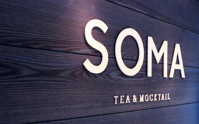
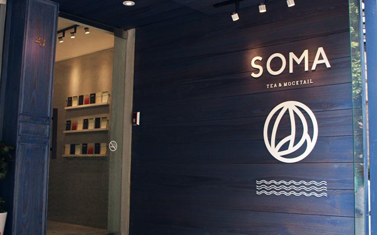
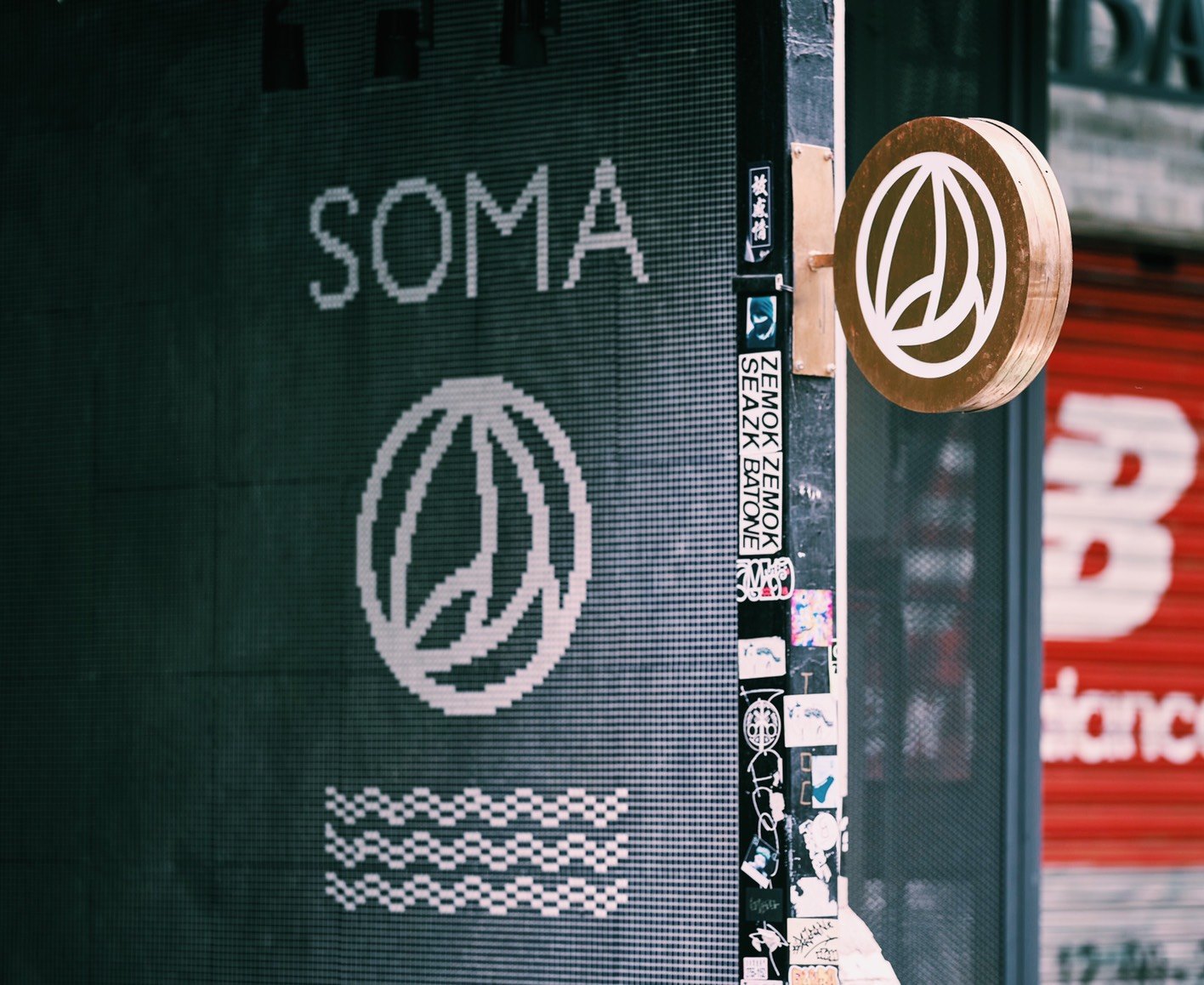
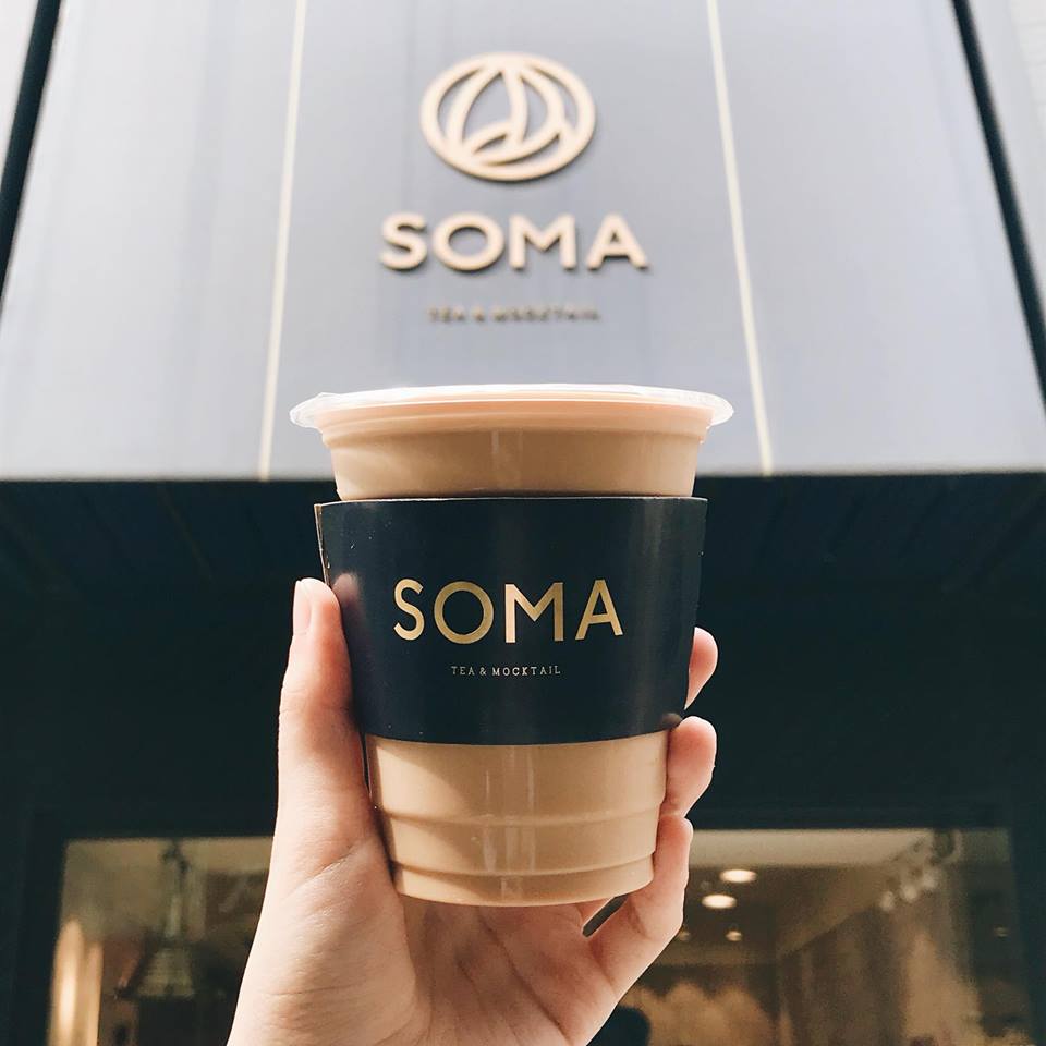
SOMA,
South of Market的簡寫,原本是舊金山的港口貨倉區, 經過整頓之後,逐漸轉型成為當地充滿特色的地區之一。
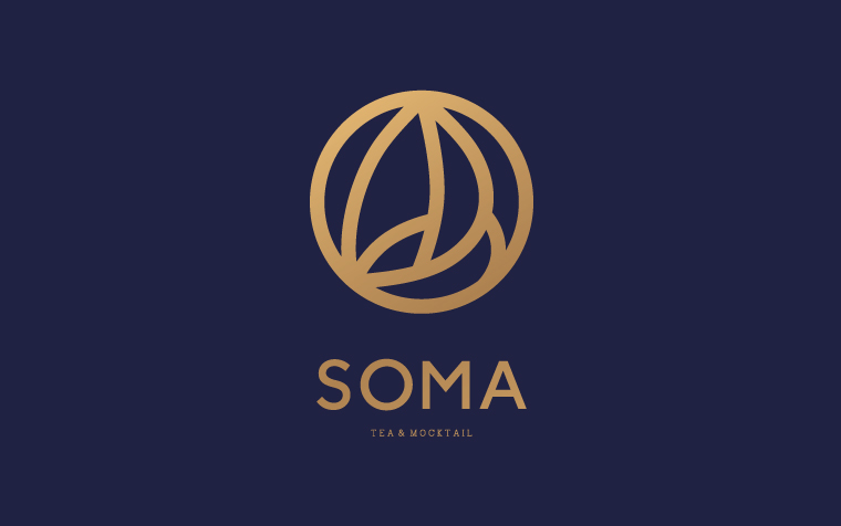
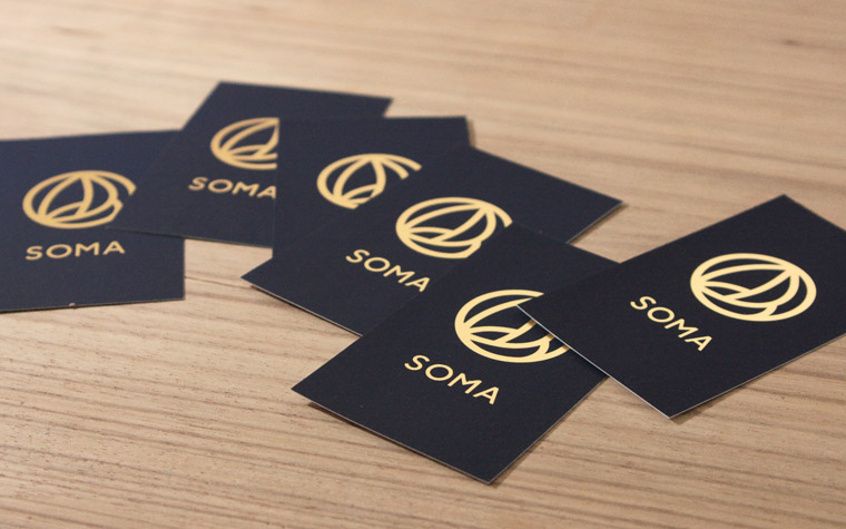
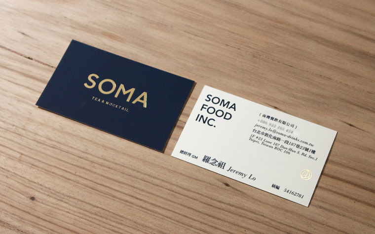
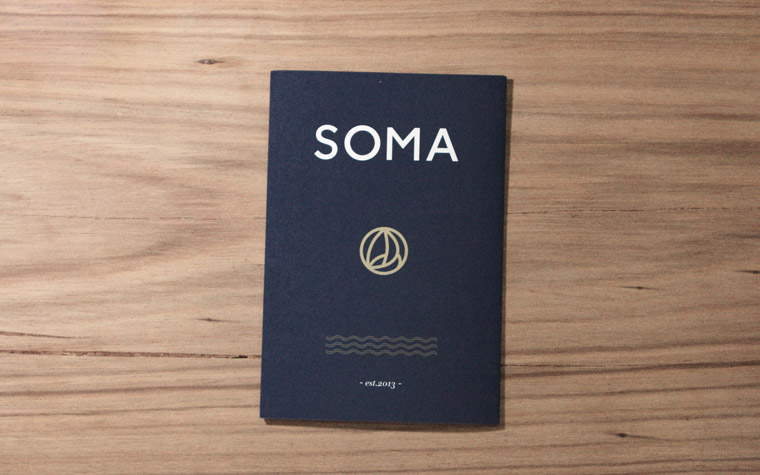
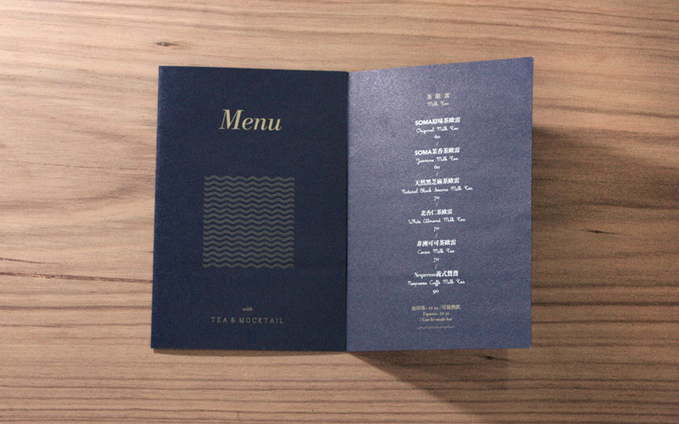
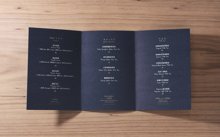
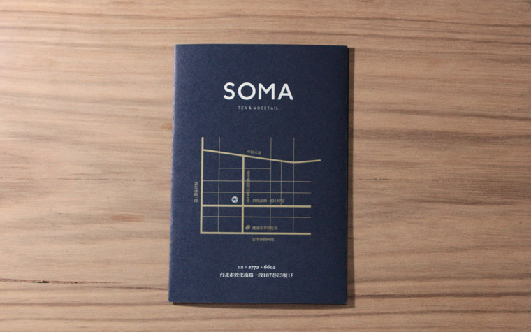
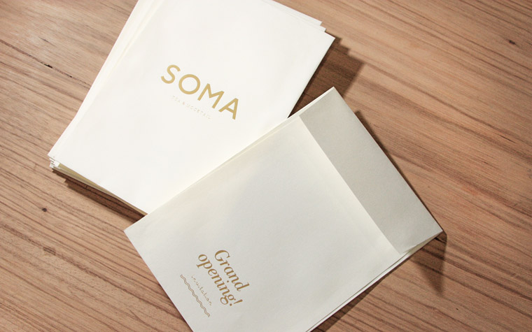
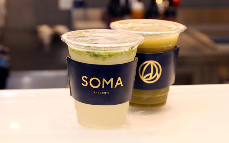
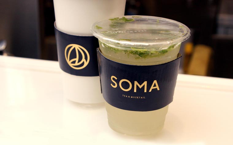
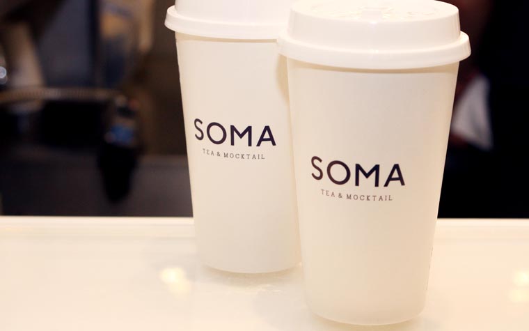
而這裡也是創辦人生涯的重要轉捩點,從EMBA轉向藍帶廚藝學院。 LOGO取帆船航行的意象,將品牌優雅又有冒險精神的特質融於其中, 標準色以海洋般的深藍搭配金色, 蘊藏了創辦人專業料理背景的細膩感,是獨具特色的外帶茶飲店。 SOMA的飲料嚴格講究品質,好喝不無聊;優雅簡約,大膽不隨波逐流。
SOMA (short for South of Market), was originally a port warehouse area in San Francisco. After being reorganized, it became one of the most characteristic regions locally. This is where the founder of SOMA encountered his turning point in life, where he switched from EMBA to Le Cordon Bleu. The logo is inspired by the image of a sailing sailboat, incorporating the brand's elegant, adventurous spirit. Standard color consists of a combination of navy blue and gold, emanating the founder's culinary expertise and finesse, this is a unique tea and mocktail store. The main appeals of SOMA's beverages are outstanding quality, great flavor and interesting selection; simple, elegant and bold, this is a trend-setting beverage label.