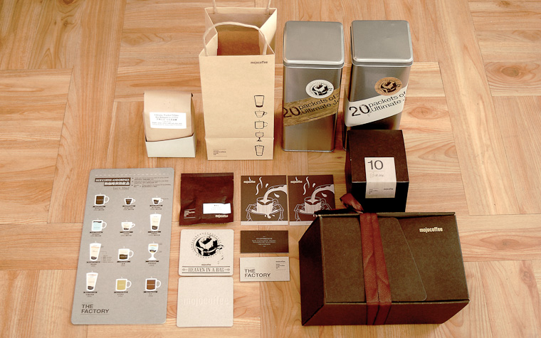

The Factory mojocoffee 是mojocoffee的第三家咖啡廳。 如其店名,除了咖啡廳外2樓還有烘培室與lab。所以以斑駁與工業風來表現logo;menu也以實驗室解剖形式來表現。 三家店有一個共同的特色是從一樓延伸到樓中樓的方格書櫃; 一系列的mojocoffee禮盒包裝,故意用斜的造型,來呼應方格概念;就是看到斜形想到方格。
www.mojocoffee.com.tw The Factory mojocoffee is mojocoffee's 3rd coffee shop. As the name suggests, it has a roasting room and lab on the 2nd floor besides the café, therefore mottled and industrial look is applied to present the logo, while the menu is also designed with laboratory as inspiration. The three stores share a common feature: the checkered bookshelf extending from first floor to the mezzanine. A series of mojocoffee gift packaging deliberately adopts an oblique to resonate with the checkered concept. In other words, seeing the oblique shape will evoke images of the checkered design.
www.mojocoffee.com.tw The Factory mojocoffee is mojocoffee's 3rd coffee shop. As the name suggests, it has a roasting room and lab on the 2nd floor besides the café, therefore mottled and industrial look is applied to present the logo, while the menu is also designed with laboratory as inspiration. The three stores share a common feature: the checkered bookshelf extending from first floor to the mezzanine. A series of mojocoffee gift packaging deliberately adopts an oblique to resonate with the checkered concept. In other words, seeing the oblique shape will evoke images of the checkered design.