
天成毛刷廠
Tin Shing Brush
branding, rebranding, culture
2014
Art Director
余岱官 Kuan
Designer
顏君如
Photography
白偉奇
Tin Shing Brush
branding, rebranding, culture
2014
Art Director
余岱官 Kuan
Designer
顏君如
Photography
白偉奇
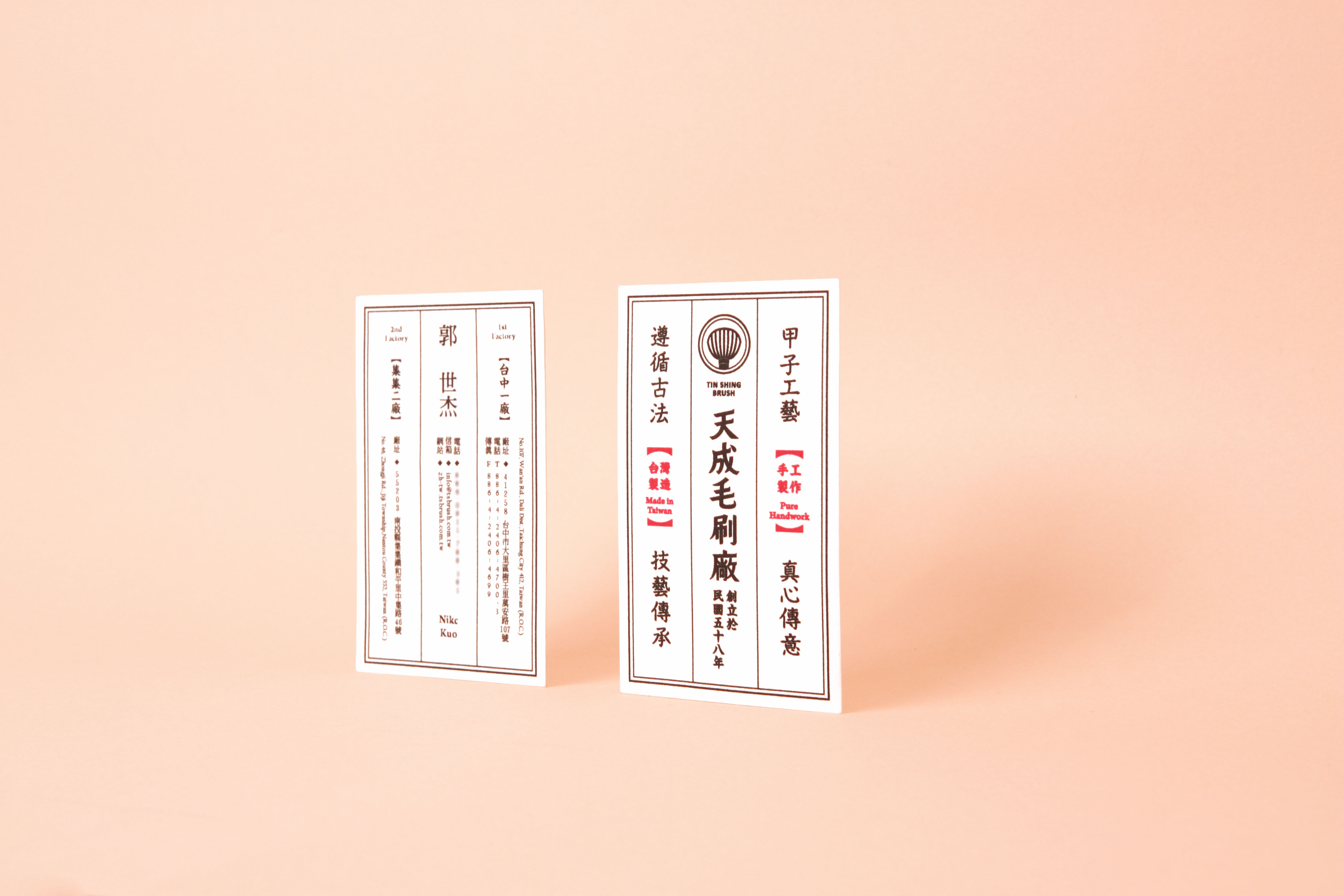
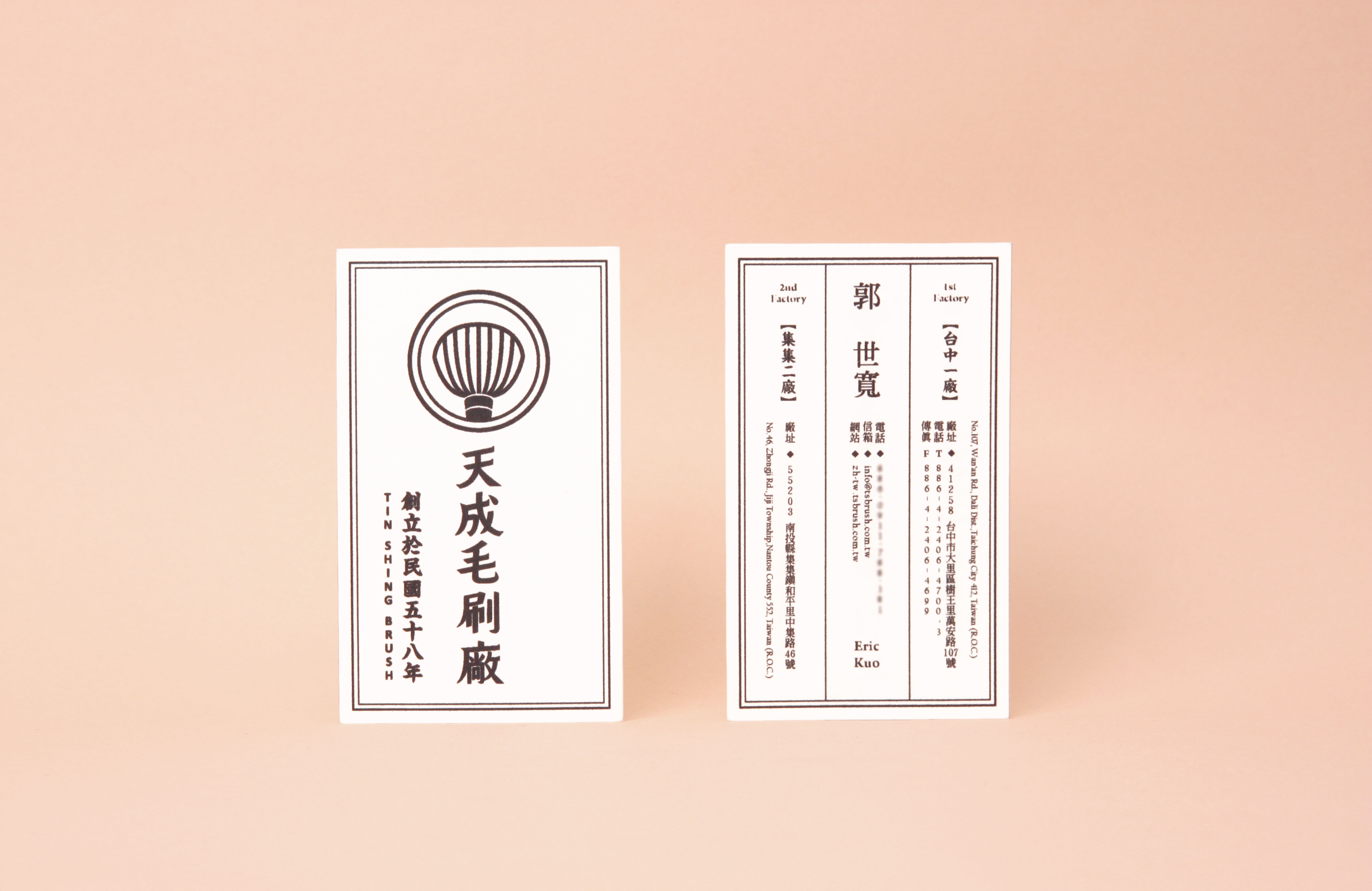
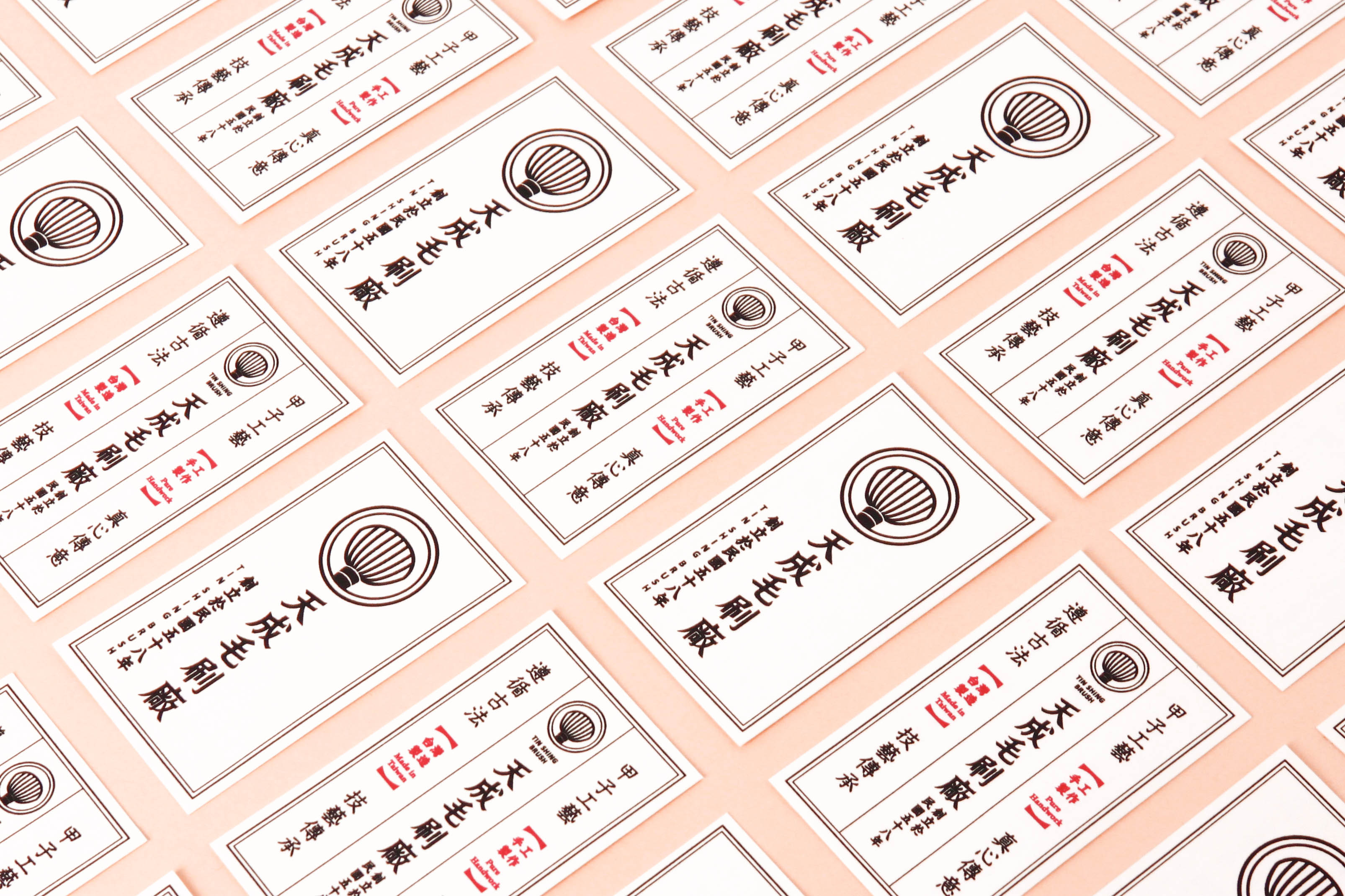
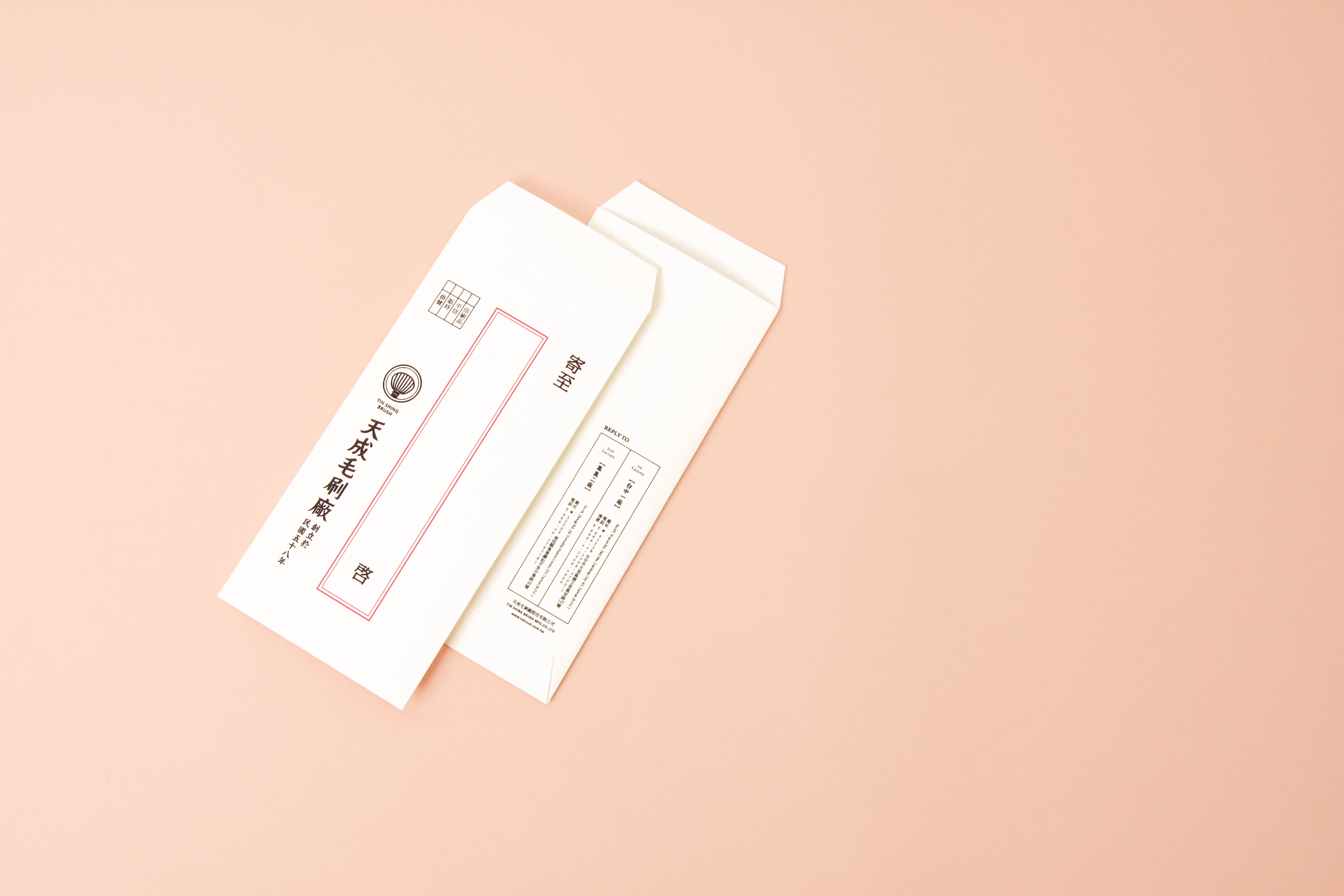
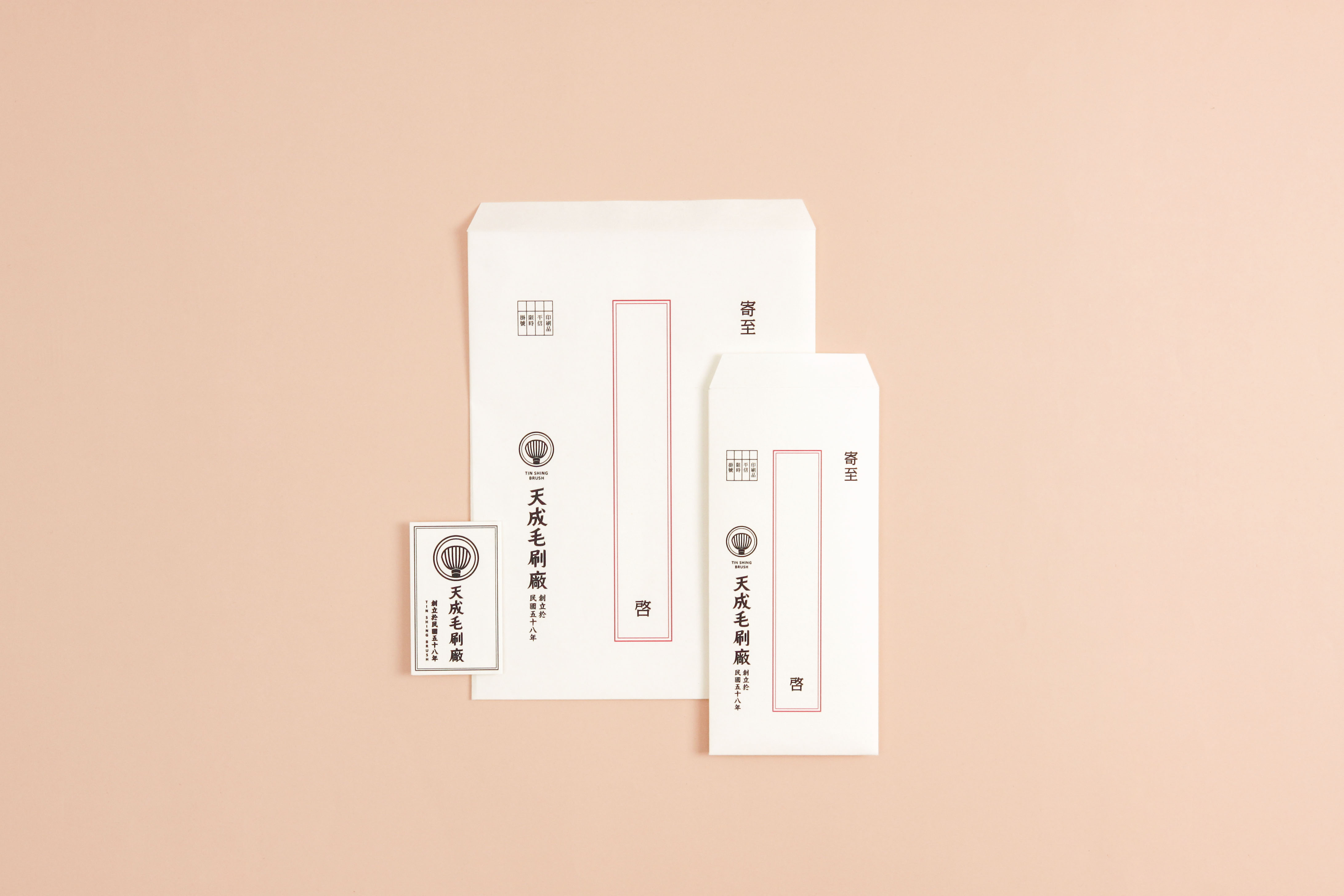
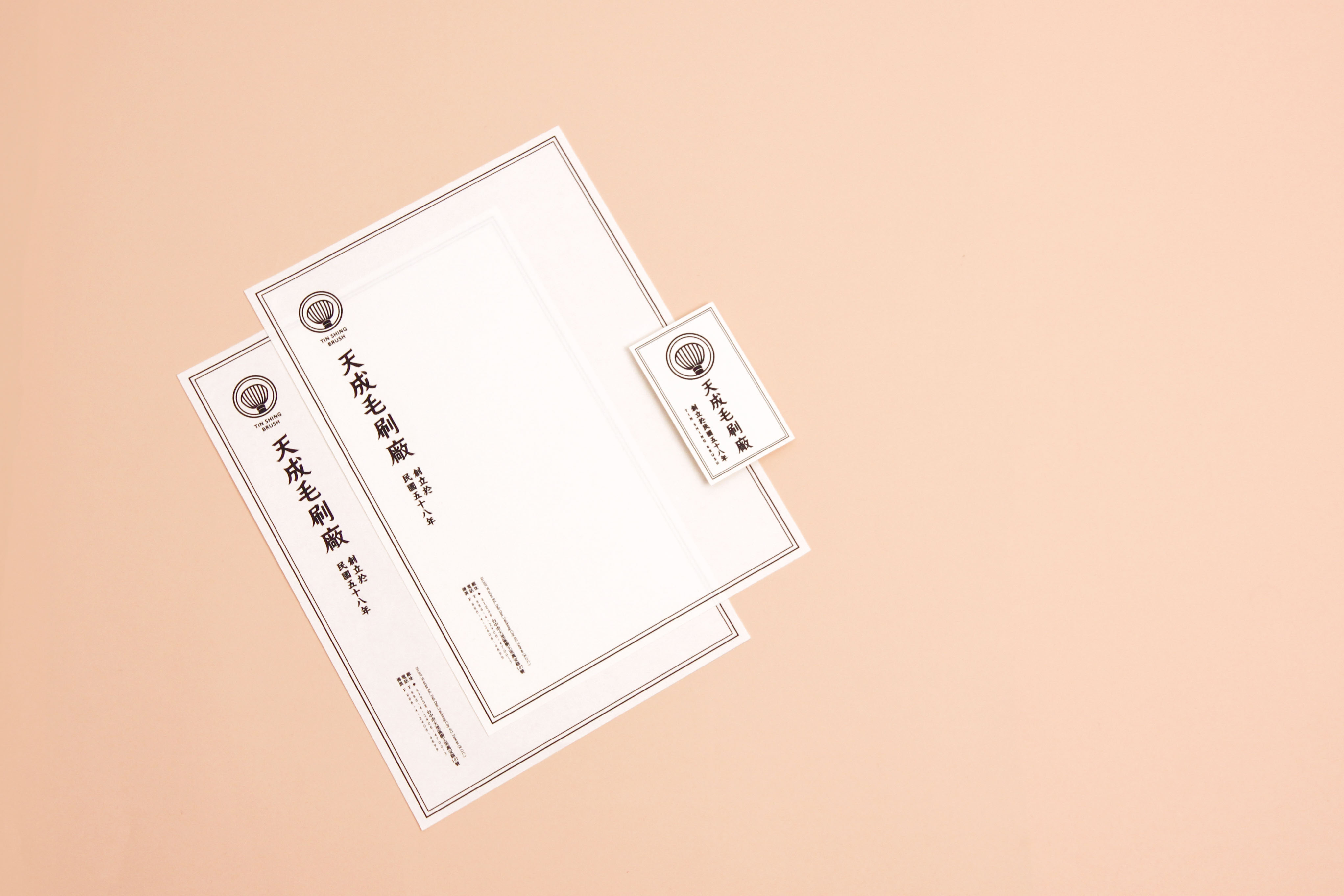
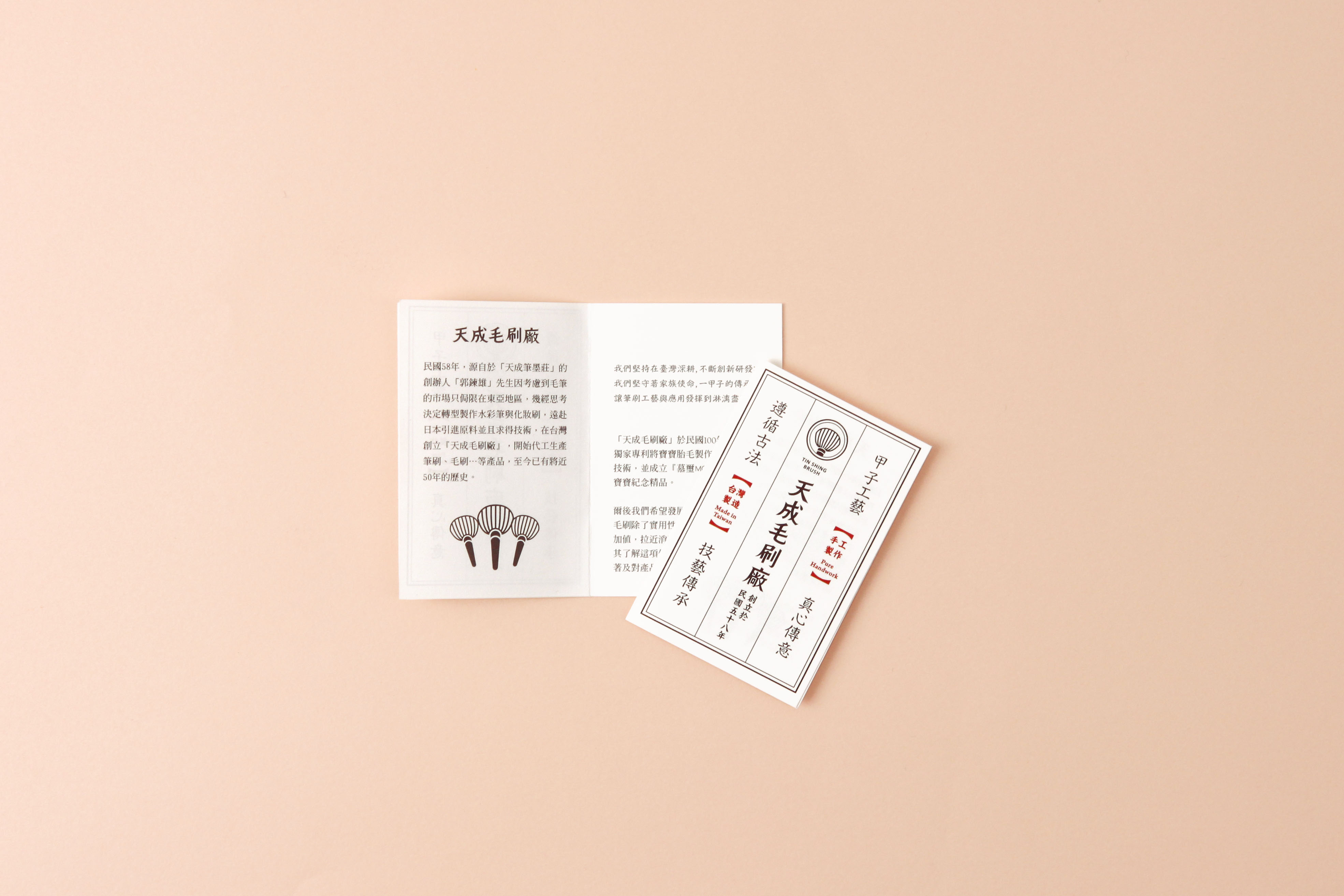
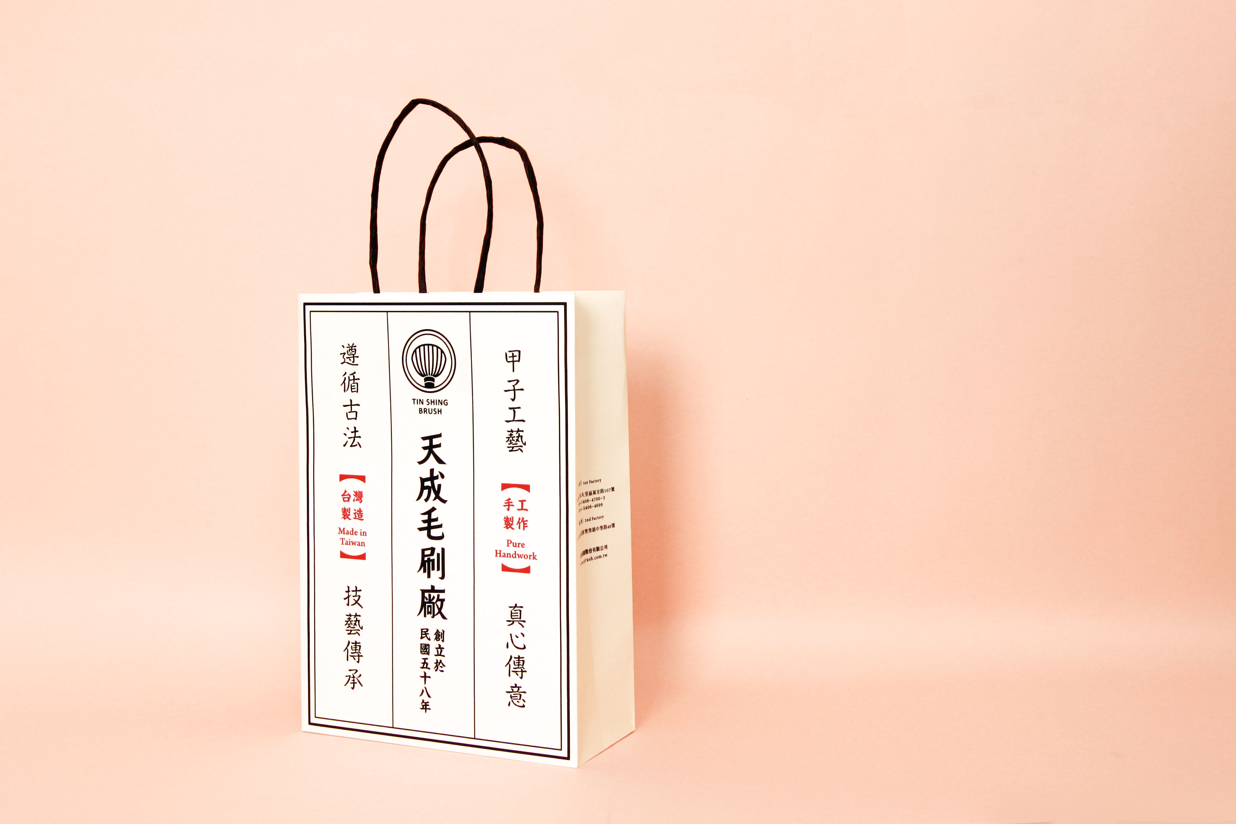
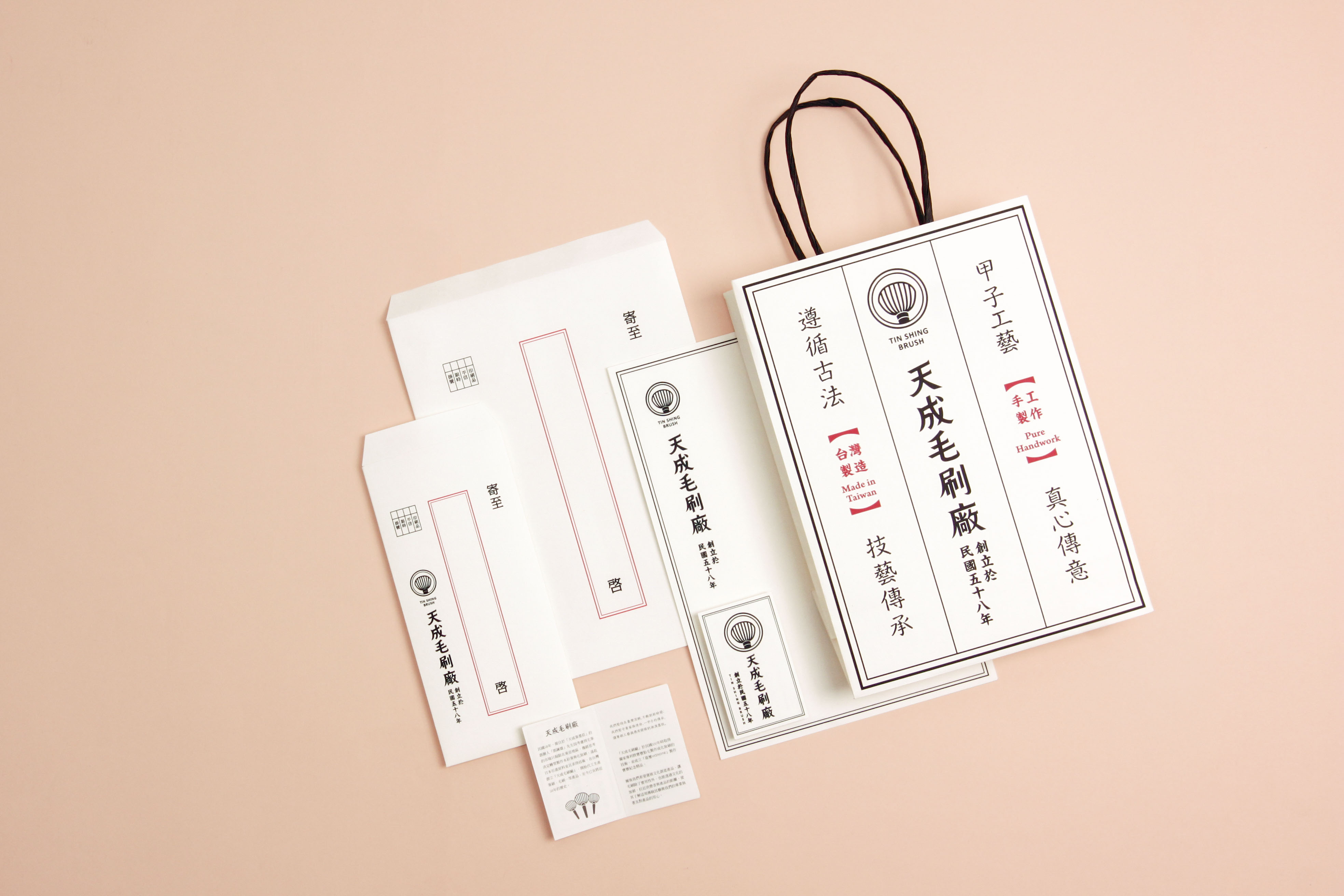
甲子工藝 真心傳意
遵循古法 技藝傳承
直接的自我介紹+復古字型+復古文字排列+框線 為天成的品牌主視覺, 訴說 品牌歷史背景 與 天成的精湛工藝 懷舊又前衛 傳達天成毛刷廠不斷創新研發, 意圖使民眾了解這項傳統技藝的執著與用心。
Six decades of craftsmanship and true heritage Traditional craftsmanship
Ancient tradition Direct self introduction+retro font+archaic layout+frame, these are the main visual appeals of Tin Shing, portraying the brand's history, background and exquisite craftsmanship. Nostalgic and avant-garde at the same time, Tin Shing is dedicated to relentless R&D, with the ambition of allowing the public understand the dedication and commitment of Tin Shing towards the traditional craft.